583 stories
·
0 followers

The 3 Gurus of 90s Web Design: Zeldman, Siegel, Nielsen

1 Share

classic web design books 
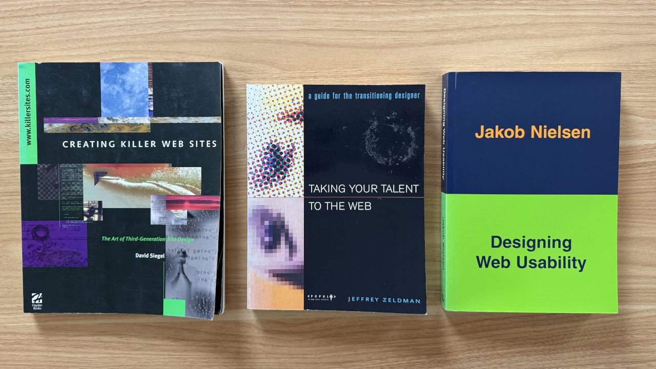
My well-thumbed copies of three classic web design books: 'Creating Killer Web Sites' by David Siegel (1996-97), 'Taking your Talent to the Web' by Jeffrey Zeldman (2001), and 'Designing Web Usability' by Jakob Nielsen (1999).

Like many of the first wave of web designers, Jeffrey Zeldman — who turned 42 in early 1997 — had begun his career in a completely different profession. He’d started out as an aspiring fiction author, briefly worked as a journalist, tried his hand as a touring musician, and then spent ten years in the advertising business. “Writing billboards and coming up with quick visuals was good training for the web because you have to communicate something instantly,” he later said in an interview.

It was the rise of multimedia that attracted creatives like Zeldman, who made his first website in 1995. “Hyperlinked text made the web, graphics made it a consumer playground,” he wrote on his personal website at the end of 1996.

Zeldman website, 30 March 1997 
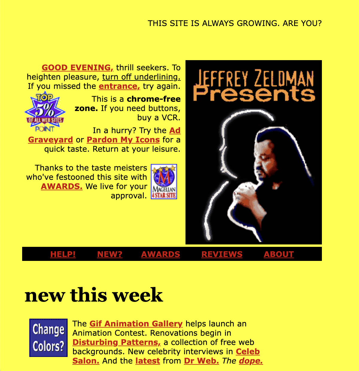
Jeffrey Zeldman's homepage, March 1997. Note that the typical display size at the time was 800x600 pixels, so this and other websites would likely have been designed for those dimensions. Via Wayback Machine.

But if the web was a “consumer playground” now, it was still one with many constraints. As Zeldman told budding web designers, “the accepted wisdom is to use as few images as possible, and make them as small as you can (small in file size, though not necessarily in height or width).”

To create his webpages, Zeldman used a plain text editor on a Macintosh computer to compose the HTML, along with Photoshop to create his graphics. He encouraged people to keep to HTML fundamentals, but he was also pragmatic — copy other designers to learn, he advised, and select “File: View Source” to see how different pages on the web were created.

Zeldman view source 
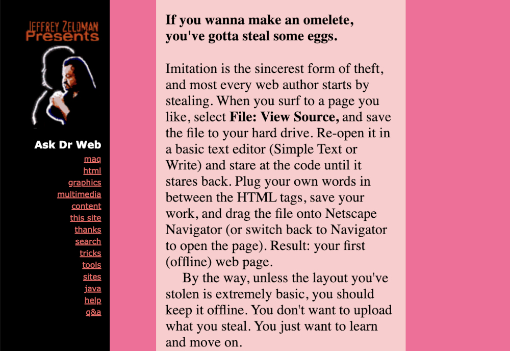
"Imitation is the sincerest form of theft, and most every web author starts by stealing." From an FAQ on Zeldman's site, March 1997; via Wayback Machine.

The 3 Musketeers

Early in his new career as a web designer, Zeldman was heavily influenced by David Siegel, who had published a book in 1996 entitled Creating Killer Web Sites: The Art of Third-Generation Site Design. This was before CSS (Cascading Style Sheets) or Flash, so the book advocated for “hacks” to HTML in order to make websites more visually appealing. The primary hacks were using invisible tables and single-pixel GIFs to help control layout. The book had a chapter entitled “A PDF Primer,” but did not mention CSS (as the final spec hadn’t yet been released). The second edition, published in 1997, replaced the PDF primer with a new chapter: “A CSS Primer.” That’s how fast web design was changing at this time.

David Siegel's homepage, February 1997 
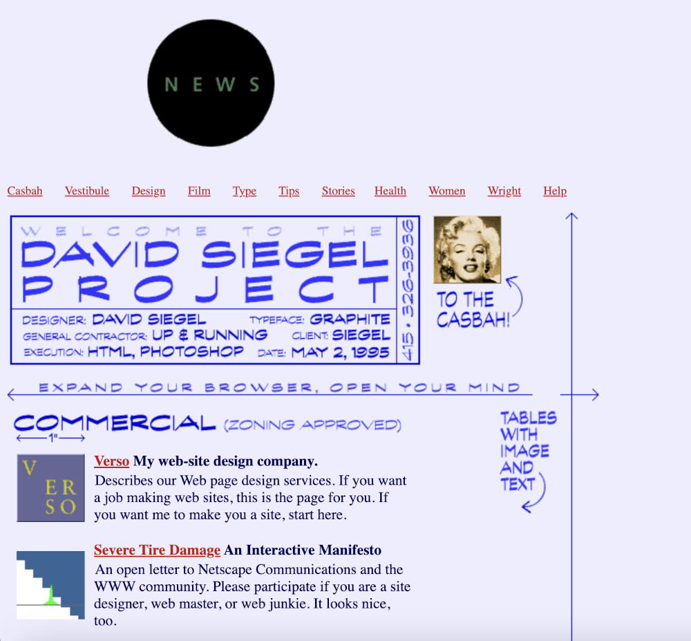
David Siegel's homepage, February 1997; via Wayback Machine.

Siegel was around 37 years old at the start of 1997, but unlike Zeldman he had a background in digital design. He’d started his career in digital typography and so when he moved to the web, his goal was purely aesthetic. “I will use any means necessary to achieve quality typography and clear communication,” he wrote on his website. One of the ways he chose to do this was to focus his efforts on Netscape Navigator. “I will not make pages that are optimized for ALL browsers,” he wrote.

This was the beginning of browser optimization on the web, which forced web users to view certain websites in a specific browser. Siegel styled himself as an “HTML terrorist,” so he was willing to take a contrary stance to achieve perfect typography on the web.

David Siegel tips, February 1997 
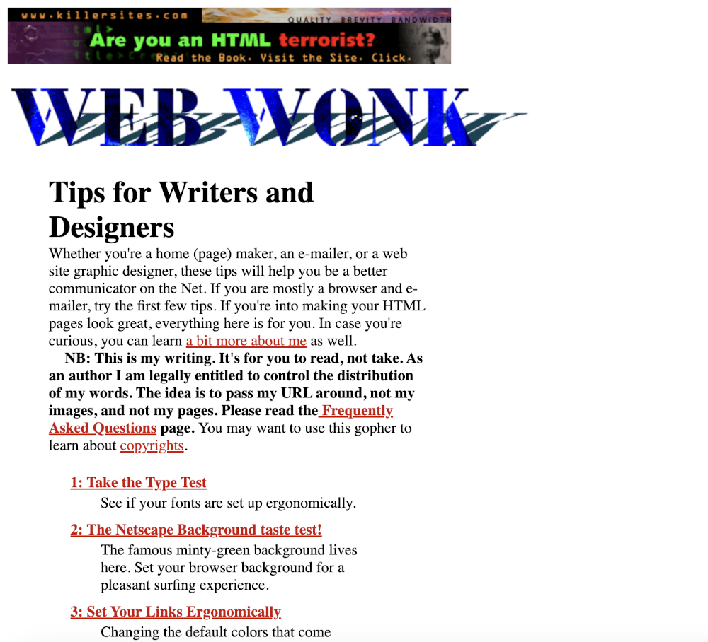
David Siegel's "Web Wonk" HTML tips site, February 1997; via Wayback Machine.

If Siegel was a self-described web design terrorist, then 39-year old Jakob Nielsen positioned himself as a web sheriff. He wrote that his goal was to “get rid of superficial coolness and make websites into serious business tools.” He wasn’t a trained designer (instead, he called himself a “usability guru”), but Nielsen strongly advocated for designs that were accessible on all the main browsers. For this reason he encouraged designers to use “semantic encoding” to keep content and presentation separate.

At first, Nielsen was talking about sticking to the structure defined in the HTML specification — such as using H1 and H2 for headers, rather than encoding something like "18 pixels tall bold Garamond.” Essentially, he was saying that each browser should define how headers would be displayed to their users. But he quickly got behind the emerging web standard, CSS. “Style sheets are a new development on the Web and currently not widely used,” wrote Nielsen at the end of 1996, “but they are the only solution to getting nice presentation with ever-increasing numbers of browsers and display devices.”

Useit, February 1997 
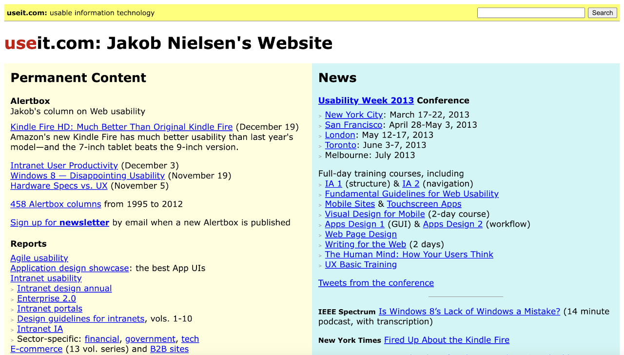
Jakob Nielsen's Useit website, February 1997; via Wayback Machine.

The problem was, CSS support from the two main browsers at the start of 1997 was patchy at best. Internet Explorer 3.0 was the closest to supporting the W3C standard for CSS, but it was buggy and inconsistent. As for Netscape, its 3.0 browser had poor CSS support. In fact, the company even tried to create an alternative to CSS, with a JavaScript-powered styling mechanism called JavaScript-Based Style Sheets (JSSS). Thankfully JSSS went nowhere, but it did serve to delay Netscape getting behind the nascent web standard for style sheets.

As 1997 progressed, the schism between the aesthetic approach to web design (personified by Siegel) and the semantic approach (personified by Nielsen) widened. Jeffrey Zeldman found himself in the middle of this. He was a proponent of CSS, but he also wasn’t above using new tools that disregarded semantic coding — like Shockwave and Flash. Over the coming years, Zeldman continued to insist that web design could be both aesthetic and standards-compliant. “Images, table layouts, style sheets, JavaScript, server-side technologies like PHP, and embedded technologies like Flash and Quicktime are all compatible with the rigors of accessible site design,” he wrote as late as July 2002.

Flash Point

Zeldman would eventually turn his back on Flash, which of all the web design tools available in the 90s was probably the least semantic. But when it first became popular, over 1997, it was seen as an animation tool that could take multimedia on the web to the next level.

Flash 1997 
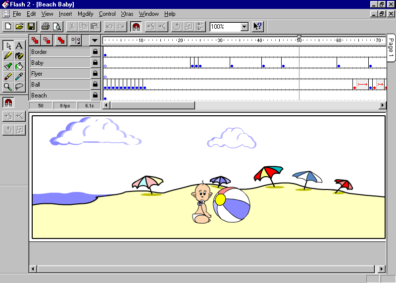
In May 1997, Macromedia released Flash 2, "the first tool for creating and animating vector-based resolution-independent graphics without programming"; image via Web Design Museum.

Flash had a few important things going for it. Firstly, the tool was easy to learn (unlike CSS). Secondly, it could do much more, visually, than CSS at that time. Almost anything was possible using Flash, with the only constraint being bandwidth limitations. Thirdly, and most crucially, Flash didn’t rely on the leading browser companies implementing it. The Flash player was a browser plug-in, so all it needed was for users to download that plug-in. Which they did, en masse.

Siegel quickly embraced Flash. In the second edition of Creating Killer Websites, published in September 1997, he wrote that “Flash is the best bet for bringing vector graphics into mainstream use on the Web.” To be fair, he also devoted an entire new chapter to CSS. However, he clearly wasn’t impressed by what CSS could actually deliver at the time. “To a certain extent, this chapter represents an exercise in futility — it demonstrates the appalling degree to which the browsers fail to deliver on the promise of style sheets in August 1997,” he wrote. In his summary, he expressed hope for CSS, but warned that “I will continue to commit HTML terrorism to accomplish my design objectives on today’s browsers.”

Killer Websites Flash The Flash section of the second edition of Killer Websites; via Internet Archive.

As quickly as Siegel and Zeldman embraced Flash, Nielsen just as quickly rejected it — primarily because presentation and content were mashed together into one file, so there was nothing at all semantic about the code it produced. A few years later, he famously wrote that Flash was “99% bad” and that it was almost always “a usability disease.”

Even Siegel was concerned that Flash was a proprietary tool, owned and controlled by Macromedia (which had acquired the technology from a company called FutureWave at the end of 1996). Flash couldn’t have been more different from CSS — the software was not open source, the file format (.fla) was proprietary, and the output did not conform to web standards.

W3C Style, June 1997 
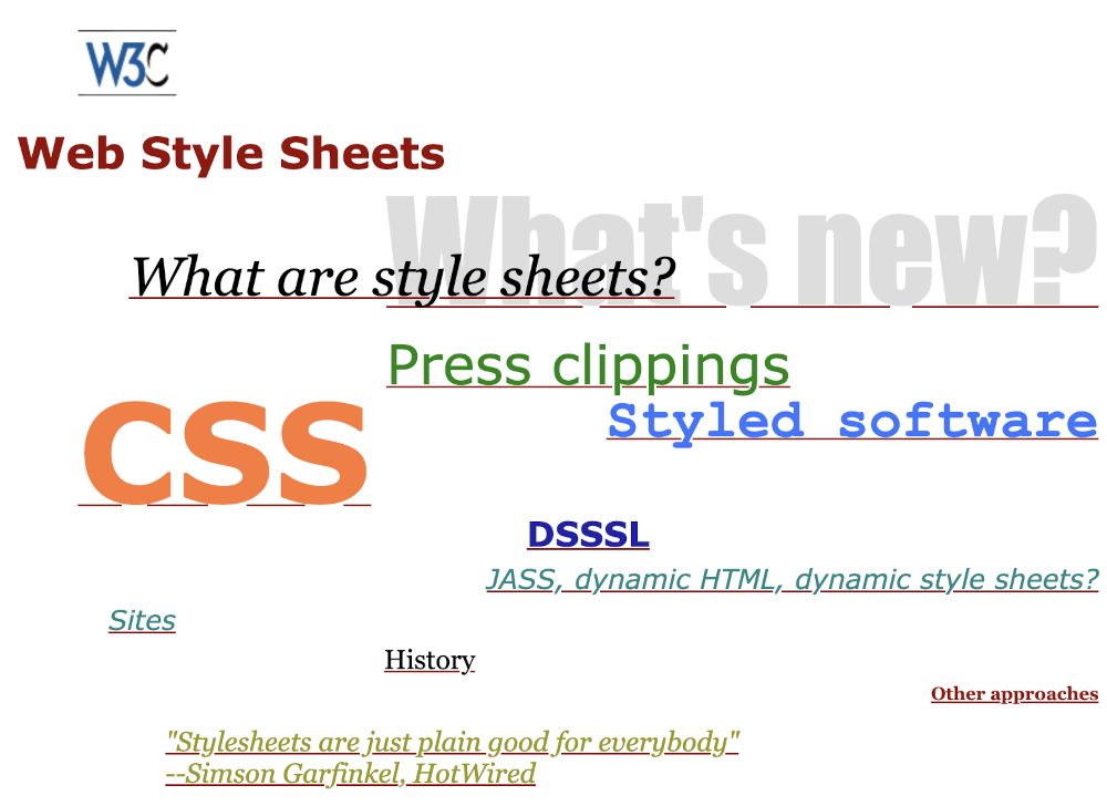
The W3C Style page, June 1997; via Wayback Machine.

For all their differences, CSS and Flash did have similar goals: both aimed to expand the state of web design on the web. Yet only one of them led to an explosion of visual creativity on the web over the rest of the 1990s…and it wasn’t the open web standard. If you wanted to create a killer website in 1997, Flash was the tool many web designers of that time reached for.

Whatever Happened To…

As for Zeldman, Siegel and Nielsen, for all their differences, the three musketeers of web design all wanted to move their fledgling profession forward. Because the web platform was in flux in 1997 — epitomised by the emergence of Flash and CSS, two diametrically opposed technologies — web design was necessarily experimental that year.

It’s only by looking at the careers of all three men in the following decades that you get a sense of which web design philosophy eventually ‘won’.

Post-90s, Jakob Nielsen became ever more defined by his barebones website, Useit, which eschewed any design flourishes. Like Craigslist, another famously minimalist website, Useit didn't change its design over the years. By the Web 2.0 period, it was seen my most in the web design profession as being hopelessly outdated. The site lasted several more years, before Nielsen announced that Useit would be folded into his main corporate website, NNGroup, at the end of 2012.

It may not surprise you to know that in 2025, Jakob Nielsen is writing about AI on Substack.

Useit, December 2012 Useit website in December 2012, just before it was closed down. The design (purposefully) hadn't changed much since 1997. via Wayback Machine.

David Siegel has had a surprisingly varied career. He was the most qualified design professional of the three, having earned a master's degree in digital typography from Stanford University in 1985 and then working at Pixar. But after two editions of his hugely influential “Killer Web Sites” book over 1996-97, he switched gears and moved from web design to web business in the late-90s. I had some contact with him in 2010, when he was promoting his fourth book, Pull: The Power of the Semantic Web to Transform Your Business.

Later, Siegel got interested in the blockchain and pursued that for a few years. His current website, cuttingthroughthenoise.net, shows that he now has a variety of business and personal interests.

David Siegel 2025 
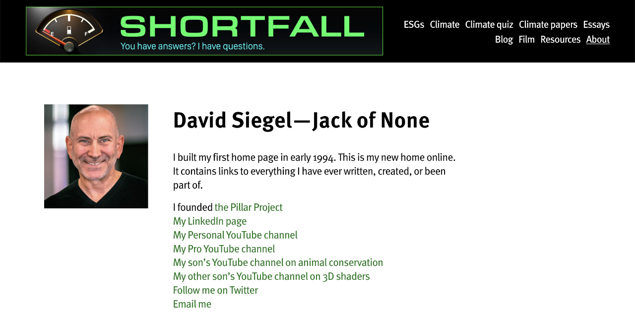
David Siegel's website in 2025 reflects his eclectic interests.

Jeffrey Zeldman is still very much a web designer. Since 2019 he’s been Executive Creative Director at Automattic, the company behind the WordPress blogging system, Tumblr, and other web products. He still regularly blogs about web design topics on his website, zeldman.com — although the current site design is one of the default WordPress themes.

I was curious why he no longer has a custom design, so before I published this article I reached out to him via a Bluesky DM. He replied: "I'm working on a redesign of my site as we speak. It will go live soon." He added that the default WordPress theme, which he switched to in February 2019, "wasn't so different from one I might have designed myself at the time. That said, after living with the default theme for six years, I'm ready to move on."

Zeldman website May 2025 
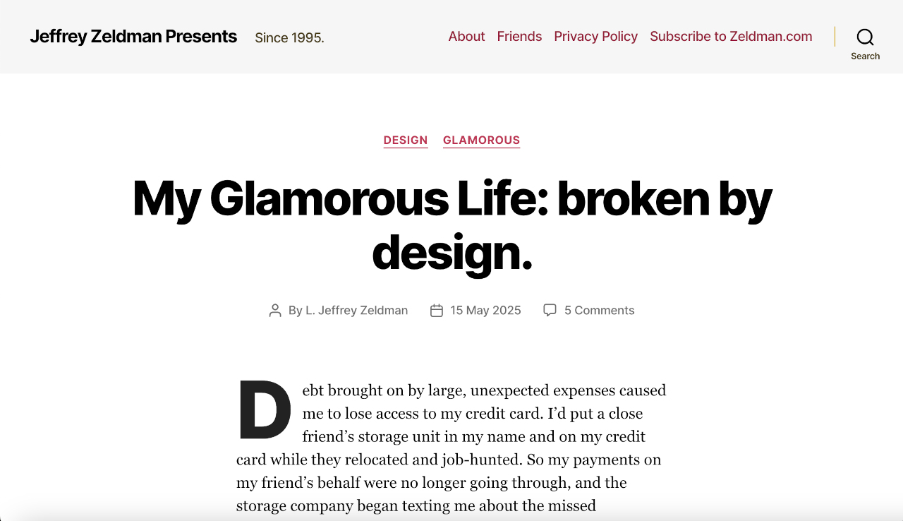
Jeffrey Zeldman's website as at 28 May 2025...but stay tuned, a redesign is coming soon!

I must say, I'm thrilled to hear that Zeldman is working on a redesign. I'd argue that his pragmatic approach to web design — combining web standards with design flair — was what won out during the 90s and early 2000s. Certainly, of the three web design gurus in 1997, Zeldman’s website back then was by far the most interesting and exotic. So I look forward to seeing that design philosophy return to zeldman.com — and indeed, let's hope it proliferates again across the rest of the indie web.

Bonus photo of ricmac in 2010 
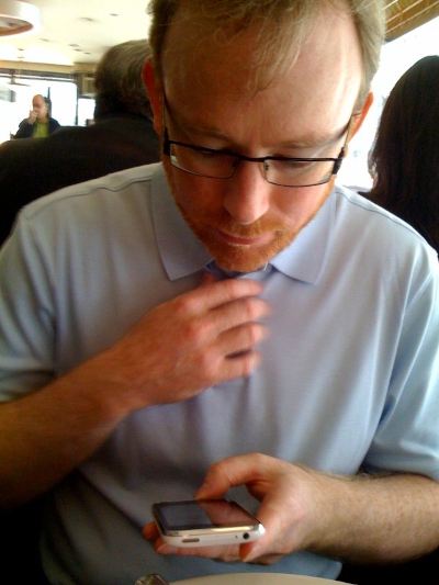
A sneaky pic of me taken by Jeffrey Zeldman in June 2010, during one of my trips to NYC.

Read the whole story
mrmarchant
11 hours ago
reply
Share this story
Delete

Why Is Everybody Knitting Chickens?

1 Share
Why Is Everybody Knitting Chickens?

A couple years ago, my wife began knitting. And when she takes an interest in something, she goes all in. She’s a perfectionist about learning a new craft, so in a short amount of time, she’s gotten pretty damn good. I can’t even pretend to know anything more than the most basic idea behind knitting, but somehow she makes incredibly complex garments with skill and precision.

She’s also become active in the online knitting community, which is interesting for me to watch because she’s otherwise not really active online. But now she follows r/knitting and shares on Ravelry and watches knitting videos on YouTube.

The other day she told me about something that’s spread like wildfire through the knitting community: chickens. Knitted chickens. They’re roughly the size of a throw pillow and are stuffed with material to be soft and huggable. Everybody’s making them.

Why Is Everybody Knitting Chickens?
“Emotional Support Chicken” by Annette Corsino

Since the knitting pattern for this chicken was posted on Ravelry in 2023, nearly 11,000 people have posted photos of their own knitted chickens on the platform. The official tutorial video has more than 300,000 views on YouTube with comments like: “This pattern should come with a warning that it is HIGHLY ADDICTIVE! I have finished 4 so far and am working on 2 more.”

People give their knitted chickens names like Hennifer Lopez and Lindsey LoHEN, a punny habit shared by owners of actual backyard chickens, who also like to name their birds after celebrities. (Mine would be Henny Youngman.)

And there are knittable accessories, natch.

Why Is Everybody Knitting Chickens?
Accessories by Annette Corsino

I was fascinated by all this. I love little artsy niches and this one was completely new to me. I had to know where the knitted chicken came from. The answer turned out to be easy to find, it just never overlapped with my own interests so I never came across it before.

The knitted chicken is known as the Emotional Support Chicken and was designed by Annette Corsino at a fiber arts shop in Los Angeles called The Knitting Tree. She made the chicken as a sort of play on emotional comfort animals, but one that doesn’t require any sort of permit to own or need to feed it.

It was adapted from an earlier chicken design from the 90s called Henrietta (another “hen” name) by Bev Galeskas.

Why Is Everybody Knitting Chickens?
The original Henrietta by Bev Galeskas

The idea of a comforting stuffed animal for grownups (or anyone really) that you can make yourself was appealing to a lot of people in these hard times. During COVID lockdowns, people developed indoor hobbies like knitting which meant there were a lot of new knitters among the old-timers looking for things to knit. Knitting is a relaxing activity for many, and the Chicken knitting pattern wasn’t too difficult, so it made a good project for beginner-to-intermediate knitters.

In 2024, the LA Times reported (with great photos you should go look at) that people were gathering at The Knitting Tree for Emotional Support Chicken knit-along events. By then the store had already sold 25,000 copies of the knitting pattern and more than 3,000 kits including everything you need except for needles and stuffing.

I admit that it does look kind of comforting to hug one of these chickens. And that comforting quality has prompted a Facebook group to knit Emotional Support Chickens for survivors of Hurricane Helene. The group description says, “There has been a request for chickens for those suffering from this historical tragedy. This is something I know we can do together! Let’s get together and make some chickens yall!!”

A couple weeks ago someone in the group shared this photo of an Emotional Support Chicken being delivered, noting “The need is real. I carry a few emergency chickens all the time now.”

Why Is Everybody Knitting Chickens?

Variations on the pattern include a crochet version, a mini-version, etc. And it’s a perfect feel-good story for TV news. Here are a couple stories I came across:

And the BBC reported on a yarn shop in Suffolk that displayed 67 olympic-themed chickens knitted by people around the world in its front window.

Olympic-themed knitted hens take over Long Melford shop front
Sixty-seven ‘Olympi’hens’ have been decorated to represent different nations in the Games.
Why Is Everybody Knitting Chickens?

More fun photos await if you click through

This is obviously a trend that lots of people know about, and I have just been out of the loop (that’s a knitting pun). Have any of my readers ever made an emotional support chicken? What did you name it?

Why Is Everybody Knitting Chickens?

And that brings another newsletter to a close! So far, the move to Ghost seems to be going okay, right? No problems on your end? Only one person said they missed last issue so hopefully everyone else is getting it.

As long as you’re here, I have something for the font nerds among us. You know who you are. I directed a short documentary for Nebula about their new font and it’s now on YouTube:

Hope everyone has a great week. See you next time!

David

Read the whole story
mrmarchant
11 hours ago
reply
Share this story
Delete

Can accessibility be whimsical?

1 Share
Can accessibility be whimsical?

It started out with me just trying to find a cute word to put with a11y, the numeronym for accessibility. Because you have to buy a cute domain name for every side project idea, of course. And as much as I try to say “a-eleven-y” of course my brain always reads it as if the 1s are ls.

I have been spending the last year or so thinking about how to enable what I've been calling “laypeople” – meaning non-developers or non-internet-nerds – to build their own websites.

Web revival or web never left?

A lot of us miss the “old” web and the webrings and the surfing and the eccentric personal websites and the communities that formed across them. I'm pleased to have found out (while setting up a webring myself and welcoming people into it), that this old web didn't go away. A lot of corporate web and e-commerce and social media silos have sprung up around it of course, but the sprawling personal website village is still there. New people keep moving into it as old ones leave. It's alive and well (see MelonLand's Surf Club and so many sites on Neocities), and there’s a surprising number of active webrings!

Just because this personal web is now proportionally much smaller than the huge platforms that exist and help the laypeople to blog and network with each other, it doesn't mean it's any less vital or central to our living web. I'd even consider it the beating heart.

Not-so-a11y

What it isn't, really, is very accessible.

Saying that makes me want to immediately add reasons and excuses for it, but first, just let it sit there. So be it. The personal web – unless it's a website belonging to a developer within accessibility circles – isn't all that accessible.

I have many thoughts, and maybe you do, too. If you have a personal website, please don't feel attacked, even if you see a picture of yourself here. This is your home on the web and it's for you to tinker with, to explore, to experiment.

Does your real home have a wheelchair ramp? A stair lift? A bathroom that can fit a wheelchair? Braille labels on things? Special taps for arthritic hands?

Mine sure doesn't. I mean, not yet. My father just got a stair lift and I remember my Nanna getting taps and kitchen tools that were easier on her hands.

Inclusivity

My implied question here is: does a personal website need to be accessible? Probably not. Many are resolutely not even responsive to mobile screens – and I actually salute those that add a declaration that proudly say so.

Here's where the idea for whimsica11y comes back – many people want their personal sites to be accessible. A lot of personal websites I've seen belong to people who are part of one or several of queer, trans, gender-fluid, neuro-diverse, leftist, anarchist, sex-positive, disabled, and other communities. They are not really in the game of being exclusive; rather, they are more keen to be as inclusive as possible.

I started building the Whimsica11y website for this audience, but I stalled out. Partly, I ran out of time and energy, and some other new shiny idea got in the way – and partly, I started to worry I was about to give out advice that would be pushed back on, that I'd get told was wrong, that I would exclude people by accident. I think this is a common fear about accessibility which scares people away.

Looking up advice

A few people will have gone looking for accessibility advice. Some of them find good resources, like this accessibility guide by Solaria or a11yphant. Others come across the Web Content Accessibility Guidelines (WCAG). Maybe some don't find the friendlier Introduction to Web Accessibility by the Web Accessibility Initiative (WAI) helpful and find reading the guidelines to be like swimming in pea soup. That document is remarkably cognitively inaccessible, given that it's promoting accessibility.

But it's not written for us as personal website builders. It's written for governments, commerce, service providers, officials, and auditors.

Sometimes you come across some nicely designed, bite-sized information that's easier to take in, and yes, good. But if you follow it all to the letter it's… a bit dull, actually. Some people worry that being accessible gets in the way of artistry – and, in some ways, they might be right.

A lot of the punchy advice that one sees in places like LinkedIn aren't necessarily following just the guidelines, but rather describing a sort-of best practice for the kinds of sites that (legally, in some places) have to be able to be used by everyone and then as efficiently as possible.

This is especially true in Europe because of the European accessibility act (EAA). There's much stricter legislation coming in about the accessibility of businesses providing goods and services to consumers.

More people are likely going to be seeking the International Association of Accessibility Professionals’ CPACC and WAS certifications for accessibility. In order to renew this certificate, IAAP requires active participation in the a11y sphere, which can include speaking, teaching, and writing series’ of blog posts with a minimum 5 posts per series.

This will hopefully increase the amount of advice out there, but this will probably also not be targeted to hobbyist website makers. Just be warned there may soon be a lot more advice around to sift through.

For now, though, here's some best practices for accessibility in the personal web.

Reframe alt text

Let's talk about alt text on images. A graphic or photo in a news article or technical illustration needs to have a brief description in its alt text that summarizes its value to the reader, and on we go. Cool.

But what about that picture on your website that's actually a picture of some art you did? Or a treasured photo of a pet or relative? Should you limit the description to under 200 characters? Should you be trying to just keep it brief?

In my opinion: No way! If the image means a lot to you and makes you feel lots of things, go to town and describe those things so that someone with a screen reader can understand and feel them too.

Good vibes only

Your website might have a vibe that comes from the general color scheme and decorative images around the place. Technically, purely “decorative” images should have an empty alt="" so that they're totally ignored by a reader.

But how else will visitors get that vibe? Is your content clearly written to go along with that sort of feeling? Or could you stash some information in those alt texts or in a visually hidden paragraph? Can you find another way to impart your vibe to the reader who can't see? How many inventive ways can you find to express yourself that aren't purely imagery? How about more use of sound?

I do actually find that personal websites are more likely to have multimedia going on; an embedded music player or midi tinkling away. I used to find this horribly annoying, but it feels so rare now. I like to let MelonLand’s audio just keep looping. It's pretty and calming, just like the visual design.

Where to start

We can try to get around our websites without a mouse by using the arrow keys or the Tab key. Are all your links and buttons accessible with Tab and actionable with Enter or Space? Can you see where your focus is on the page, on which link or button you have landed?

We can browse our site without any images, and see if it's still interesting or if it makes sense without descriptions.

We might get brave and use a built-in screen reader (VoiceOver for MacOS, Narrator for Windows, and Orca is available for Linux), or install NVDA on Windows for free, and listen to our websites. Can we get the screen reader to find all the text available and read it out? Is it speaking sense?

We can provide subtitles or transcripts for audio within embedded videos or podcasts for those who can't hear it.

Some people record occasional blog posts as podcasts, the best of both worlds!

If not WCAG, then what?

If the guidelines aren't written for the personal web, what rules shall we follow?

Well, even if a website follows all of WCAG, it can still manage to make itself inaccessible in myriad creative ways. I suspect you can also have a pretty accessible site even if there are some guidelines that you don't meet or aren't aware of. What I mean is: don't read the WCAG document unless you want to work as a web developer.

What you can do is read the WAI's Accessibility: It's about people section or watch its videos.

We can try to put ourselves in the place of the people we want our sites to reach. Find videos that show people using assistive technology. Follow people with disabilities and see what annoys them online. Ask your disabled friends what they'd love to come across on the web.

Don't panic!

There is so much we can do. But like the homes that haven't got any disability affordances, you're not going to get into trouble for not doing these things on your homepage. These are just ideas, for now.

Take one idea, or one kind of disability, and see what you can do to enable or maybe even amuse someone who is using the relevant kind of assistive tech.

Bit by bit. Little fix by little fix.

Before long, we'll be including silly little Easter eggs to liven up the experience of our disabled friends online.

We all deserve a little more whimsy.


Sara has been extremely online since 1998, making her own personal websites since 1999. She fell off the wagon some time around 2010 until getting back on it in 2021 to switch her career from electronic engineering to front-end web development. She loves the web platform and wants it to be accessible to everyone. You can find her at sarajoy.dev.


Read the whole story
mrmarchant
11 hours ago
reply
Share this story
Delete

Comparing Numbers Badly

1 Share

This is just a gripe about two differently bad ways to compare numbers. They share a good alternative.

“Order of magnitude”

Typically sloppy usages: “AI increases productivity by an order of magnitude”, “Revenue from recorded music is orders of magnitude smaller than back in the Eighties”.

Everyone reading this probably already knows that “order of magnitude” has a precise meeting: Multiply or divide by ten. But clearly, the people who write news stories and marketing spiels either don’t, or are consciously using the idioms to lie. In particular, they are trying to say “more than” or “less than” in a dramatic and impressive-sounding way.

Consider that first example. It is saying that AI delivers a ten-times gain in productivity. If they’d actually said “ten times” people would be more inclined to ask “What units?” and “How did you measure?” This phrase makes me think that its author is probably lying.

The second example is even more pernicious. Since “orders” is plural, they are claiming at least two orders of magnitude, i.e. that revenue is down by at least a factor of a hundred. The difference between two, three, and four orders of magnitude is huge! I’d probably argue that the phrase “orders of magnitude” should probably never be used. In this case, I highly doubt that the speaker has any data, and that they’re just trying to say that the revenue is down really a lot.

The solution is simple: Say “by a factor of ten” or “ten times as high” or “at least 100 times less.” Assuming your claim is valid, it will be easily understood; Almost everyone has a decent intuitive understanding of what a ten-times or hundred-times difference feels like.

“Percent”

What actually got me started reading this was reading a claim that some business’s “revenue increased by 250%.” Let’s see. If the revenue were one million and it increased by 10%, it’d be 1.1 million. If it increased by 100% it’d be two million. 200% is three million. So what they meant by 250% is that the revenue increased by a factor of 3.5. It is so much easier to understand “3.5 times” than 250%. Furthermore, I bet a lot of people intuitively feel that 250% means “2.5 times”, which is just wrong.

I think quoting percentages is clear and useful for values less than 100. There is nothing wrong with talking about a 20% increase or 75% decrease.

So, same solution: For percentages past 100, don’t use them, just say “by a factor of X”. Once again, people have an instant (and usually correct) gut feel for what a 3.5-times increase feels like.

“But English is a living language!”

Not just living, but also squirmy and slutty, open to both one-night stands and permanent relationships with neologisms no matter how ugly and imports from other dialects no matter how sketchy. Which is to say, there’s nothing I can do to keep “orders of magnitude” from being used to mean “really a lot”.

In fact, it’s only a problem when you’re trying to communicate a numeric difference. But that’s an important application of human language.

Perversely, I guess you could argue that these bad idioms are useful in helping you detect statements that are probably either ignorant or just lies. Anyhow, now you know that when I hear them, I hear patterns that make me inclined to disbelieve. And I bet I’m not the only one.

Read the whole story
mrmarchant
1 day ago
reply
Share this story
Delete

How does ChatGPT work? What is AI, really?

1 Share

How does AI work? Since 2022, it’s been possible to have a conversation with a computer: first with ChatGPT 3.5, and now with a variety of AI models from multiple companies. AI can answer your questions, write letters or essays, code for you, and so on. In some areas it’s superhuman - for instance, it can write a short working program faster than any person could - but in other areas it makes mistakes that a child would catch. Many top AI models struggle with questions like “count the number of ‘r’s in ‘strawberry’”, or “is 9.11 greater than 9.5?” What explains this weird variance in ability?

I’m going to pitch this explanation at the level of an intelligent person with no technical background: no jargon, no mathematics. If you want an explanation pitched for a software engineer, try my other posts about AI.

AI models only predict the next word

An AI model is the thing you’re talking to when you talk to ChatGPT. Like a human, it takes as an input some text (for instance, the message you send it), and outputs some more text (the response it sends you back). People have been producing AI models for decades, but only since 20221 have they been “smart enough” to actually understand and talk in human language.

AI models are built by engineers, but they’re not normal computer programs: they’re not hand-made with a set of pre-baked rules. Instead, they’re “trained”. That means they start out “empty”, and then millions of sentences are fed into them. With each sentence, they grow a little bit smarter, until eventually they can output sentences themselves.

How does this work? A model starts out as an assemblage of billions of random numbers, called the “weights”. You can think of these numbers as the knobs and dials of a very complicated, multi-purpose machine. If you have the billions of knobs and dials set the exact right way, it can do almost anything. How do you figure out which way to set them (i.e. what the weights should be)? That’s what training is. As you feed in each word2 in each sentence, you ask the model to predict what the next word should be. If it gets it wrong, you change all the weights a little bit. If it gets it right, you keep the weights the same3. Early on in training, the model gets almost everything wrong. But over time it gets better and better, and after many millions of sentences it ends up quite good at predicting the next word in the sentence.

Now we can articulate exactly what an AI model is doing (in fact, the only thing an AI model is doing). Given some existing words, AI models predict the next word.

How does that add up to something you can talk to?

That’s it! By itself, it seems kind of basic. How does that add up to something you can actually talk to? Well, when you go and talk to ChatGPT, it has a bunch of pre-written text in the conversation (called the “system prompt”). It might look something like this4:

You are a helpful AI assistant called ChatGPT. You take the “assistant” parts in this conversation.

User: [whatever first message you’ve sent, e.g. “Hi”]

Assistant:

If you were predicting the next word in that text, it would probably be something like “Hello”. ChatGPT predicts the same way you do, which is why when you say “Hi” it says hi right back. If your first message instead was “Where is Paris?”, the next word would instead probably be something like “Paris” (and then “is”, “in”, “France”, and so on). When you talk to ChatGPT, the messages you’re seeing are whatever is filled into those “User:” and “Assistant:” parts.

Note that the model is talking like a person without actually having a personality. If the pre-written text said “You are an angry pirate”, it would predict the content of the “Assistant:” parts very differently5. The apparent personality of ChatGPT is in large part the result of the pre-written text. In practice, this pre-written text can be many hundreds of words, with lots of specific instructions and context for the model.

Hallucinations

This is why AI makes up facts. ChatGPT has a lot of sentences in its training data about Lionel Messi. If it’s asked to pick the next word in the sentence “Messi plays”6, it’ll probably pick “soccer” instead of “cricket”, because it’s seen “Messi” and “soccer” together in hundreds of thousands of pieces of its training data. That means that in practice, ChatGPT “knows” that Messi plays soccer. But if instead it’s completing the sentence “Messi’s childhood pet was a”, it might not have that in its training data. In that case, it’ll still pick the next likeliest word, because that’s what it always does. Maybe it’ll say “dog”, because it’s been trained on a lot of sentences about pet dogs.

It’s popular to call this a “hallucination”. From a human, it would certainly seem like one. But from ChatGPT’s perspective, it’s not really doing anything different than when it says “Messi plays soccer”. In both cases, it’s picking what it thinks the next most likely word is - it’s just that in one case that happens to be correct, and in the other case it happens to be false.

When a human doesn’t know something, they might be vague or evasive. When ChatGPT doesn’t know something, it often speaks with the same perfect confidence and detail as it does about everything. For instance, if it makes up a fake citation for a source, it’ll be a real-sounding paper name with a real-sounding author. If you then ask it for more details, it’ll happily continue to make stuff up - because it’s just predicting the next words that a helpful AI might say in response, and it doesn’t know the difference between a correct word and a false word.

Current AI models will sometimes tell you that they don’t know something instead of making stuff up. There are lots of clever tricks that go into making that work. But they’ll all sometimes hallucinate at you, because that’s just a fundamental part of how AI models work.

The power of predicting the next word

If AIs can’t distinguish truth from fiction, and will occasionally make up facts out of thin air, why are people excited about them? Why can they do some things that seem genuinely difficult (such as identifying the location of a blurry photo, or out-performing almost all humans at competitive programming)?

The central insight here is that being good at predicting the next word requires understanding how the world works. To put it slightly differently, next-word-prediction is a much more fundamental skill than it appears to be. If you can make a model that’s very good at that, your model will be very good at a whole bunch of real-world tasks.

Why is that? As a trivial example, consider simple language-based physics problems. If ChatGPT can complete the sentence “if I put a grape in a sealed box, then put the box on a table, then knock the table over, the grape is now”, then ChatGPT has to have some kind of mental model of how physical objects work in the real world. It learned that model from language alone, but that still counts. It’s no different from how I have a model for how black holes work despite having only read about them.

The surprising power of AI is a demonstration of the power of human language. ChatGPT really can understand more about the world by just being trained on a lot of text. Maybe “understand” isn’t the right word - certainly it’s different from how humans understand things - but as a user of AI it amounts to much the same thing.

Summary

  • All ChatGPT does is predict the next word, given a bunch of previous words
  • A pre-written preface makes it seem like someone you can talk to
  • It does this by being trained on millions and millions of existing sentences
  • If you’re asking it about something in its training data, it will probably be correct
  • Otherwise it’ll confidently hallucinate - so be careful about relying too heavily on ChatGPT for facts!
  • This “one trick” is much more powerful than it seems, because completing sentences requires building a functional model of how the world works

If you’re interested in how much water AI uses, you might want to read this post I wrote. If you’re interested in the moral arguments against AI in general, I cover those here


  1. If you’re wondering what changed, it began with this insight. (Probably there were models internally available at AI labs that could do this in 2019, they just weren’t available to the general public.)

  2. Models don’t actually learn in words, they learn in “tokens”, which include words, punctuation, and some sub-word parts (e.g. the word “strawberry” might be decomposed into the tokens “stra”, “w” and “berry”). Which set of tokens to pick is itself an open research problem, but in theory you could train a model on individual letters alone if you wanted to.

  3. You’re not changing all the weights the same amount - weights that were most involved in generating the word get updated more strongly.

  4. In practice, the “User:” and “Assistant:” stuff is not directly part of the system prompt, it’s “trained into” the model directly. But it amounts to much the same thing.

  5. This is not the whole truth. Current models have personality “trained into them”, to some extent, via techniques like this.

  6. Possibly because you asked it “what sport does Messi play?”, and it’s already generated “Messi” and “plays” in response.

Read the whole story
mrmarchant
1 day ago
reply
Share this story
Delete

Our diverse togetherness

1 Share

A young person with curly hair and glasses, wearing a backpack, indoors in what appears to be a school setting, with a green door and soft lighting, other children in background.

While initiatives for inclusive education mean well, schools fail to provide neurodivergent students what they need to flourish

- by Chelsea Wallis

Read at Aeon

Read the whole story
mrmarchant
1 day ago
reply
Share this story
Delete
Next Page of Stories