How the words we teach English language learners changed


A dark history that is in danger of returning as support for people with disabilities withers
The post When Stupid Was a Diagnosis appeared first on Nautilus.
I first heard about the Fourier Transform in a stuffy lecture theater. I was fighting off sleep at the time and thought the whole thing was just too abstract and so did my fellow students judging by their nodding heads. Still, I was good at math and I learned what I needed to get through the exam. It's only years later that I realized how fundamental and important the Fourier Transform is in the real world. The professor could have made his lectures come alive if only he'd only given us a taste of why it's so consequential in so many areas.
In this blog post, I'm going to make up for my professor's shortcomings and explain why it's so important. I'm also going to share some of the math because that shows where it all comes from and how it can be used. But first, let's have a really high-level explanation of what a Fourier Transform is.
The Fourier Transform converts data measured in one domain to data in the inverse domain. For example, it can convert music in the time domain to its constituent frequencies in the frequency domain.
It works by decomposing a signal into a series of overlapping sine waves. Even a square pulse can be decomposed into sine waves, in this case yielding an infinite number of them. Once you have the sine waves, you can work out their frequencies and so do the conversion from the time to to frequency domain. Understanding that any signal is a sum of sine waves opens the door to understanding natural phenomena like analog circuit behavior or heat flow.
There are two types of Fourier Transform: a version which works on discrete data (like sampled music) and a version which works on continuous data (for example, an equation describing the orbit of a planet).
The easiest example to explain is processing audio data like music. Digitized music is in the time domain and applying the Fourier Transform puts the data in the frequency domain. Once it's in the frequency domain we can do things like filtering out frequencies we don't want. For example, by removing frequencies humans can't hear, we can compress the data (which is partly how MP3 works).
It's not just music signals; the Fourier Transform is used extensively in signal processing, including processing radar, sonar, radio signals, images (including medical images), and seismology data. It's the same idea in each field: by transforming the data into the inverse domain some types of processing become a lot easier.
It turns out it's fundamental to quantum mechanics too. The Heisenberg Uncertainty Principle states that you can't know a particle's position and momentum both with 100% accuracy; the more you know about one, the less you know about the other. In quantum theory, position and momentum are Fourier Transform pairs, which means one is the Fourier Transform of the other. This relationship directly leads to the Heisenberg Uncertainty Principle as I'll show later.
Back in the 19th century, the transform was originally developed to model the flow of heat. Legend has it, Napoleon wanted more efficient cannons, so he engaged Jean-Baptiste Joseph Fourier to study the limiting factor for cannons, which was heat flow. In solving this problem, one of Fourier's key insights was that any complex signal or wave could be decomposed into a series of overlapping sine waves. At the time, this idea was very controversial and it took some time for the scientific community to accept it.

These uses cases should have been enough to wake up sleepy students, but there's more.
It turns out, Fourier Transforms play a key role in probability theory, which is why they're used to model risk in insurance companies. I'll come back to this in a later blog post.
Given what we already know, it's probably not a surprise that they're used to solve some differential equations; an intractable problem in one domain might be very solvable in the inverse domain. Perhaps more surprisingly, they also creep into number theory.
I haven't covered all of its uses, but let's move on to defining some quantities and the Fourier Transform itself.
There's a really dumb problem with the Fourier Transform, there are two many things beginning with f. We have f for frequency, function, and Fourier. Capital letters only take us so far so we're going to have to make some choices about what characters we use for what. I'm following the herd with my choice of notation.
Angular frequency is the number of radians per second and there are \(2 \pi\) radians in a complete oscillation. Here's how frequency and angular frequency are related:
Why do we care about angular frequency? Because \(2 \pi \nu\) crops up a lot in Fourier math and using \(\omega\) just simplifies things.
Let's imagine we have a signal we've sampled in the time domain, say we sample some live music at a rate of 96 kHz (or one sample every 10 micro-seconds). We'll represent our signal like this:
\[\{x_n\} = \{x_0, x_1, x_2, ..., x_{N-1}\}\]
The Fourier Transform of \(x_n\) is:
\[ X_k = \sum_{n=0}^{N-1} x_n \cdot e^{-i2\pi \frac{k}{N} n} \]
which gives us the transformed data set:
\[\{X_k\} = \{X_0, X_1, X_2, ..., X_{N-1}\}\]
This is all very abstract, so let me show you what this means in reality. Let's imagine that our music is a simple sine wave that looks like this:
\[x_n = \sin(2\pi \cdot 9000 \cdot t)\]
Of course, we're dealing with discrete data in this section, so we're going to sample the data at 48 kHz. If we plot it out, it looks like this (the light blue line is just to guide the eye, the dots are the measured data):
Now, let's Fourier Transform the data. After the transform, we get data in the frequency domain that looks like this:
See the peak in Fourier Transform plot? That tells us the frequencies present in the data. In this case, we know there's only one frequency and we know what it is, but that's not always the case. We can use this technique to find out the "active frequencies" in a piece of music or speech. The chart below is the Fourier Transform of some sampled music, you can see the frequencies present and you can see this is much, much more complex than a simple sine wave.
(BTW - do you think you can identify the piece of music? It's a 10 second burst from the start of a very famous song.)
Once we know all the frequencies present, we can remove some of them and transform the signal back to the time domain, which takes us to the inverse Fourier Transform.
Let's say we've done what we want to do with the frequency domain data \({X_k}\), how do we bring the data back to the time domain? With an inverse Fourier Transform defined like this:
\[ x_n = \frac{1}{N} \sum_{k=0}^{N-1} X_k \cdot e^{i2\pi \frac{k}{N} n} \]
I'll do one more example to give you a flavor of what you can do with this method. Let's say we have a more complicated time domain signal with two frequencies, like this:
\[x(t) = 0.5\sin(2\pi \cdot 9000 \cdot t) + 1.0\sin(2\pi \cdot 12000 \cdot t)\]
Here's what this looks like on a chart:
How might we get rid of one of the two frequencies? Let's start by doing a Fourier Transform and looking at the data. We can see the two peaks corresponding to the two frequencies.
Let's cut the higher frequency out so the data looks like this.
Now, let's transform the data back to the time domain. Here's what we get (chart below).
We've filtered out the higher frequency.
In reality, digital filtering is much more sophisticated than this, but this simple example gives you a taste of what's possible.
Before I move on to talk about continuous data, it's worth noting that the discrete Fourier Transform only works on data that's been sampled at regular intervals. This sounds like it's trivial, but it has important consequences for real-world analysis.
To put it simply, continuous data is data that has values at all points, it has no gaps, meaning it isn't sampled. In the continuous case, we have the equations that govern the data. Good examples of continuous data include the equations governing the motion of planets, probability distributions, and electrical voltage.
We'll start with a continuous function, \(f(x)\), its Fourier Transform is:
\[F(\omega) = \int_{-\infty}^{\infty} f(t)\, e^{-i\omega t} \, dt\]
To go back, there's the inverse Fourier Transform, defined like this:
\[ f(t) = \frac{1}{2\pi} \int_{-\infty}^{\infty} F(\omega)\, e^{i\omega t} \, d\omega \]
For a continuous signal defined like this:
\[ x(t) = 0.5\sin(2\pi \cdot 9000 \cdot t) + 1.0\sin(2\pi \cdot 12000 \cdot t) \]
It's looks like this in the time domain:
Its Fourier Transform looks like this:
Just as in the discrete case, the transform of the signal lets you clearly see the frequencies present in the data and their relative importance. The frequency at 12 kHz is "louder" and we can see that from the equation and the Fourier Transform.
It's often useful to know how much power is present at different frequencies. We can do this by something called the power spectral density. The Fourier Transform often gives complex data (in the sense of complex numbers, meaning having a real and imaginary component). The power spectral density is the magnitude squared of the real component.
I've just quoted the Fourier Transform equations without having derived them. That's deliberate because I want to focus on their use and properties rather than spending too much time on the math (it's also a pain to write so much LaTex). Years ago, my professor focused on their derivation and we spent lecture after lecture on derivations, which for me missed the point. I want to focus on their use.
This is a little abstract, but it does help explain how the Heisenberg Uncertainty Principle comes from the Fourier Transform. It's also a nice example of it's use.
The dirac delta function is a weird mathematical function. It's not really a function, it's something else, but it is useful. The function is zero everywhere except at zero where it has the value infinity. Mathematically, this is:
\[ \delta(x) = \begin{cases} +\infty, & x = 0 \\ 0, & x \neq 0 \end{cases}, \quad \int_{-\infty}^{\infty}\delta(x)\,dx = 1 \]Here's a chart showing the same idea.
Let's say we know the position of a subatomic particle with 100% certainty. That means the uncertainty in /(x/) is 0, so we can model the position using a dirac delta function.
Momentum is the Fourier Transform of position, and here's the Fourier Transform of the dirac delta function.
This chart shows the Fourier Transform has the same value everywhere. In other words, all possible momentum values are equally likely. Which means if we know the position with 100% certainty we know the momentum with 0% certainty.
In professional use of the Fourier Transform, we're often combining multiple functions and transforming them, so it's useful to know how the transform behaves. Let's go through some of its properties.
If we have a function \(f(at)\), where \(a\) is a constant, then:
\[ \mathcal{F}\{f(at)\}(\nu) = \frac{1}{|a|}\mathcal{F}\{f\}\left(\frac{\nu}{a}\right) \] \[ \mathcal{F}^{-1}\left\{\frac{1}{|a|}\mathcal{F}\{f\}\left(\frac{\nu}{a}\right)\right\}(t) = f(at) \]If \(f(t)\) and \(g(t)\) are functions with Fourier Transforms \(F(\nu)\) and \(G(\nu)\), and \(a\) and \(b\) are constants, then:
\[ \mathcal{F}\{af(t)+bg(t)\}(\nu) = a\mathcal{F}\{f\}(\nu) + b\mathcal{F}\{g\}(\nu) \]This property says that shifting a signal in time (e.g., delaying it) adds a phase shift to the Fourier Transform of the signal. That's a little too complex (pardon the pun) for me to explain here.
\[ \mathcal{F}\{f(t-t_0)\}(\nu) = e^{-i2\pi\nu t_0}\mathcal{F}\{f\}(\nu) \] \[ \mathcal{F}^{-1}\{e^{-i2\pi\nu t_0}\mathcal{F}\{f\}(\nu)\}(t) = f(t-t_0) \]This is another property I'm not going to explain too much, other than saying it's similar in concept to the time shifting property.
\[ \mathcal{F}\{f(t)e^{i2\pi\nu_0 t}\}(\nu) = \mathcal{F}\{f\}(\nu-\nu_0) \] \[ \mathcal{F}^{-1}\{\mathcal{F}\{f\}(\nu-\nu_0)\}(t) = f(t)e^{i2\pi\nu_0 t} \]I've shied away talking about the fact that the Fourier Transform relies on complex numbers underneath. My Professor zoomed in on that area and we spent a long time slogging through complex algebra to get to results. Yes, the fact that they're complex underneath is important, but for me it misses the wood for the trees. Anyway, here's the conjugation property.
\[ \mathcal{F}\{f^*(t)\}(\nu) = \mathcal{F}\{f\}^*(-\nu) \] \[ \mathcal{F}^{-1}\{\mathcal{F}\{f\}^*(-\nu)\}(t) = f^*(t) \]Differentiation in the time domain corresponds to multiplying by frequency in the frequency domain. This is a very powerful property and can massively simplify some calculations.
\[ \mathcal{F}\{f'(t)\}(\nu) = i2\pi\nu\,\mathcal{F}\{f\}(\nu) \] \[ \mathcal{F}\{f'(t)\}(\omega) = i\omega\,\mathcal{F}\{f\}(\omega) \] \[ \mathcal{F}\{f^{(n)}(t)\}(\nu) = (i2\pi\nu)^n\mathcal{F}\{f\}(\nu) \] \[ \mathcal{F}^{-1}\{i2\pi\nu\,\mathcal{F}\{f\}(\nu)\}(t) = f'(t) \]This is another very powerful relationship. It relates integration to division and so may very well simplify calculations.
\[ \mathcal{F}\left\{\int_{-\infty}^{t}f(\tau)\,d\tau\right\}(\nu) = \frac{1}{i2\pi\nu}\mathcal{F}\{f\}(\nu) + \frac{1}{2}\mathcal{F}\{f\}(0)\,\delta(\nu) \] \[ \mathcal{F}\left\{\int_{-\infty}^{t}f(\tau)\,d\tau\right\}(\omega) = \frac{1}{i\omega}\mathcal{F}\{f\}(\omega) + \pi\,\mathcal{F}\{f\}(0)\,\delta(\omega) \] \[ \mathcal{F}^{-1}\left\{\frac{1}{i2\pi\nu}\mathcal{F}\{f\}(\nu)\right\}(t) = \int_{-\infty}^{t}f(\tau)\,d\tau \quad \text{(when } \mathcal{F}\{f\}(0)=0\text{)} \]Mathematically, this looks difficult, but the meaning is simple: the energy of a signal is the same in the time domain and the frequency domain. This can be very helpful when you're dealing with some complicated systems.
\[ \int_{-\infty}^{\infty}|f(t)|^2\,dt = \int_{-\infty}^{\infty}|\mathcal{F}\{f\}(\nu)|^2\,d\nu \] \[ \int_{-\infty}^{\infty}|f(t)|^2\,dt = \frac{1}{2\pi}\int_{-\infty}^{\infty}|\mathcal{F}\{f\}(\omega)|^2\,d\omega \] \[ \int_{-\infty}^{\infty}f(t)g^*(t)\,dt = \int_{-\infty}^{\infty}\mathcal{F}\{f\}(\nu)\mathcal{F}\{g\}^*(\nu)\,d\nu \]Let's say you're doing some signal processing, maybe trying to process a weak signal in the presence of noise and other signals. You need to do math on the data you receive to filter it, amplify it, and so on. The key signal processing operations all rely on the properties I've just outlined.
Of course, it's not just signal processing. These properties also come into play when you're combining probability distributions to calculate risk. Even something like Parseval's theorem turns out to be important in insurance.
One of the most astonishing uses of the Fourier Transform is in convolution. That's such a big topic, I'm going to write my next blog post on it.
The Fourier Transform is important, but it would have remained a theoretical nicety if it weren't for the Fast Fourier Transform.
As I said in the beginning, the key insight Fourier had was that an arbitrary signal can be decomposed into a series of overlapping sine waves. That's great, but to do this kind of decomposition in the real world is computationally very expensive, especially in the digital domain. If it had remained this expensive, frankly we wouldn't be using it much.
The game changer was the discovery of the Fast Fourier Transform (or FFT) algorithm. This slashed the number of computations for digital transformations bringing it well within the reach of computers, even computers in the early days of computing.
The FFT story is an interesting one. It seems to have been discovered several times and the ground work was laid years before it was developed. The math is interesting, but tedious to write out and draw.
Because it's a whole big topic of itself, I'm going to gloss over it for now. I might return to it later in another post. For now, you should know it a very big deal.
I'm going to be bold here. The Fourier Transform (particularly in it's FFT form), has changed the world. It's one of the hidden engines of the modern world, driving areas as diverse as music processing and insurance risk calculation.
It does neatly illustrate one of the problems we face as a society. It's a crucial core technology to our lives, but it takes serious math to understand it. Which means that the majority of the population don't understand it and aren't in any position to make judgements or decisions about it. If the population doesn't understand key areas, how can a government allocate research funding to those areas and retain public support? Trust is the answer, but that's a whole different blog post.
I would advise that anyone working in math-heavy areas understand the what and why of the Fourier Transform. It's fundamental in many areas. Don't get lost in the derivations, but focus instead on how to use it for your benefit.
Oh, and pay attention to your physics professor when they're lecturing about Fourier Transforms.
I (a human being) wrote all of this. I did not use AI for any of the writing. I used AI to generate code to show charts and I used AI to correctly format equations.

Happy Wednesday! I hope you're having a chill week. Do you find this newsletter delightful or thought-provoking? Share it with like-minded friends!
💙 Amanda
Here's a line from 1,000 to 1 billion. It's a linear scale. Where on this line would you place 1 million?
Have a guess? A 2013 study asked this of nearly 500 people. Roughly half got it wrong. Honestly, I'm surprised it wasn't higher. Here's where 1 million falls on that line:
Most of us are terrible at understanding large values. Yet, we encounter these magnitudes frequently in the news: ChatGPT now has 1 billion users; America's national debt is over $39 trillion; Taylor Swift's net worth recently topped $2 billion; and briefly, Elon Musk became the world's first trillionaire.
These numbers are so big they're effectively meaningless. Very few of us have real experience with values in the millions, billions or trillions. (If you are an exception, please become a paid subscriber!) We lack an innate understanding of them.
Day-to-day, we deal with small numbers. We're good at small. Picture three rocks in your head. Easy! Now picture 100 rocks... Not so easy. Now a million? Impossible.
But we can't continue to suck at this. Our world is increasingly moving towards extreme values: Damages from climate change, deaths due to genocide, wealth that knows no bounds. And we can't tackle them if we can't wrap our heads around the numbers.
Luckily, a bit of perspective can help.
What time is that number? Let's convert these big values into something we understand better: Time. I think this is one of the clearest ways to understand the extreme differences between million, billion and trillion. Here's what each looks like in seconds.
| Seconds | Day/year | Roughly |
| 1 million | 11.6 days | A vacation |
| 1 billion | 31.7 years | A career |
| 1 trillion | 31,700 years | Longer than human civilization |
What time are dinosaurs? This 24-hour clock compresses the entire history of Earth into a single day. Dinosaurs appear about an hour before humans. And humans don't show up until seconds before midnight.
How far is that number? Another way to grasp large values is to convert them to distances. I don't find this as effective as time, but maybe it works for you! (I'm probably too time stressed). Here's what they look like in millimetres.
| Millimetres | Kilometres | Roughly |
| 1 million | 1 | Down the street |
| 1 billion | 1,000 | Across France |
| 1 trillion | 1,000,000 | Around the world 25 times |
Incomprehensible wealth. Mona Chalabi's illustrated piece for the New York Times translates Bezos' bucks into creative comparisons, from cake slices to temperature.
Zoom out to infinity. This 1977 video is a classic. A single, slow zoom takes you from a picnic to the edge of the universe.
What's it to you? This piece from the Washington Post personalizes purchases by the ultra-wealthy by comparing them to your own net worth. (It's a few years old, but still useful).
To them, it's trivial. A few days ago, comedian Katherine Ryan popped up on my socials. She tried to put Taylor Swift's $26 million wedding donation into terms an average person might understand — a more normal net worth. It was a great idea, but her math was off. The correct numbers are here:
| Net worth | Donation |
| $2.2 billion | $26 million |
| $50,000 | $590 |
Real-time trillionaire. Watch as Elon Musk's net worth tracks up and down. I had the page open for less than 10 seconds and he'd already made $80,000.
Just a yacht or two. Modelled on Bill Gates' wealth, this game asks you to spend a virtual fortune. Extravagant purchases — yachts, an NBA team — don't even make a dent.
Keep scrolling... Finally, experience large numbers as a horizontal scroll. With this one, you'll feel the difference.
Do those incomprehensible sums feel a little less incomprehensible now? I hope so. Because our numbness to large numbers can affect how we address large-scale problems.
In a famous study from the '90s, researchers asked people how much they would pay to save 2,000 birds from drowning in an oil spill. Then they asked how much they'd pay to prevent 20,000 birds from drowning. And 200,000? Logically, the amounts should have scaled up. But they didn't. On average, people offered to pay roughly the same amount — $80, $78 and $88 — no matter how many birds were at stake.
This is a cognitive bias called scope insensitivity: Failing to adjust our valuation of a problem in proportion to its magnitude. And it happens with human lives, too.
Once a quantity gets big enough, it just becomes "a lot". "A lot" feels the same whether it's "a lot" times a hundred or "a lot" times a million. Our heads do this naturally, but it's worth working on. You and I might never run into a billion or a trillion anything in our day-to-day, but for us to understand modern problems, we need to cultivate an ability to sense the real difference between them.
Not-Ship is free for everyone. And that's absolutely by design. We could all use more data — informing our conversations, our decisions and the way we see the world — and none of us need more ads or paywalls in the way.
But in order for it to stay free, some people simply need to chip in. It's $9/month or $90/year. The model only holds if the people who can pay, do. I hope that's you.
Here's what I found interesting, important or delightful this week:
&, #, @ and ¶ are letters. Promise me you'll watch this video about the origin of common typographic symbols. I had to pause it so many times, just to exclaim: What!? Seriously. Watch it.
We need nitrogen. This gorgeous piece from Reuters explains how fertilizer shortages caused by war in Iran will impact global food prices for some time. (Want more? I explored the data behind national food self-sufficiency. Fertilizer plays a big role!)


The Hechinger Report is creating a print edition, and wants young artists to contribute. Find out more here.
This spring, I spoke to a mom in suburban Washington, D.C., who was growing increasingly worried about a lack of filters on her kids’ school devices. During class this year, her kids watched Kendrick Lamar videos on YouTube, she told me. One came home knowing the words to a semaglutide commercial. Parents at the school shared concerns that their fourth graders regularly played a game called BitLife, a text-based life simulation game created in 2018.
She was one of more than 45 parents, educators and experts across the country for my recent story about the dangerous content and games children access on their school-issued devices,
From my reporting, I had already heard of — and tried out — other games elementary students are playing at schools around the country, one featuring Jeffrey Epstein and another where a “corpse-like grandmother” chases players with a bloody baseball bat. In comparison, BitLife’s premise sounded less disturbing than some others I had played, perhaps even relatively innocent. (Spoiler alert: It’s not.)

I started the game as “Ally Baker,” the daughter of a school psychologist and police officer. The game then presented me with random life scenarios and asked me to choose how to respond. When my character was 5 years old, a screen popped up that read, “You broke your parents’ sex toy while you were trying to understand what it was. What will you do?” (The options were to admit it or lie about it.) My character went on to be assaulted by her brother, diagnosed with depression and diagnosed with cervical cancer. (Between those events, I also failed my driver’s test.) Ally Baker died at age 21.
As disturbing as it is to think about elementary-age children playing this game, I learned while reporting my recent story that this is just the tip of the iceberg. While some districts have layers of blocks and filters, others have a piecemeal approach, with far fewer blocks. And even in some districts that try to block content, children are often able to outsmart the filters and access wildly inappropriate content. In fact, many game designers — and fellow students — are helping them do so.
When I first navigated to BitLife, for example, the website boasted about being able to circumvent blocks because it was using a proxy server: “BitLife is available to play unblocked right here on Bitlife.School. This means you can start a new life on your school Chromebook, library computer, or even at work during a break.” I found another website hosting the game that advised players they could “press CTRL+Q to hide your screen.” Doing so changed the screen to a page titled “Math Lesson Notes — Week 3 Overview” with notes about a fake math lesson. (Although the tab at the top still read “Bitlife.”) Questions sent to an email address on the Bitlife website were not answered as of Thursday morning.

I also came across a Google Doc with dozens of links to unblocked games. (Schools use, and do not block, Google Docs.) Not only are these websites well aware of schools trying to block games, some of them seem to be actively trying to enable students to keep playing, illustrating just one more of the many challenges schools are up against when it comes to young children and technology.
Read my story, published in partnership with Mind/Shift.
This story about games on schools devices was produced by The Hechinger Report, a nonprofit, independent news organization focused on inequality and innovation in education. Sign up for the Hechinger newsletter.
The post Many game sites evade school web filters appeared first on The Hechinger Report.
If you work in or around the film industry, there is a decent chance you have used the work of The Numbers this month, whether you realise it or not.
Its hand-researched data is the highest quality, tracking box office grosses, budgets, home video and streaming across more than 78,000 films and 236,000 people. It gets north of eight million visitors a year, and is treated as THE definitive authority by journalists, academics, filmmakers, prediction markets, and even Guinness World Records.
And it was this GOAT status which caused the catastrophic events of March this year.
On the 5th March 2026, TheNumbers.com website vanished.
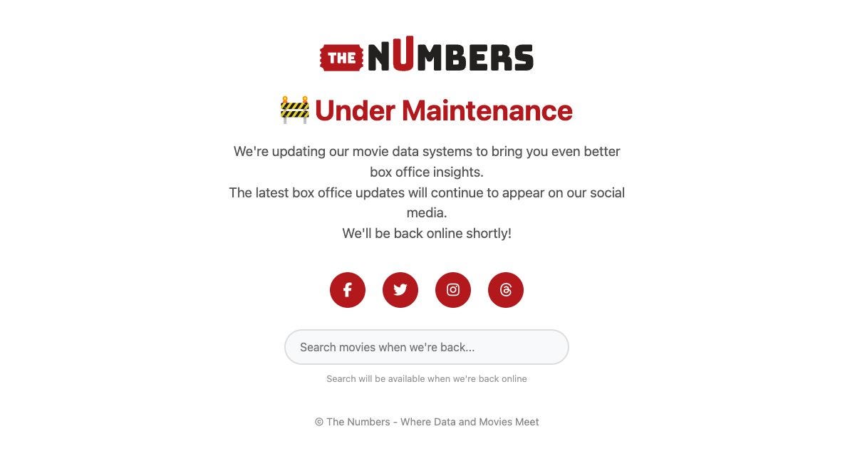
The site was down for over a week, without explanation. A week later, it resurfaced at a fraction of its former size. Gone were the historical charts, the individual movie pages, and even the much-loved Report Builder.
With only a generic “we’re rebuilding, please bear with us” message to go on, the internet responded as it always does - with confusion, anger, and conspiracy theories.
One Reddit theory even suggested it was a deliberate rug pull designed to cripple the free site to push people towards paid products.
Three months on, I spoke at length with Bruce Nash, founder and CEO of The Numbers, about what happened. He describes quite an unpleasant and eventful experience:
We got a lot of angry emails from people who are like, 'Where's this page that you used to have and you don't have anymore?'
Within his tale are a number of things that should worry anyone who runs, relies on, or simply appreciates the internet.
On Friday 17 October 1997, mathematician and former IBM software developer Bruce Nash launched a Geocities site that tracked 300 films.
Bruce described the launch in a 20th anniversary essay (which now survives only in the Internet Archive, for reasons that will become clear):
I hit a button in an Access database, uploaded some HTML pages to Geocities, and made a brief announcement on the Hollywood Stock Exchange message boards to let people know that I was starting to analyze box office for films to help them pick MovieStocks to trade on HSX.
From those humble beginnings, Bruce and the team he built around the site turned The Numbers into the film industry's most reliable financial source.
At the start of 2026, the database tracked 78,396 movies, 178,375 theatrical release records, and 236,176 people.
During its lifetime, the challenges The Numbers has faced have changed immensely. For its first quarter century or so, the traffic was manageable and mostly polite. As Bruce puts it:
Pre-AI, we got human traffic, mostly well-behaved search engine crawlers, and a few people crawling the site for personal projects. If someone got too greedy, we could spot them and block them.
Over the past couple of years, website owners the world over have seen their web traffic change. What was initially only people browsing gave way to an ever-increasing number of bots. By 2024, automated traffic had surpassed human traffic, and just last month, Cloudflare announced that bots had reached 57.5% of web page requests.
The Numbers felt this shift in two distinct waves. The first started around 2024:
We saw a big increase in crawls as AI training joined the search engine crawlers. The AI crawlers are generally less well-behaved than the search engines, which increased the management tasks for us to keep the site running smoothly.
And the second wave was stronger and more damaging:
Around December 2025, we saw another big spike in traffic which I attribute to agentic AI: a combination of AI agents that scrape sites in response to prompts, and people being able to write agents that scrape sites.
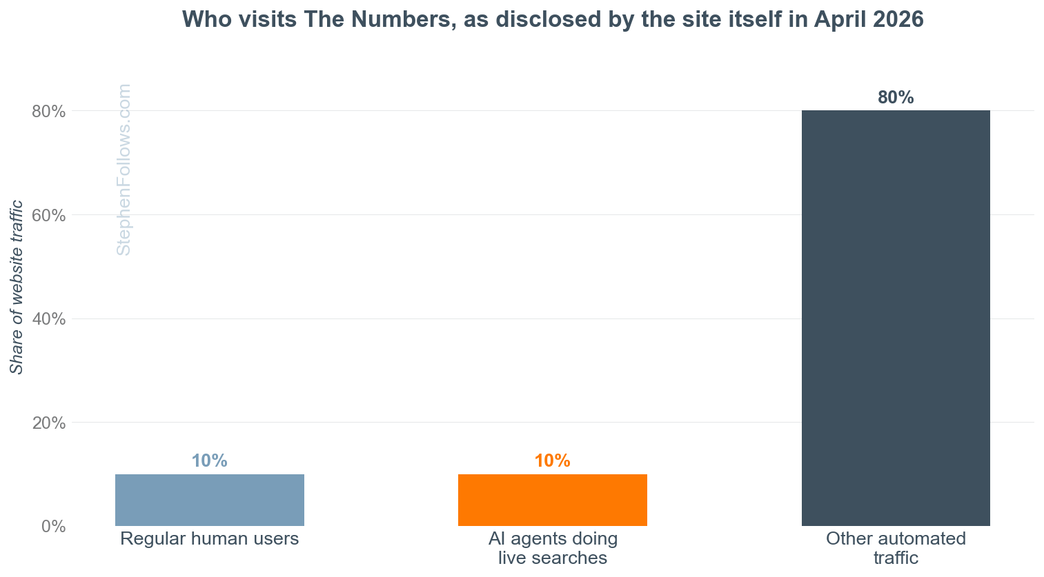
Like every data-rich site, by early 2026 The Numbers was being hammered hard by AI bots scraping its pages over and over at an industrial scale. Bruce says that only 10% of their traffic is from humans browsing the site, with the rest coming from AI bots and automated traffic.
This put enormous strain on the site, but Bruce and his team were able to take measures to mitigate the worst of it. One of the cleverest was talking to the robots in their own language:
There’s stuff on the site which is designed for an LLM to read, so that it can tell somebody ‘here’s how you licence the data’ rather than ‘here’s how you scrape the website’. It’s had a huge effect. We’re now getting probably ten times the volume of licensing enquiries.
But mitigation is not the same as escape. From December through early March, the team struggled to keep the site alive under the load. Bruce estimates that:
Around 90% of our time was spent keeping the existing site running while we spent our spare moments working on a new and improved system.
The problem was compounded by the site’s age: thirty years old, with approximately 160,000 source files serving around 2 million pages.
Then, in the early hours of Thursday 5 March, the servers collapsed.
The team scrambled to understand what had happened, initially assuming it was the sheer weight of AI traffic. It seems AI was to blame... but possibly not only in the way they first thought.
Buried in the flood of agentic traffic, the site’s logs showed something more pointed than scraping. As Bruce describes it:
Some of these used the site using legitimate URLs, others were looking for back doors, most likely so they could get to the data before it appeared on the site, or to manipulate the data presented to users.
On the advice of a friend who works in cybersecurity, the old server stayed off. For good. Restoring the backups and nursing the thirty-year-old site back online would have meant defending 160,000 legacy files against attackers who had spent months probing them.
The team rushed up a skeleton version of the website on new infrastructure, which could at least keep delivering the latest box office figures while they took stock of what had happened and what to do next. It went live on Friday 13 March.
At first glance, The Numbers may not seem like an obvious target. It doesn’t collect credit card information, and there is no juicy customer data to flip on the dark web. It is a small, independent company that publishes how much money movies make.
How could someone expect to make money purely from having private access to their site?
In case you haven’t guessed it yet, it’s linked to prediction markets.
Polymarket runs weekly markets on opening weekends, and names The Numbers as the ultimate source of truth:
The ‘Daily Box Office Performance’ figures found on the ‘Box Office’ tab on this movie’s The Numbers page will be used to resolve this market once the values for the 3-day opening weekend are final.
The sums on any single weekend market are modest by financial-market standards, typically in the tens to hundreds of thousands of dollars, with a couple of million dollars across live box office markets at any given time.
If you could see The Numbers data before everyone else, every single week, you would have a significant edge over all the other traders - learning the answers slightly ahead of publication would allow you to front-run the trades.
In a situation like this, it is hard to know for certain what happened. We know that the logs showed months of automated probing and scraping of the site, but what finally brought the site down, and who did it, remains an open question.
But the theory that someone used AI to develop an advantage in a prediction market is entirely plausible. The Numbers experience shows us that:
We now live in a world where a movie statistics website is worth hacking because prediction markets empower anyone to turn almost any data into money.
Hacking websites is now something anyone can do with a cheap AI subscription.
The web, as we have it, is incredibly fragile in the face of large-scale swarms of agentic AI bots.
In November 2025, Anthropic (the AI lab behind Claude) published a report on what it called the first documented AI-orchestrated cyber espionage campaign. A state-sponsored group had used its coding tool to attack roughly 30 organisations, with the AI performing 80% to 90% of the work and humans stepping in at only 4 to 6 decision points per campaign.
Anthropic’s own conclusion was:
The barriers to performing sophisticated cyberattacks have dropped substantially, and we predict that they’ll continue to do so.
In an earlier threat report, Anthropic were even clearer:
Criminals with few technical skills are using AI to conduct complex operations, such as developing ransomware, that would previously have required years of training.
Meanwhile, an autonomous AI penetration tester called XBOW reached number one on HackerOne’s US leaderboard, the ranking of the people (formerly all people) who find security holes in real companies for bounties, submitting nearly 1,060 vulnerabilities along the way.
Getting access to a thirty-year-old website with 160,000 legacy files is exactly the kind of known-flaw surface that AI tools have made cheap to probe. The expertise barrier that once protected small sites from all but the most determined attackers has largely evaporated.
Bruce and his team were relatively lucky. Despite having their entire site knocked out overnight, they were able to keep going. The Numbers has always been free to use, and the site hasn’t relied heavily on advertising for the past few years, so the outage didn’t destroy an income stream they depended on.
Their core business is tied to selling bulk data through the OpusData service, producing comp analysis reports for filmmakers and investors, and publishing the Business Report - all of which were unaffected by the public site going down.
But they do need to build an entirely new website, from scratch, to host those 78,396 movies, 178,375 release records and 236,176 people. Restoring the site from a backup wasn’t an option, as Bruce points out:
It was really clear that we couldn’t just put that server up again, because it would inevitably be brought down again, possibly within minutes.
That is why the site came back bare-bones in mid-March, and why features are returning gradually rather than all at once.
Right now, the team is having to reconsider what a public website even means in 2026. Bruce’s analysis is that The Numbers used to serve two audiences (human beings and search engines) and now serves roughly six: humans, search engines, LLM training runs, prompt-based AI traffic, agentic AI, and prediction market punters. Each has different needs and a different traffic profile. As he puts it:
We’ve gone from a world where running a web site meant focusing on three things (content, ads, and SEO) to about eight to ten different factors that go into every design decision.
The goal, he says, is to support all six audiences, with new OpusData services and online features for Business Report subscribers, and, importantly, to help regular human users of the site regain the data it has always provided, some of it in new and improved form.
Pretty bad, tbh. Enough that site owners such as Bruce have to question the value of something that will take so much time and money to build and defend.
Cloudflare, which protects a huge share of the world’s websites, publishes data on how many pages each AI platform crawls for every one visitor it sends back to the websites it crawled.
Google crawls about five pages for every visitor it sends you. OpenAI crawls over 1,000. Anthropic crawls over 38,000 pages for every single visitor it refers.
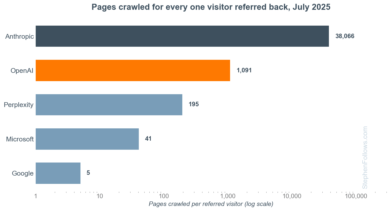
Note that the scale is logarithmic, i.e. each step along the bottom is ten times bigger than the last, because otherwise the differences are quite literally too large for me to include on one chart.
For the history of the internet to date, the principle of the open web was that, in return for letting the search engine robots read your site, they would send you readers. But now, that trade no longer applies. The number of robots has exploded, and they no longer send anyone back.
When this firehose is aimed at a small site, it can inflate the bandwidth bill and possibly even take down an entire site. Sites which can relate to Bruce’s experience include:
Read the Docs, a non-profit that hosts documentation for open-source software, who watched a single crawler download 73 terabytes of zipped HTML in one month, costing it over $5,000 in bandwidth.
iFixit, the repair-guide database, logged a million hits from Anthropic’s crawler in a single day.
Triplegangers, a seven-person company selling 3D scans, was knocked offline during business hours by OpenAI’s bot, in what its CEO described as “basically a DDoS attack”. The founder of code-hosting service SourceHut reported spending “anywhere from 20-100% of my time in any given week” fighting AI crawlers, with “dozens of brief outages per week”.
The editor of Linux news site LWN described crawler traffic from “literally millions of IP addresses” and concluded: “it is a distributed denial-of-service attack”.
When the GNOME open-source project measured its traffic, roughly 97% turned out to be bots.
A university library banned 16,000 IP addresses in 48 hours to keep its catalogue online.
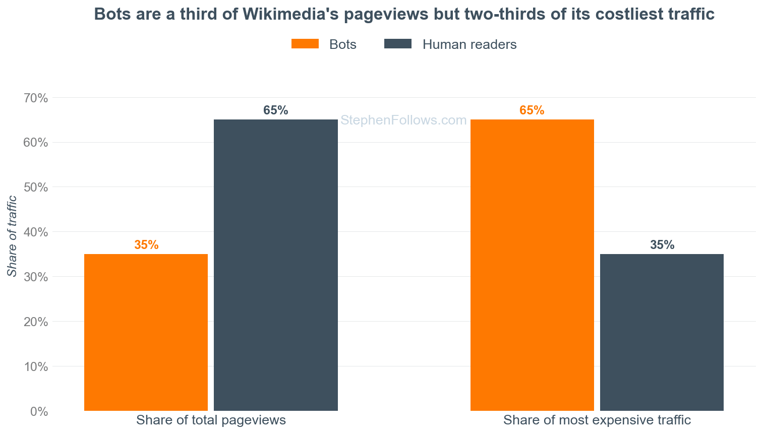
The Wikimedia Foundation, which runs Wikipedia, reported in April 2025 that bots account for about 35% of its pageviews but at least 65% of its most expensive traffic, because crawlers bulk-read obscure pages that human readers rarely touch.
Six months later came the other half of the squeeze, when Wikipedia’s human pageviews fell roughly 8% year on year, as people increasingly get Wikipedia’s knowledge from AI summaries without ever visiting Wikipedia. The machines are taking both the content and the readers at an industrial scale, too.
AI tools are some of the most powerful and destructive things humans have ever created. And they are being effectively tested by the public in real time in the real world. When the Manhattan Project was trying to work out the power of their atomic tech, they did not do so by sending everyone the specs each morning and seeing which houses blew up.
The world we have built thus far is so incredibly ill-prepared for the power and scale of the AI models we all have access to.
I don’t wish for this to sound like a one-sided anti-AI fear campaign. There is a lot to like about AI and what it can do for the human race. But we do need to consider the world we’re currently stepping into.
What breaks first are the things built for the old internet. The open web was built on assumptions such as that visitors are mostly human, that traffic roughly tracks readership, and that the cost of serving your site is related to the value you get from serving it. Every one of those assumptions is now out of date.
A year ago, Cloudflare launched pay-per-crawl, letting sites charge AI crawlers per page. Last week, it went further, announcing a pay-per-use model in which publishers get paid when their content actually appears in an AI answer, and declaring that, from 15 September, its customers’ ad-supported pages will block unpaid “mixed-use” crawlers by default.
Whether any of this works depends on whether the AI companies play along rather than route around it. But as Bruce put it to me, somebody has to try.
Let’s look beyond the specifics for a moment and consider what happened here.
A beloved, useful, free website, run carefully by a competent, honest person for nearly thirty years, was crushed between two features of the new AI economy.
Unsustainable machine traffic hammered it from above, and in all likelihood a financially motivated intruder, operating in a world where breaking into websites has never been easier, took it down.
Bruce’s business and livelihood survived only because the website was not the whole business.
Others have not been so fortunate. Just last week, ZEGO, a German textile firm that had been in business for 37 years, filed for insolvency after a single cyberattack in March shut down its production for six weeks. Unlike The Numbers, they had no other business to fall back on.
The web is full of independent archives, hobby databases, local news sites, forums, reference works. Decades of accumulated human effort, running on old code, maintained by small teams or single individuals, quietly holding up far more of our shared knowledge than anyone acknowledges.
The Numbers is coming back, better built than before. I would encourage you to keep using it, keep supporting it, and, if you are one of the many people who emailed Bruce in fury about a missing page, perhaps send a kinder one now you know why it was missing.