
Note from Emily and Denise: We are noticing that EdTech companies seem to be shifting uncomfortably in their metaphorical chairs these days— increasingly so as the school year approaches and concerns about their products’ presence in schools grows. We believe we are witnessing an “EdTech industry rebrand” and we’re here to call it out. This is Part 1 of a two-part essay.

From summer conference themes to repurposed terminology to doubled down efforts to insert AI into more classrooms this fall, educational technology companies and their ilk are feeling the heat from the growing backlash of parents, teachers, neuroscientists, lawmakers, and advocates opposed to the overreliance on for-profit products in schools that do not improve learning outcomes, threaten the teaching profession, and expose children to serious risks.
In response, instead of pulling their health-harming products from the classrooms or seeking external audits and independently verifiable scientific research to prove their claims, they’re getting a makeover.
But the trouble is, “Children do not need tech; technology companies need children,” as Emily pointed out recently in her testimony to the Kentucky State Senate on education and screentime. At the end (and beginning) of the day, EdTech is an industry– a massive one worth nearly $200 billion currently, with some projections putting it at nearly double that over the next ten years. (Can you imagine if schools had budgets like that?)
“How do we grow when the easy money is gone?”
EdTech products are heavily pushed into school districts by an industry that is well-funded and skilled at marketing. As one example (and there are many), the Tech & Learning EdExec Summit scheduled for September 2026 is pitched to attract:
CEOs & Founders “who need to steer the ship through economic uncertainty”;
Sales & Marketing Directors “who need to shorten complex sales cycles and bypass gatekeepers”;
Product Managers “who need to build for ‘Evidence-Based’ compliance and interoperability”; and
Strategic Partnership Directors/Business Development “looking to build relationships with key industry players.”
This “learning” summit promises that attendees will have access not just to industry executives, but “school district administrators” too.
The “two-day strategic summit” will seek to answer one question: “How do we grow when the easy money is gone?”
The hosts of the Tech & Learning EdExec Summit say the experience is built to “deconstruct the real friction points in today’s district sales cycle—guided by the leaders who control the budgets.“ Attendees will “get valuable insight into the education market in time for the Back-to-School buying season.” Who are these attendees?
Here’s a list:
It seems to us that the only “learning” occurring here is how to keep milking the cow even when she’s gone dry.
Profits are clearly the motive at such events, not education.
Which is What the Backlash to EdTech Really Threatens
Activists and teachers and concerned parents like us often get painted as “anti-tech”-- but this couldn’t be farther from the truth. Yes, we are deeply concerned about the kinds of content our children can see on their school-issued Chromebooks and yes, we see the potential for serious risks to the mining and selling of their personal data, and yes, we would much rather see kids engaging in classrooms with human teachers and books and pencils. But we do not believe that all technology is inherently evil— we just see a big difference between EdTech and TechEd, for example.
The problem is the business model of the EdTech companies.
These companies rely on “time on device” and “engagement” to compete for a piece of that $200 billion pie, but this business model is fundamentally in opposition to healthy child development.
The problem is the business model of the EdTech companies. These companies rely on “time on device” and “engagement” to compete for a piece of a $200 billion pie, but this business model is fundamentally in opposition to healthy child development.
It doesn’t matter if an EdTech company has a noble mission, or if they have high quality materials, or if they swear they do not collect and sell student data— at the end of the day, if their business model depends on children spending time on a device this is no different than the business models of social media companies.
That’s why we say “EdTech is just Big Tech in a sweater vest”— the business models of Instagram and Snap and Meta are the same as iReady and Seesaw and Canvas. (Which may explain why Emily is also finding she has to fight to protect her intellectual property and trademarks from being co-opted by the very industry she is battling.)
This is how we find ourselves in the middle of Extreme Makeover: EdTech Edition.
The EdTech Industry’s New Look: “Purpose-Built EdTech”
The EdTech industry has taken notice of our movement…and they are concerned. They’re seeing and feeling the impact (and trolling us on social media). They are trotting out the same tired talking points that we’ve come to expect.
But a new report from Instructure reveals a new tactic: “purpose-washing.” You may remember Instructure as the parent company of Canvas, an EdTech company that was the target of a massive data breach in the spring of 2026. Canvas is used by over 40% of higher education in North America and the breach nearly paralyzed institutions around the country.
Instructure’s newest report claims to have analyzed the evidence, compliance and interoperability, and accessibility and usability of the top 150 EdTech products used in K-12 schools during Fall 2025. Before we dive into their report, we should point out that Instructure’s partnerships with companies like Google and Microsoft render such a “report” as scientifically compromised.
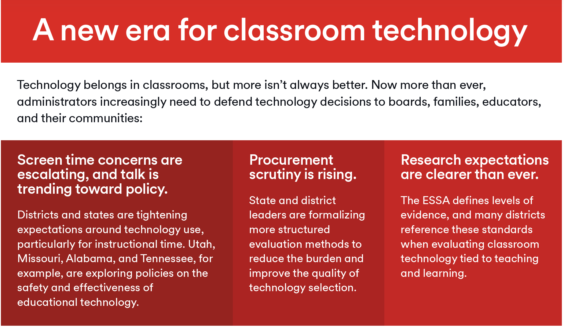
According to Instructure, “families, communities, and policymakers” are starting to ask if “all this screen time is beneficial for students.”
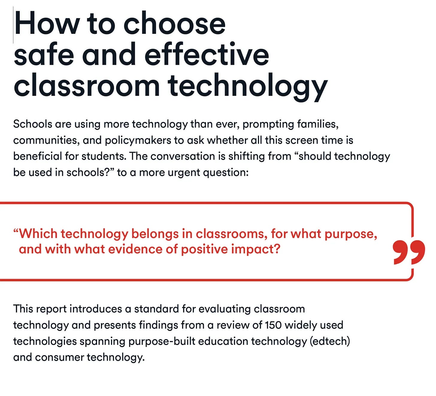
As a result of these questions being asked, Instructure believes, school leaders will need to defend their use of technology in the classroom to “boards, families, educators, and their communities.”
Of course, the most burning question is “Why weren’t they doing this before?”
Instructure, of course, has a “solution”: school leaders should make a distinction between “purpose-built” screentime and “consumer products,” and be sure parents and policymakers see Instructure products as the former not the later.
By attempting to put distance between “purpose-built EdTech” (which Instructure claims includes Kahoot! and iReady) and “Consumer Tech” (YouTube and ChatGPT), Instructure attempts to weave a story that “purpose-built” products like these offer more evidence of effectiveness and are safer.
Except we know from research, journalistic deep-dives, and lawsuits that products like iReady are anything but “effective” or “safe” or “legal.”
Real-Time Rebrand: What It Looks Like
A recent LinkedIn post by Curriculum Associates, creators of the troubled iReady Math program and current defendant in a lawsuit about data privacy concerns, is a great example of an EdTech company attempting to assuage parental and school administrator anxiety by claiming that by partnering with “Digital Promise,” Curriculum Associates will be able to provide a “framework” to justify inserting AI into schools.
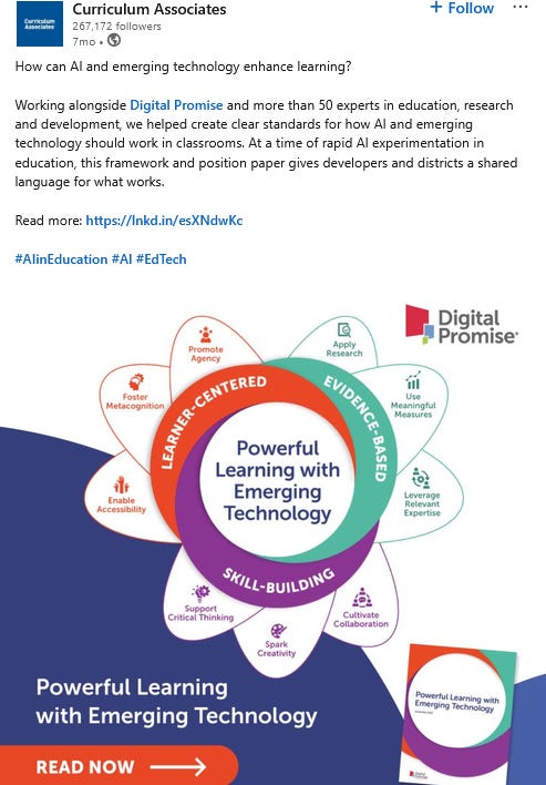
The only problem is that Digital Promise, an organization that describes itself as “a global nonprofit working to expand opportunity for every learner,” has numerous funders and partners with the tech industry.1
Emily and Denise were both lead authors on Fairplay’s recent Call for a Pause on AI in PreK-12th Grade and we firmly oppose the use of any AI products in education. We reject the notion that in an era of “rapid AI experimentation” that a “framework” given out by tech-funded “non-profit” and bestowed by a problematic EdTech company facing lawsuits for taking kids’ data without parental consent should be the arbiters of such designations.
At the same time, the language now being used by Curriculum Associates (and other EdTech companies) sounds very similar to the “Tech-Intentional” framework created by Emily. We’re seeing this in multiple places, and as Emily has written about, it appears to be a growing issue.
It’s Not just EdTech Companies. It’s the Organizations Who Defend Them, Too.
We have written previously about the need to follow the money, not just behind EdTech companies, but the organizations that defend them, too.
One well-known example is ISTE, formerly the International Society for Technology in Education, who merged with ASCD (the Association for Supervision and Curriculum Development) in 2022 and recently rebranded themselves as the International Society for Transforming Education. In a not-so-transparent attempt to distance themselves from the growing skepticism of the products they push in schools, note how the word “Technology” has been replaced with “Transforming.”
ISTE also offers an “ISTE Seal”2 for EdTech products that “align” to their ISTE Standards.3 However, the ISTE Seal, which seems to require only a self-audit, appears to be a pay-to-play rubber stamp for well-funded EdTech companies to lend their for-profit products false merit. To “receive” an ISTE Seal, companies must pay $5K to apply and pay a $3K fee every two years.
ISTE also targets educators through tech-funded conferences sponsored by tech industry giants such as Microsoft, Google, META, Pinterest, Intel, Epson, Logitech, Samsung, Dell and the Chan Zuckerberg Initiative.
ISTE is obviously tech-funded, but claims to be a “non-profit” serving educators and administrators. They’re doing quite well for a non-profit. In 2024, ISTE announced that Google had invested $10 million “to support ISTE+ASCD in its efforts to provide AI skills training to educators and students across the country.” According to CauseIQ, in 2024 ISTE had a revenue of approximately $46 million.
What the Makeover Reveals
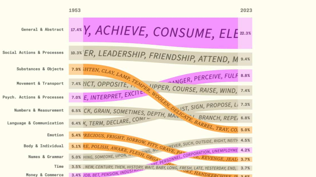
ISTE is attempting to reframe the conversation around screentime in schools. Language in a recent document titled “From Screentime to Screen Value”4 cites research that is a decade old or comes from compromised, tech-funded organizations; pitches four “themes” rooted in industry myths and propaganda (more on this in Part 2); and implies that parents just don’t understand the value of “quality” screentime.
ISTE has it all wrong, of course.
This is not just a conversation about “quality” screentime or “consumer tech vs EdTech.”
What the industry doesn’t seem to understand is that the growing backlash from parents, teachers, lawmakers, and a few brave school administrators is not about what type of screentime children are getting at school; it is driven by the fact that children can and should experience quality learning experiences without the use of technology products created by for-profit companies in the first place.
As criticism grows, EdTech companies will continue to dig into their deep pockets and spend their marketing budgets to “purpose-wash” their products in the best light possible.
But we know what this makeover really shows— that the EdTech industry is worried enough that a hasty remodel seems the best path forward to protecting their bottom line.
Just like slapping a coat of paint on a mold-infested wall only hides the dark spots temporarily, however, attempting to rebrand the same old EdTech products as somehow new and improved does not hide the problem— it reveals it.
In Part 2, we will break down ISTE’s “Four findings that cut across the evidence” and challenge the dubious research they cite to defend these “findings.”
“Digital Promise Global has a diverse and independent governing board comprised of individuals with relevant expertise to the mission and operations of the Digital Promise Global, including fundraising, financial, controls and subject matter expertise in innovation in education, education technology and research to support education. Digital Promise Global board members, both current and former, include university presidents, education technology entrepreneurs and key researchers in the fields of education and learning. Digital Promise Global has a broad fundraising campaign and actively seeks new donors. FInally, Digital Promise Global’s mission is to accelerate innovation in education to improve opportunities to learn which is a charitable purpose with broad public appeal” From 2024 public tax documents
Formerly known as the “Seal of Alignment.”
“A framework that guides educators in using technology to create high-impact, sustainable and scalable learning experiences for all students.”
A “summary of evidence for technology in education.”