Mathematicians spend most of their time thinking about what’s knowable. But the unknowable can be just as compelling. Perhaps the most famous example comes from a theorem by the logician Kurt Gödel. Gödel’s celebrated result — one of two “incompleteness theorems” he published in 1931 — established that for any reasonable set of basic mathematical assumptions, called axioms, it’s impossible to…
I’ll get straight to the point: your AI coding agent, the one you use to write code, needs to reduce your maintenance costs. Not by a little bit, either. You write code twice as quick now? Better hope you’ve halved your maintenance costs. Three times as productive? One third the maintenance costs. Otherwise, you’re screwed. You’re trading a temporary speed boost for permanent indenture.
Oh, you want to know why? Sure. Let’s go for a drive. On a dark desert highway...
Productivity is Determined by Maintenance Costs
Every line of code you write has to be maintained: bug fixes, cleanup, dependency upgrades, and so forth. I’m not talking about new features or enhancements. Just maintenance. For every month you spend writing code, you’ll spend some amount of time in the following year maintaining that code, and some in each year after that, forever, as long as that code exists.
Let’s say you asked a crowd of, say, 50 developers what those maintenance costs were. Using a technique called Wisdom of the Crowd, you could get a reasonably accurate response.1
1You’re welcome to conduct your own wisdom-of-the-crowd survey! But it turns out that the specific numbers don’t matter for the overall point I’m making here.
Your crowd might tell you that, for each month you spend writing code, you’ll spend...
10 days on maintenance in the first year; and
5 days on maintenance each year after that.
If you were a particularly obsessive individual, you could spend hours making a spreadsheet modeling how those estimates affect productivity over time. A spreadsheet like this.
The first month of a new project is glorious. You spend all your time building fancy new features.
The next month is slightly less glorious. A fraction of your time—not much, but a smidge—goes to fixing bugs and cleaning up design mistakes from the first month. In the third month, a smidge more. And the fourth month, the fifth, the sixth...
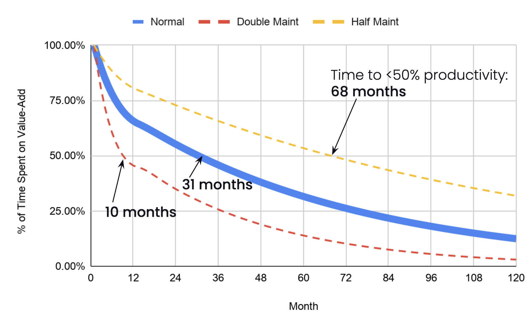
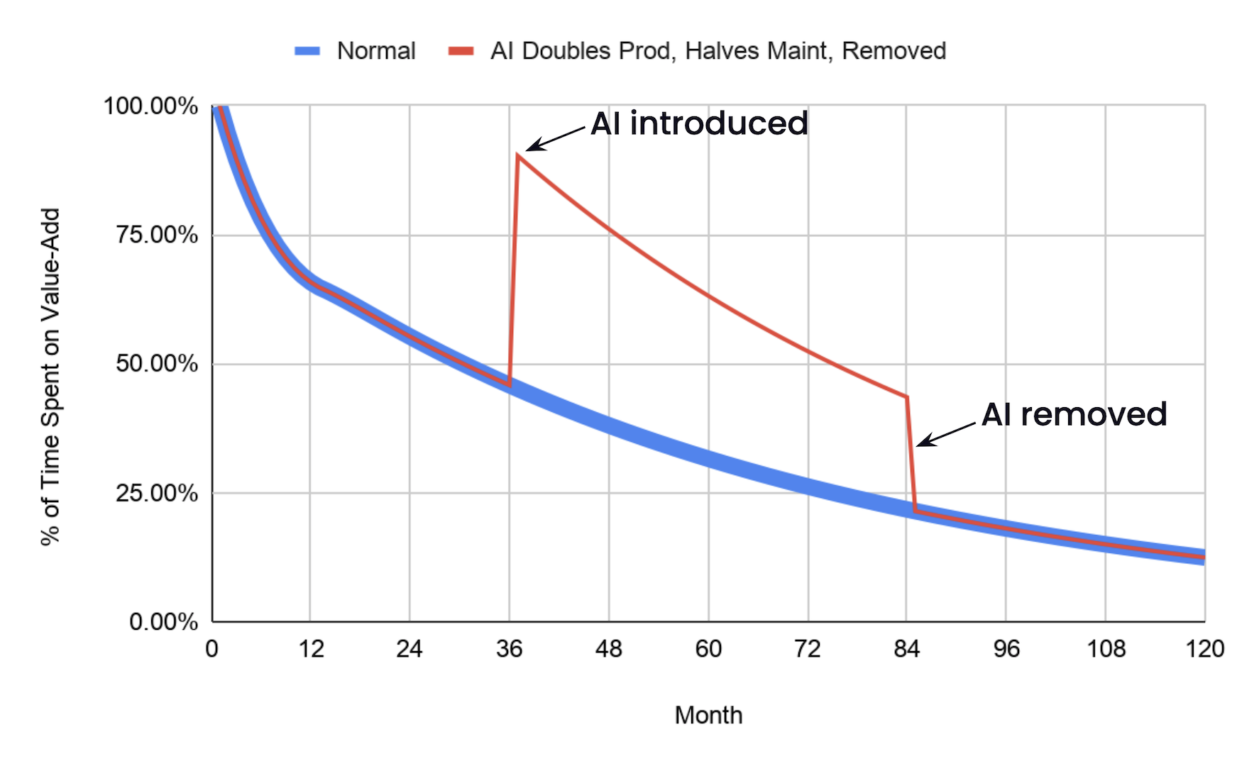
Eventually, it’s not glorious at all. According to our crowd’s maintenance estimates, you’ll spend more than half your time on maintenance after 2½ years. After ten years, you can hardly do anything else.
Halving the crowd’s maintenance estimates gives you three more years before you hit the 50% mark. Doubling them sees you below 50% in less than a year.
The lesson is clear. If you want a productive team, you have to focus on their maintenance costs.
All Models Are Wrong
Do these numbers ring true to you? They do to me. In my career as a consultant, I specialized in late-stage startups, and they all had the exact problem shown in the graph above. About 5-9 years in, they’d notice their teams were no longer getting shit done, and then they’d call me.
Their teams weren’t quite as bad as the graph shows. Maybe their maintenance costs were lower. Or maybe... and this feels more likely to me... their maintenance costs were exactly that bad, and they papered over the problem instead. Maybe they:
Decided not to fix every bug, or upgrade every dependency
Added people when the team got slow... and then kept adding more, because it was never enough
Scrapped it all and started over with a rewrite
There’s room to debate the precise maintenance numbers, but overall, the model feels right. If you’ve been around the block, you know this graph is true. You’ve seen how productivity melts away over time. You have the scars.
What Does This Have to Do With AI?
Only everything.
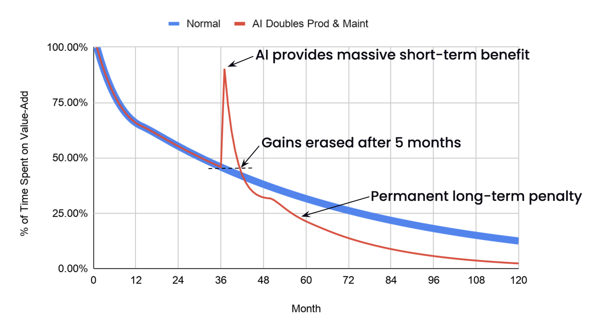
Let’s say your team just started using Rock Lobster, the latest and greatest agentic coding framework, and it Doubles!! your code output! Woohoo! The code’s a bit harder to understand, though, and your team is drowning in pull requests, and you maybe kinda sorta teensy weensy don’t actually read the code before smashing the approve button. Like, at all. I mean, you skimmed it, during boring meetings, sometimes, and that’s gotta be good enough, right? LGTM, let’s get this shit done!
So now you’re producing two months of work in a month, and let’s say you’ve doubled how much each “month” of output costs to maintain. Next month’s maintenance costs quadruple.
Oh.
About five months after you start using Rock Lobster, your productivity is back down to where you started, and a few months after that, it’s worse than it would have been had you never touched Rock Lobster in the first place.
I’m not saying your AI doubles maintenance costs. Or productivity. This is an extreme example. But even if your AI produces code that’s just as easy to maintain as your human-written code, the productivity gains don’t last.
You Can Check Out Any Time You Like2
2But you can never leave.
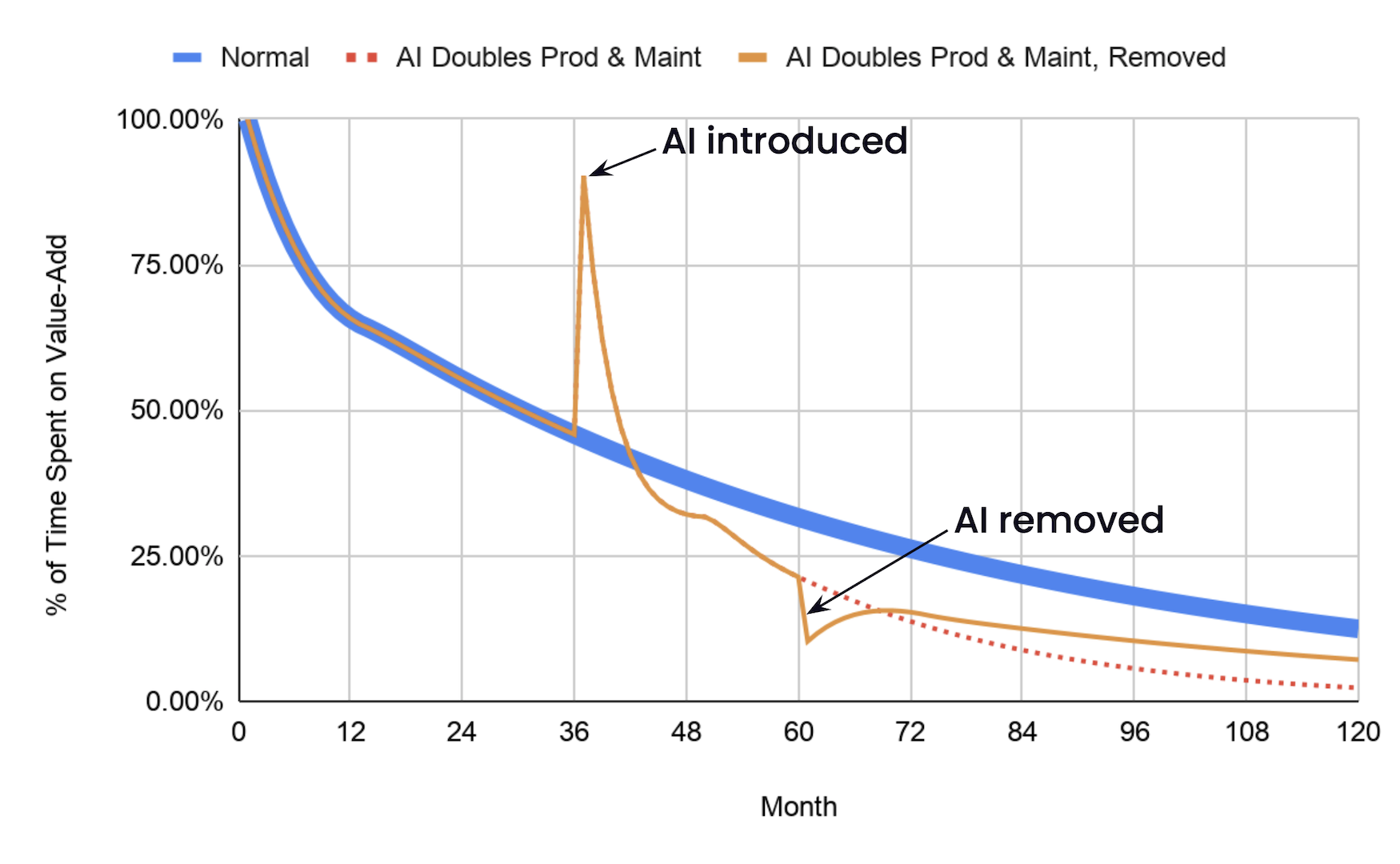
Agents are expensive, and they’re only getting more so. Once your agent’s juice is no longer worth the squeeze, you might decide to save your pennies and go back to coding the old way. Like a caveman. With your fingers.
Ha! Joke’s on you! When you stop using the agent, all the productivity benefit goes away... but the added maintenance costs don’t! As long as that code’s still around, you’re stuck with lower productivity than if you had never touched the agent at all.
The Passage Back
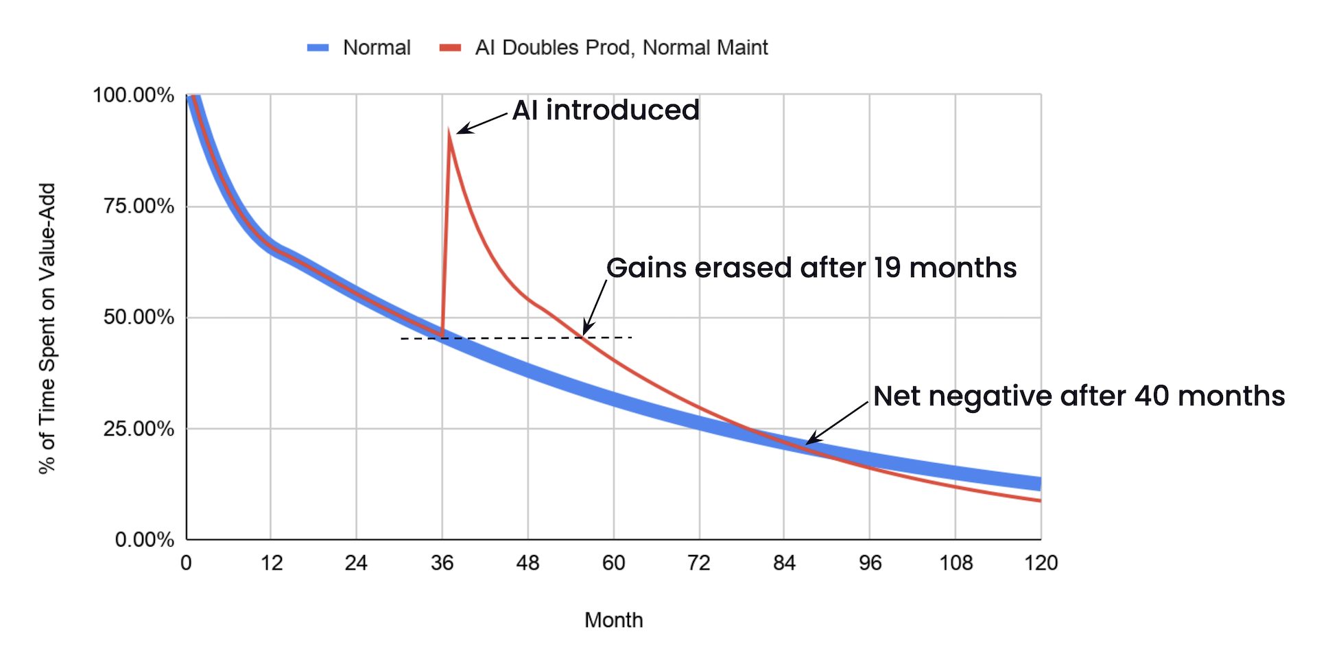
The math only works if the LLM decreases your maintenance costs, and by exactly the inverse of the rate it adds code. If you double your output and your cost of maintaining that output, two times two means you’ve quadrupled your maintenance costs. If you double your output and hold your maintenance costs steady, two times one means you’ve still doubled your maintenance costs.
Instead, you have to invert your productivity. If you’re producing twice as much code, you need code that costs half as much to maintain. Three times as much code, one third the maintenance.
This is the secret to success. All the benefits, none of the lock-in.
Can We Kill the Beast?
I dunno. All my reading of the finest news sources says that coding agents increase maintenance costs. Some people do say they help them understand large systems better. But big decreases in costs, of the size we need to see? No. Just the opposite.
That’s a problem. The model isn’t a perfect representation of reality, but the overall message is right. You need AI that reduces your maintenance costs, and in proportion to the speed boost you get from new code. Without it, you’re screwed. You’re trading a temporary speed boost for permanent indenture.
So, yeah, go ahead, chase improvements to your coding speed. But spend just as much time chasing improvements to your maintenance costs. Or you, too, will be trapped in Hotel California.
Such a lovely place.
Such a lovely face.
As much as it might seem like it, this isn’t meant to be an anti-AI rant. There’s other levers to pull, such as AI that makes maintenance itself more productive, even if it doesn’t make the code more maintainable. I encourage you to copy the spreadsheet and play with all the levers in the model. See what happens when you change the assumptions to match your real-world situation.
A few years ago, while I was covering the rise of AI slop on Facebook, I asked my friends and family if they were getting AI spam fed into their timelines and if they could send me examples. A handful of them responded, sending me obviously AI-generated science fiction scenescapes, shrimp Jesus, and forlorn, starving children begging for sympathy. But a few of my friends sent me images that they thought were AI but were not. Their mental guard was up to the point where they were looking at human-made art and photos and thought it safer to dismiss them as AI rather than be fooled by it.
To browse the internet today, to consume any sort of content at all, is to be bombarded with AI of all sorts. People think things that are fake are real, things that are real are fake. Much has been written about “AI psychosis,” the nonspecific, nonscientific diagnosis given to people who have lost themselves to AI. Less has been said about the cognitive load of what other people’s AI use is doing to the rest of us, and the insidious nature of having to navigate an internet and a world where lazy AI has infiltrated everything. Our brains are now performing untold numbers of calculations per day: Is this AI? Do I care if it’s AI? Why does this sound or look or read so weird? Does this person just write like this? Is this a person at all?
I see AI content where I’m conditioned to expect and ignore it: In Google’s “AI Overviews” that famously told us to eat glue pizza, in engagement-bait LinkedIn posts, and throughout our Facebook and Instagram feeds. But increasingly I have the feeling that it’s everywhere, coming from all directions, completely unavoidable. It’s not exactly that I have a revulsion to AI-assisted content or don’t want to get fooled by it. It’s that something is happening where my brain has become the AI police because everything feels incredibly uncanny. I will be going about my day reading, watching, or listening to something and, suddenly, I notice that something is wildly off. Quite simply, I feel like I’m going nuts.
An example: Last week, in a desperate attempt to avoid yet another take on the White House Correspondents Dinner shooting, I was listening to an episode of Everyone’s Talkin’ Money, a podcast I’ve been listening to off-and-on for years about taxes (yikes). This podcast has been going on for years, has a human host named Shari Rash, and hundreds of episodes. Rash started reading the intro script: “The shift I want you to make today—and this is the shift that changes everything—is starting to see your tax return as information—not a bill, not a badge of shame, but information.” The script went on and on and on like this, with AI writing trope after AI writing trope. My brain shut down and stopped paying attention to the script and started wondering if Rash was using AI just for the intro script? What about for the research? Did she edit the script at all? I turned the podcast off.
Later that day, I was scrolling the Orioles Hangout forums, a small community of diehards obsessed with the Baltimore Orioles that I have been lurking on for decades. Until recently, it had been one of the few places on the internet that I could safely assume was not full of AI. Except now, it is. The site’s administrator has started using AI to analyze player performance and to help him write some of his posts. To his credit, he explains how he’s using AI and prefaces these posts by noting they are AI-assisted analysis. Some of them are interesting. But now, most days I’m browsing the forums, I will see arguments between posters who have been there for years that seem overly generic or don’t really make sense. One recent post arguing about the timetable for an injured player’s return suggested a ludicrously long recovery. One poster pointed this out: “You said 10-18 months and I said it won’t take that long for a position player.” The poster responded: “You’re right I did. The 10-18 months was an AI generated answer … consider it a small cautionary tale about trusting AI and another on the benefits of seeking out actual medical research on questions like this.” Every day I now scroll the forum and see people noting that they plugged something into ChatGPT or Gemini and have copy pasted the answers for other people to see. In this 30-year-old community of human beings discussing sports, AI is unavoidable.
It is, of course, not just me. Friends send me screenshots of texts they’ve gotten from people they’ve started dating, wondering if they’re using ChatGPT to flirt. I’ve gotten obviously AI-generated apologies or excuses from people trying to bail on a social engagement. I’ve been to weddings where the speeches felt—and were—partially AI-generated.
A recent PEW poll showed that people believe it is important to be able to tell whether an image, video, or piece of writing was AI-generated, AI-assisted, or written by a human. And it showed that a majority of people do not believe that they are able to tell the difference between AI-generated works and human made works. Studies have repeatedly shown that humans judge AI-generated art and writing more harshly than human works, and a study published in the Journal of Experimental Psychology found that when people know or perceive a piece of writing to be AI-generated, it is “stubbornly difficult to mitigate” and “remarkably persistent, holding across the time period of our study; across different evaluation metrics, contexts, and different types of written content.” Put simply, it is not just me who hates AI writing or finds it annoying. Even if AI writing can be “fine,” it very often feels bland, weird, formulaic. The writer Eve Fairbanks wrote a thread the other day that I thought more or less nailed it: “The tell for AI isn’t rhythm, wording, or fact errors. It’s that problems with *all these elements* exist equally & at once.”
Thomas Jefferson High School for Science and Technology. Source.
The Schoolhouse is a series from Education Progress featuring articles for and from teachers, parents, education officials, and others working in the education system.
I haveloved EdTech for a long time.
And for a long time everything about it made my job easier. My love began slowly, though, starting with simple communications to students and parents, or sharing problem sets that students would complete on paper from their math textbooks. As the technology evolved, so did use of it: distributing PDFs, sharing lecture notes, accepting assignments, communicating even more with families, and giving students more ways to access materials.
I did not have to worry about printing allowances, or whether a student had a pencil, which are bigger concerns than many realize. As schools moved to 1:1 technology, computers became abundant. I could stop providing printed copies of my typed lectures. I could communicate with parents more easily. I could allow students to type instead of handwriting, which by the mid-2010s had become so atrocious that it could only be interpreted with the help of a cuneiform tablet.
Most of the time, tech was also something my students liked. With very, very few exceptions, most students preferred typing papers and essays to writing them out by hand. Students generally preferred typing notes, even though we now know that is often an inferior method of learning. Most students preferred being able to edit and revise their work. They preferred being able to turn something in at midnight if they had a basketball game that went until 10 PM.
But decreasing friction came at a cost. Today we are reckoning with a decade of having conflated technological progress with progress in education. It is easier to update our EdTech platforms than it is to improve learning outcomes, and technological development has become a metric all its own.
Technology Transfers
It’s hard to say how it could have gone differently, though. EdTech gave us — teachers and school admins —flexibility with deadlines. It let me personalize classroom and accommodation materials and made collection and distribution easier in almost every way. It was a lubricant in the wheels of education. For myself and for the hundreds of students I taught over the years, it made a lot of daily classroom work much less onerous.
Not only did I love it, but I was also an early adopter. I started with Weebly and classroom blogs, then began using Canvas/Instructure in 2012. I helped integrate EdTech into every aspect of classroom management and classroom practice, from using Microsoft Teams for video calling to early adoption of Google Classroom. I have done it all. And yet, even as I continue to use it for my classes this week, I also understand its limitations. I also understand what instructors give up when we move instruction online.
While I am the first to say I love EdTech, I am also the first to acknowledge that sometimes it really sucks. There are times when, over the past 15-plus years, it has failed. I have had to extend deadlines. I have had to rush to print things out because the Wi-Fi was down or a student system had crashed. There are times when tech does not do the job it promises to do, and times when using it makes you neither more knowledgeable nor more competent in your work.
As much as I am an early adopter of all things EdTech, I also — shockingly (to many) — paired that with a devoted use of notebooks and paper-based materials. I would have discussions online and still require students to take handwritten notes and submit problem sets, graphs, and illustrations drawn by hand, even when Word, Slides or Desmos might have provided me with something more visually interesting, technically polished, or easier to read. To this day I have not found a suitable technological alternative to a student taking handwritten lecture notes, or keeping notebooks of vocabulary, mathematics proofs, or market diagrams.
It is a paradox, then, that I land where I am today: increasingly convinced that we need to reconsider 1:1 EdTech in K-8 classrooms and return much of early technology use to a more intentional, lab-based model. I think there are real benefits to using technology in the classroom. But it has a major problem we need to consider more carefully moving forward: the problem of security theater.
Having managed EdTech admin accounts across Microsoft Teams, Instructure, GSuite, and other platforms, I know how much information we provide to EdTech companies: student names, ages, birthdays, ID numbers, email addresses, parent contacts, assignments, grades, accommodations, and messages. All of this goes into a black box system that only the technology advisor or administrator really sees and approves, often on behalf of every student opted into that system while every parent has little choice but to accept it. Public or private, across the country, this is now normal. But what happens when that data is breached?
We say it is unavoidable because we have to use EdTech. But is it really that unavoidable? I still enjoy EdTech, and I will continue to use it. But that does not mean that I believe we have to use it uncritically. Does it make certain parts of the job easier? Undoubtedly. Recent regulations for ADA accommodations for visual media and audio media used in the classroom make EdTech one of the greatest tools for inclusion. But I would also be a hypocrite if I did not also acknowledge that it also had a deleterious effect on student privacy. I do not think we can separate the benefits of EdTech from its harms. And one of its main harms is the commodification of student data and student profiles.
EdTech allows us to communicate with parents and stakeholders much more efficiently through a thin veneer of security. These platforms give the appearance of walls and barriers around student information. They tell us that communication is protected, that data are secure, that access is controlled, and that vendors are compliant. But this is a façade. The truth is actually far more complicated.
Most EdTech companies claim to provide best-in-class security. But as administrators, we must rely on our technical advisors and on people more knowledgeable than us about how secure that information is. Most operate at a knowledge deficit. I devoted several years of my life to understanding cloud database structures, cloud data systems, multi-character key encryptions, and student information tagging, and while I have a much better understanding of what types of security EdTech platforms can provide, I also know just how much information most schools feel obliged to share with these platforms.
When I started using EdTech in my classroom there were no logins for students, no single sign-on, and no two-factor authentication. Student use of EdTech was often passive. Teachers used online blogs or personal pages to post materials for wide distribution. Students and parents could, if they wanted to, create their own accounts to access and participate in online discussions, coordinate material submission, or receive feedback, but accounts began anonymously in online systems and most of the coordination happened outside the digital world. Over time formalized systems were established to comply with FERPA as gradebooks and materials submissions moved online and became connected to unique student profiles.
Today, almost any tech-enabled tool requires the creation of a unique student avatar. That avatar is connected not only to individual students, but also parents, teachers, materials, assignments, and of course grades. Increasingly, these online learning systems are connected to student information systems, which also archive academic records, attendance records, discipline, and whatever other systems are connected across schools, districts, and state data collection systems. As schools have moved from being hubs for education to hubs for community services, our data systems additionally catalog vaccines opt-outs and immunization records, mental health appointments, social service referrals, health records, and other sensitive information housed in or coordinated through schools. While much of this is managed under HIPAA, anything shared from a HIPAA secure system willingly, but unknowledgeable, by parents goes into an SIS system or Cloud Platform that almost never maintains the same level of security.
“As schools have moved from being hubs for education to hubs for community services, our data systems additionally catalog vaccines opt-outs and immunization records, mental health appointments, social service referrals, health records, and other sensitive information housed in or coordinated through schools.”
I do not think most people understand what this landscape really looks like, or how it operates. Few grasp just how interconnected our school management systems have become, not just to each other but also to the numerous cloud platforms that schools and districts do not manage themselves. Most people, moreover, have no idea how much information schools are required to distribute across so many unique platforms including AWS, Azure, Box, Google Cloud, Dropbox, and so on. Families often have very little visibility into which privacy regime applies, which vendor holds the data, and what downstream integrations may touch it.
Clever was built to help manage the data coordination and login problem for districts, and it is used nationwide. But this is one example of a popular platform. There are many others managing, hosting, syncing, and transferring student data in the background. When we share and provide these student data profiles, we increase our exposure to bad actors. The issue is not just whether one database is encrypted. The issue is what happens when student identity, school records, assignments, messages, accommodations, grades, and third-party tools are all connected across systems.
What used to be securely stored in PDFs, PostgreSQL relational databases, and other encrypted storage systems is not suddenly insecure because of AI. Those systems can still be very secure when they are properly configured, access-controlled, and narrowly managed. The problem is that AI makes data exposure more consequential. Neural networks, transformers, and generative AI systems can now process images, scripts, text, tables, and scanned documents at speed. Their real power lies not simply in processing information, but in finding connections across information that once remained separate. This architecture is extraordinarily useful for science, research, and complex monitoring systems. But it also means that what we choose to collect, copy, sync, and retain is more vulnerable to reconstruction, linkage, and misuse than ever before.
We have built an education technology ecosystem where ease of access often depends on connecting more systems together. A student logs in once and reaches the LMS, email, documents, assignments, messages, third-party tools, assessment platforms, parent portals, and more. It all feels efficient, but every connection also expands the surface area of risk.
The Canvas Hack
Which brings us to last week, the ransomware hack of Canvas systems. Over 9,000 schools were impacted, and we still do not know the full scope of what was accessed or how exposure varied across institutions. But that uncertainty is itself part of the problem. The risk to any given school depends not only on whether it used Canvas, but on how deeply Canvas was integrated into its identity systems, messaging, student records, assignments, third-party tools, and student-facing communication systems. For some schools, the exposed information may have been relatively limited. For others, depending on how much information was shared with and routed through Canvas, the exposure may have been much broader. That is precisely the point. The danger is not just the platform. The danger is the degree of integration.
If this Canvas incident exposes anything, it is not that one login provider caused the breach, or that one type of school account was uniquely vulnerable. It exposes something broader: how deeply modern EdTech depends on linked identity systems, single sign-on, cloud platforms, browser-saved credentials, third-party integrations, and centralized student profiles. By allowing any company, system, or platform to manage student data at this scale, we give it more power than it deserves. And we engage in security theater.
We play-act that we are secure because the system looks professional, because the vendor has a compliance statement, because there is a login screen, because there is two-factor authentication, because the contract has been approved, or because someone in technology signed off on it. But vendor approval is not the same thing as safety. Single sign-on is not the same thing as safety. A privacy policy is not the same thing as safety. How did we let this become so ubiquitous in our education system?
It makes logging into everything easier. We can save passwords in our Chrome accounts and browsers. We can use Clever and other login systems to connect everything together. We can make a student’s digital school life seamless. But seamless is not always safe.
So where do we go from here?
Perhaps the problem of EdTech, laid bare for millions of students, teachers, administrators, and parents last week, is the wake-up call we needed. My suggestion today is simple: roll things back. Require EdTech only where and when it is actually needed. We need to look honestly at the value of EdTech in our schools, for students, and for the education ecosystem as a whole. Do endless EdTech subscriptions provide a real value-add for student learning? Do we need a 1:1 device program for every student at every level of instruction? Do we need every assignment, message, accommodation, assessment, and parent communication routed through third-party systems?
I am increasingly convinced that the answer, particularly at the K-8 level, is no. If we are serious about FERPA and COPPA, then we need to stop pretending that compliance is achieved because a vendor has a privacy policy, a district has approved a contract, or a parent clicked through a consent form they did not really understand. Compliance cannot be reduced to paperwork; it should mean minimizing unnecessary exposure in the first place.
For younger students especially, the default should not be full integration into an always-on EdTech ecosystem. The default should be to opt-out. Let’s bring back lab-based technology, limited-purpose tools, local storage where possible, paper-based alternatives, and far fewer student accounts connected across platforms. This does not mean no technology, but it does mean more technology with clear boundaries.
We need to care more about students’ realized learning, and we need to more intentionally ask which systems are essential in achieving that goal. Platforms that provide and extend access, accommodation, instruction, or communication — we can consider using those carefully. But many are not essential, and if one is not, we should cut ties with it.
In any case, what I have learned over the past five days is that the most meaningful technological revolution for schools may not be changes in security authentication, widespread use of AI, or the adoption of personalized learning platforms. It might just be refusing to collect, upload, connect, and retain data that schools did not need to hand over in the first place. Perhaps in doing so we can begin to reconstruct a model of education that works for the students in our classrooms, rather than one that quietly turns every child into a permanent digital profile.
Join the Center for Educational Progress and receive all our content — and thanks to all our amazing paid subscribers for their support.
Welcome! This is a new Sunday issue of the Animation Obsessive newsletter, and our plan goes like this:
1. On Chen-Yi Chang’s designs for Mulan.
2. Newsbits in animation.
With that, let’s go!
1. What Chen-Yi Chang did
Mulan is a well-designed film. It’s been said many times, but it’s worth repeating. In style, the project was possibly Disney’s most ambitious and different of the ‘90s, during its renaissance era. The artists really did something.
One of them was Hans Bacher, the production designer, whose work on the film we’ve covered before. Mulan “still was supposed to be a Disney movie,” he wrote — but one mixed with aesthetic ideas from China. In his style guides, online here and here, Bacher explained in painstaking detail what that meant.1
But Bacher didn’t create the look by himself. Maybe even more crucial to Mulan’s style was the character designer, Chen-Yi Chang. “I could not have designed Mulan without him,” Bacher wrote. “He very patiently explained everything about China, gave me the real books and background information.”2
One of Mulan’s directors, Tony Bancroft, argued that the film’s “unique and consistent” design came from “the combination of these two strong artistic visions.” And Chang was, in many ways, the linchpin. Producer Pam Coats referred to him as a “walking library” and “our salvation on this movie.”3 By the time Bacher joined, Chang had spent roughly a year on Mulan already.
From the start, Chang studied and experimented. “I was trying to figure out what makes Chinese art look Chinese,” he said. The answers he reached, both alone and with Bacher (an artist he admired), helped to make Mulan special. Chang treasured his time on the film; he called his art for it his “best work so far.”4
Yet the job was challenging, too. “Mulan was a big responsibility,” Chang said. “If I hadn’t done it well … I’d have felt that I’d let down the Chinese people. The pressure was enormous.”5
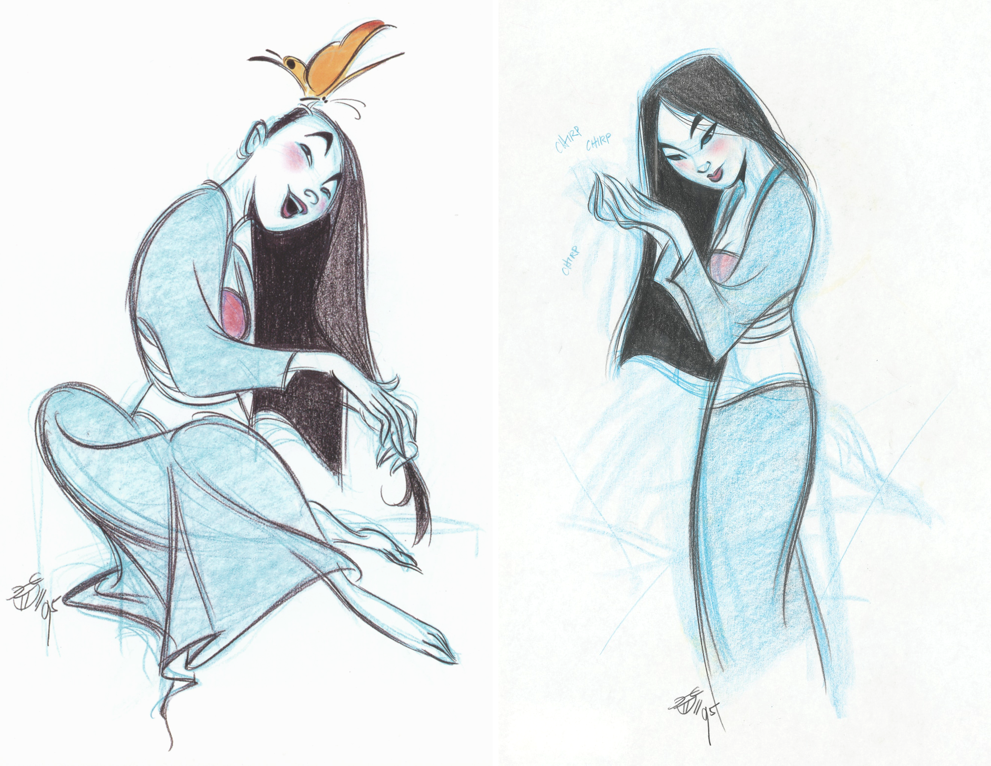
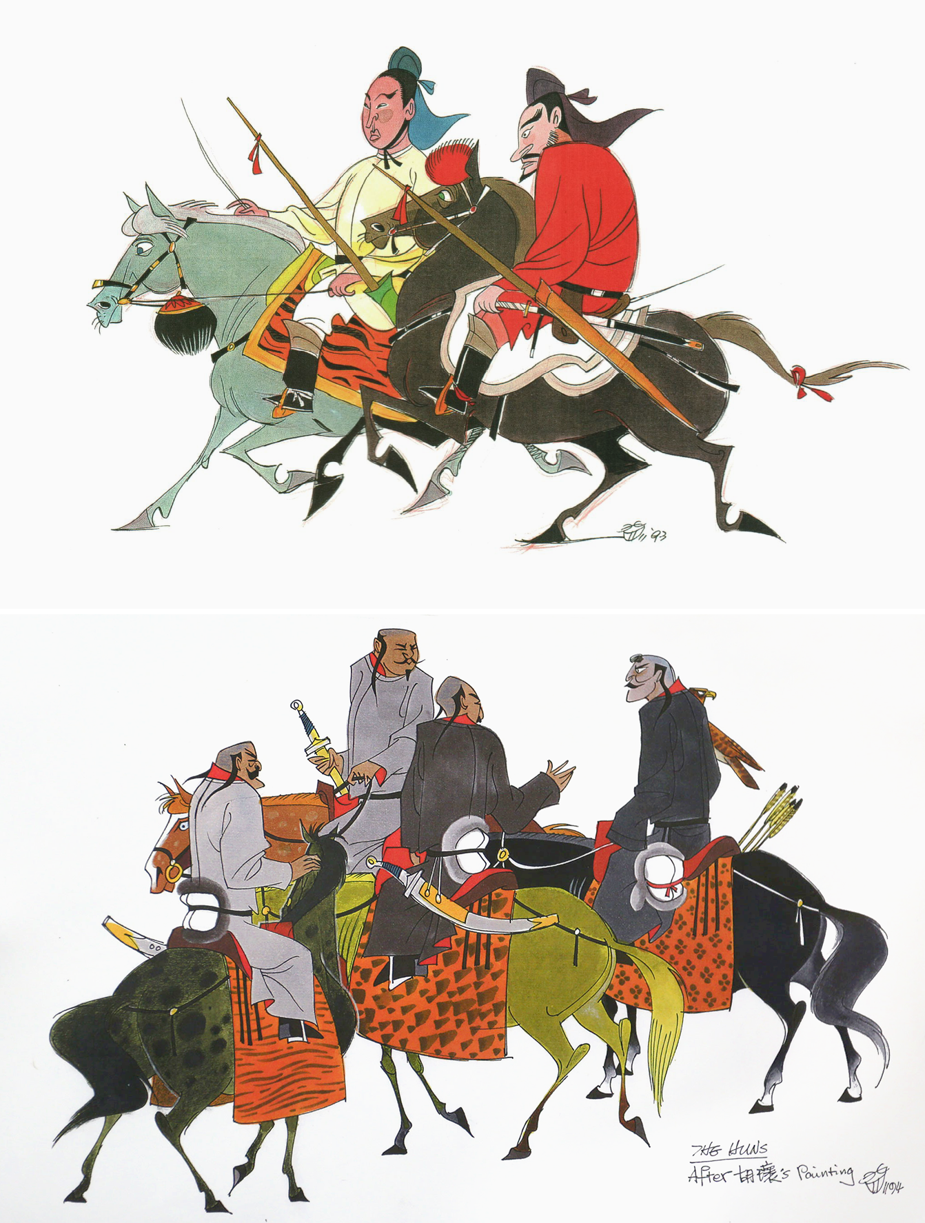
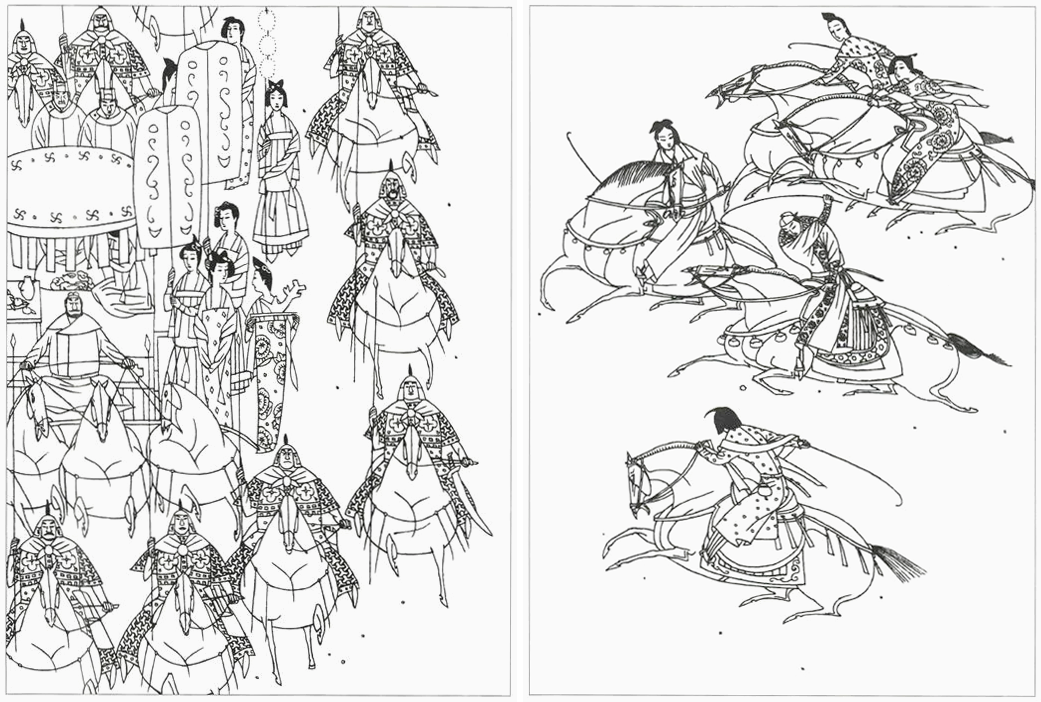
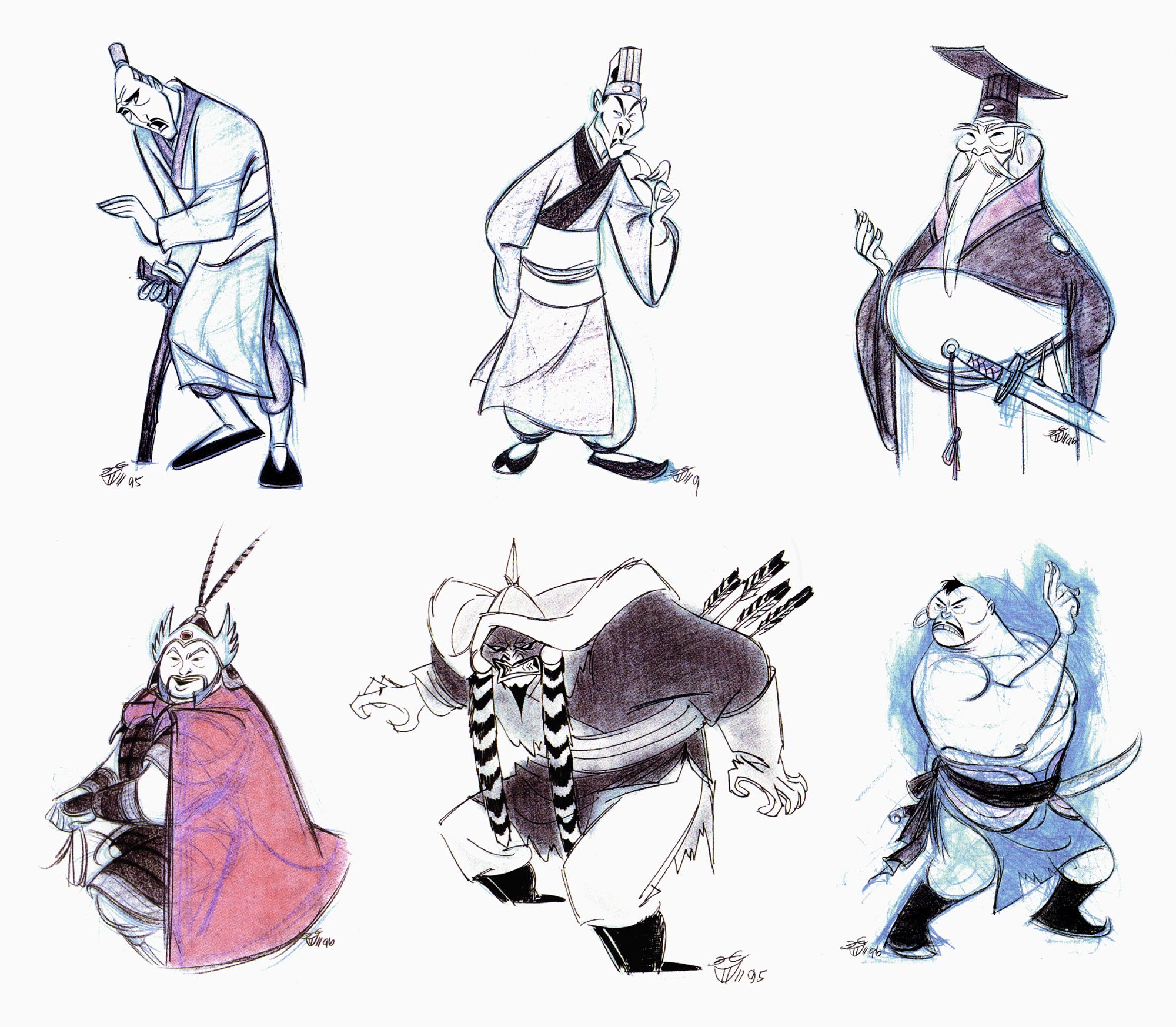
Early Mulan concept art by Chen-Yi Chang, done in 1993
More developed Mulan design work by Chen-Yi Chang from 1995
Chen-Yi Chang wasn’t a Hollywood veteran when Mulan came along. Even so, he’d been in animation for well over a decade.
As a child in Taiwan, during the ‘70s, Chang saw an article about Disney in Reader’s Digest. It sparked a lifelong interest in animation. Around 1978, he began working at Cuckoos’ Nest in Taipei, a major outsourcing site for American cartoons.6
Somewhere along the line, Chang stopped caring for Disney. “[W]hen I was in my late teens and early 20s, I fell in love with those animated shorts from Eastern Europe, especially those ones from Zagreb,” he said, referring to the Zagreb School of Animation. He became an experimental animator as well — his Childhood Impressions (1985) won a major prize in Taiwan.7
A few years later, Chang traveled to America to learn more. As he wrote:
I went to CalArts to pursue what I’m really interested [in], experimental animation. But, in order to have a job, I also took a lot of classes at the character animation department: design, animation, layout, storyboard... anything related to animation.8
His talent stood out. In the early ‘90s, he got a Disney internship — and a character design job on Batman: The Animated Series, which shaped his future style. In the same period, Chang “started to love Disney again,” he said. And, when the Mulan project revved up around 1993, he got an offer to change studios.
“The likelihood that Disney would make a second movie with a Chinese theme was close to nil,” he said, “so I couldn’t pass up the chance.”
Chang, an alt artist, landed in the center of Hollywood animation. It was the start of his fight to really, genuinely put old China into a Disney feature film.
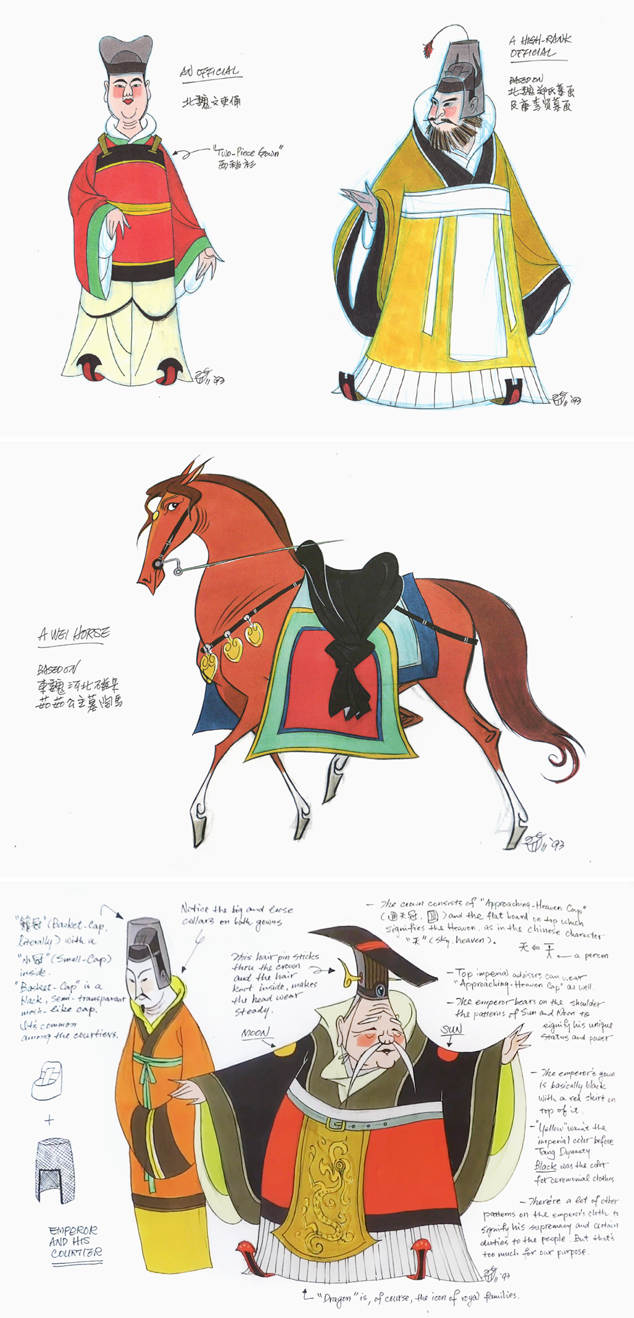
Chen-Yi Chang’s studies of the above paintings from 1993 and 1994
Right from the initial development of Mulan, Chang submerged himself in ancient Chinese art and architecture and fashion and more. He was looking at materials from a thousand (or close to two thousand) years before.
One of his research methods was to draw studies of old paintings. “I just go over it with a sense of cartooning, and kind of make those ancient paintings into cartoons,” he said, “and try to find out if there’s anything I can copy from them — or, I should say, steal from them.”
Chang pulled ideas from a mountain of reference books, many of them in Chinese. For the team, he assembled a reference bible by scanning key photos and translating the descriptions beneath. Copies were distributed throughout the studio, reported Taiwan Panorama, so that everyone could see what he was seeing.
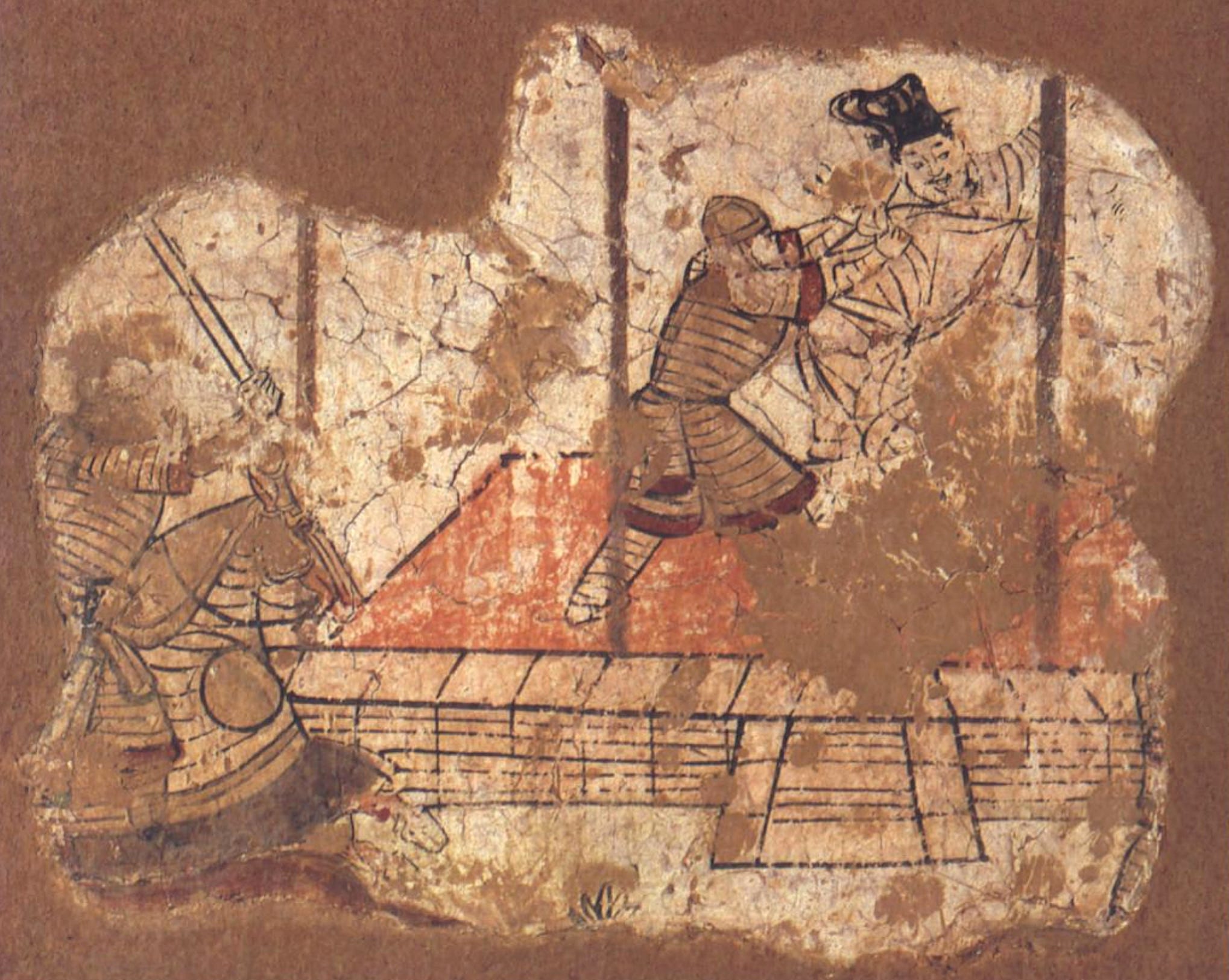
You find that type of research in action across the film. Take Mulan’s armor, based on the intricate lamellar armor of the Tang dynasty. Chang had trouble stripping it down for animation — until he saw a mural from the Kumtura Caves, in which the same gear appears in almost symbolic form. “Oh, this is how ancient artists see it,” Chang said. “And I thought, ‘Wow, that’s a really good way of doing it.’ ”
The Kumtura mural (8th or 9th century) that inspired the armor designs in Mulan
The armor solution grew out of Chang’s wider plan for the film. Visually, he wanted to adapt eras of China that were relatively near in time to the story of Hua Mulan itself. He was fighting against preconceptions of China, as he said:
I got a lot of confusion and headache at the beginning of development. Because at that time I knew I was facing two hurdles. One was Westerners who had a stereotypical idea of how ancient Chinese should look. I mean, like, long mustaches and pigtails. Totally false. And so I was wondering, “If I present the real look of ancient Chinese, they would get shocked, and they would probably think I didn’t do any research at all.”
The other audience group is Chinese, most of whom grew up, like I did, with low-budget TV and movies that used the Ming dynasty culture to represent all of the previous dynasties, which is totally wrong. If I go back to the time that Mulan is supposed to have lived, and create a more accurate representation of that era, the Chinese might be shocked, because not many of them know much about it. It will be educational for everybody.
Early design work by Chang from 1993
Chang design work from 1995
Chang settled on a blend of the medieval Tang dynasty with the earlier Han dynasty of the 200s. “The art from the Han dynasty is more primitive, and we liked that direct approach a lot,” he said.
Meanwhile, they relied heavily on the surviving Tang “sculptures, figurines and paintings,” with their “curvy motifs.” In Chang’s words, “[T]heir recurring design elements became the main resource for the style that was developed for Mulan.”
He knew that this direction could be controversial. Sure enough, even in the ‘90s, stuff like Mulan’s hanfu and white makeup drew criticism from people unfamiliar with the ancient past. Her fashion was Japanese, some argued. But, as Taiwan Panorama reported in 1999, Chang:
… can’t help taking issue with such comments. He explains, if you look at facial portraits of women from the Sui and Tang dynasties and the Five Dynasties era, you will see that in ancient times women made up their faces by first applying white powder and then applying rouge. This form of appearance was common down through the Qing dynasty. The fashions and apparel of traditional Japanese culture were originally adopted from Tang Chinese culture. Today, most people have turned cause and effect on their heads, and that is why they think Mulan has a “Japanese” flavor.
Pages of Lu Hua’s lianhuanhua illustrations (20th century)
The exploration by Chang and Hans Bacher (who joined around late ‘94) led to a design system with a set of guidelines. Mulan’s look would be old China run through cartoons — and not just American cartoons. Bacher wrote that Chang exposed him to “original Chinese comic books ... with very delicate black and white drawings.” He was stunned by the lianhuanhua artwork of Lu Hua.9
One rule that research brought Mulan was reduced detail. The film needed to focus on general, graphic, flattened shapes rather than “unnecessary wrinkles, folds, things like that,” Chang said. His idea was “to imply instead of to show,” as was common in traditional painting.
Similarly important was the “S-curve,” the elegant swoop visible throughout each character. It was Chang’s discovery. As he said, “It’s a graphic motif I picked up from ancient Chinese art. … [Y]ou see this flowing-, running-water-like elegance.” He took that motif and boiled it down into repeatable graphic design.
It had to be systematized. Making Mulan at Disney’s industrial scale meant training a large team “to draw like Chen-Yi,” as animator Aaron Blaise put it. Mulan’s art director, Ric Sluiter, mentioned that Chang used:
… real simple S-shapes, one line leading into another, simple, graphic, elegant shapes and so to get that, you have to design each character with a lot of rules. It’s like a schematic formula that has to be laid out and embedded into each artist.10
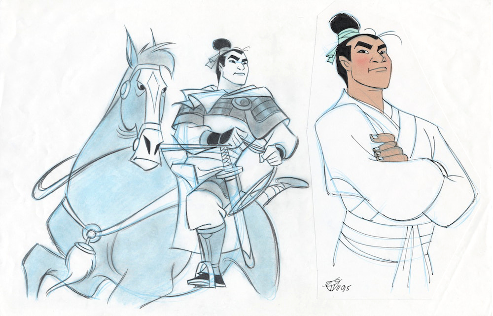
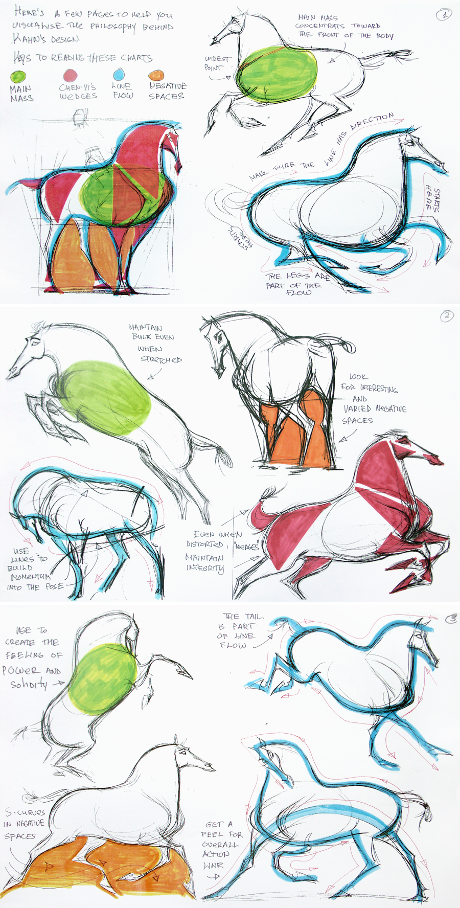
Horse guideline pages by Chang
A Chang drawing for Mushu from 1995
Many of the designs Chang sketched were ultimately developed by others on the crew. Still, it’s hard to miss his hand in Mulan. Some designs, like Mulan’s horse, came basically straight from his concept art.11 Plus, his sense of caricature is all over the film.
Chang placed a big focus on caricature. Like director Barry Cook said, “He showed us ways to do fun caricatures that weren’t demeaning or insulting.” Floyd Norman, who worked on the film, noted that the plan wasn’t to “soft-pedal the facial features.”12 Everyone is pushed, down to their shapes and sizes.
Mulan’s soldier friends, the so-called gang of three, are an example Chang gave. Chien-Po (“our big Buddha”) is very tall, and is all soft edges and circles. Yao is short, stocky and squared off: a “bulldog.” Meanwhile, Ling is thin, of medium height and defined by triangles. These are caricatures built out of the three basic shapes, Chang said — and the three basic sizes.
“There’s only big, medium and small,” he explained. “I know it sounds very stupid, but, trust me, a lot of artists, when they are working on characters, they tend to forget it.”
Chang put real effort into caricaturizing the background characters, too. One of his key words for Mulan was variety — he wanted a broad set of looks and personalities. He’s argued that using “just one single type of graphic element to overgeneralize,” as earlier cartoonists did “every time when they drew a Chinese,” is the mistake that causes caricature to become stereotype.
As he said:
After we finalized the main characters, I told the directors that I would like to do the secondary characters, because I’m concerned that artists here — because of their educational environment — don’t really have a good set of graphic icons to portray the individuality of Asians, and this would be my opportunity to do so. Even though they are secondary characters or background people whom the audience probably won’t single out, I still tried to make them look like individuals, people you would see if you went to Asia.
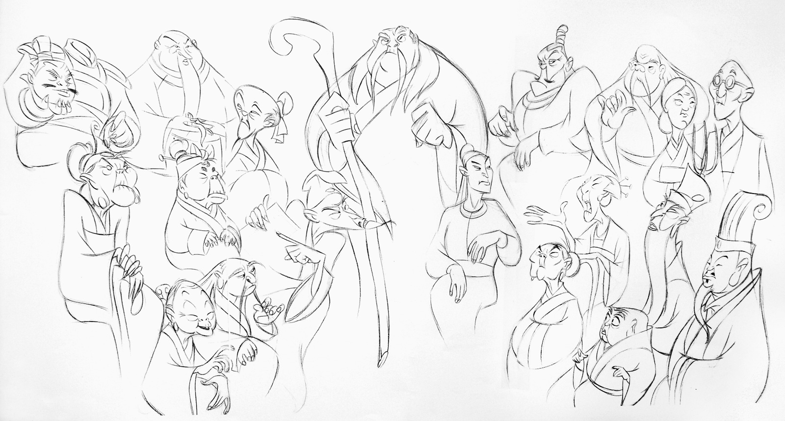
A Chang sketch lineup of the ancestors
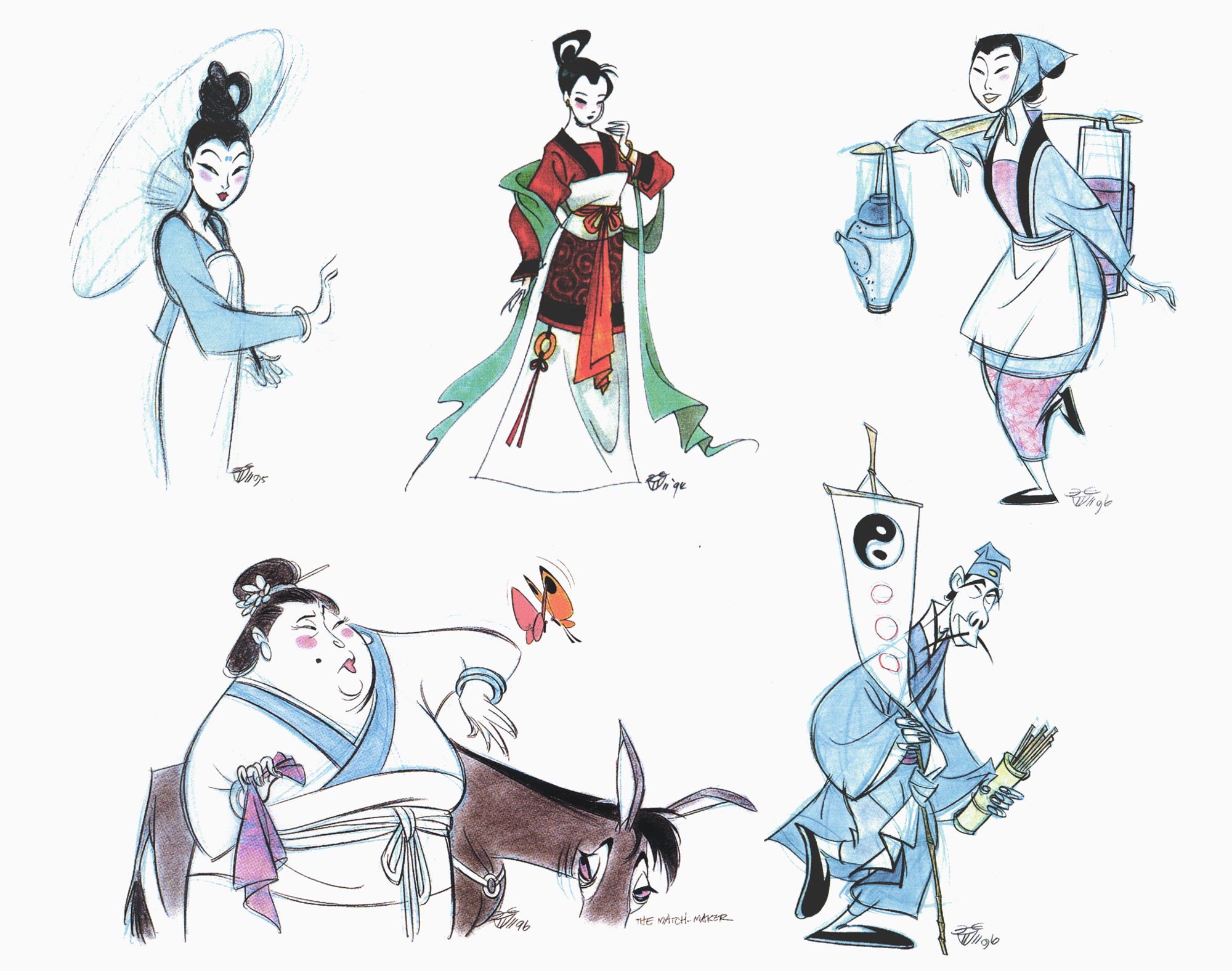
Chang design sketches from 1993 through 1996
Chang design sketches from 1995 and 1996
Mulan was, like Chang said, a high-pressure thing. Because of his status at the studio, he had an unusually large say in this film. Which meant that his successes would show up on screen — as would his mistakes. Only he knew enough to get it right, and so he needed to get it right.
Luckily, he did. Chang’s work, coupled with Hans Bacher’s, remains one of the high points of Hollywood design over the past 30 years. And, despite some controversy inside China, Mulan enjoys a pretty good reputation even there: it has a very solid rating of 8.0 from Douban’s harsh users.13
Over the years, Chang often hasn’t gotten enough credit for what he did here — or for how much time he spent on his research. That’s normal with Disney. The studio’s name tends to absorb attention; the individual artists who make the films rarely become famous.
Still, Chang’s team knew what he’d pulled off. In the ‘90s, Aaron Blaise called him “just amazing” and “one of the best artists on this picture.” Hans Bacher, who isn’t easily impressed, has praised him for decades. And Tony Bancroft once said:
If it wasn’t for Chen-Yi and all his amounts of enthusiasm and research for costuming and that sort of thing, Mulan wouldn’t be nearly what it is today.
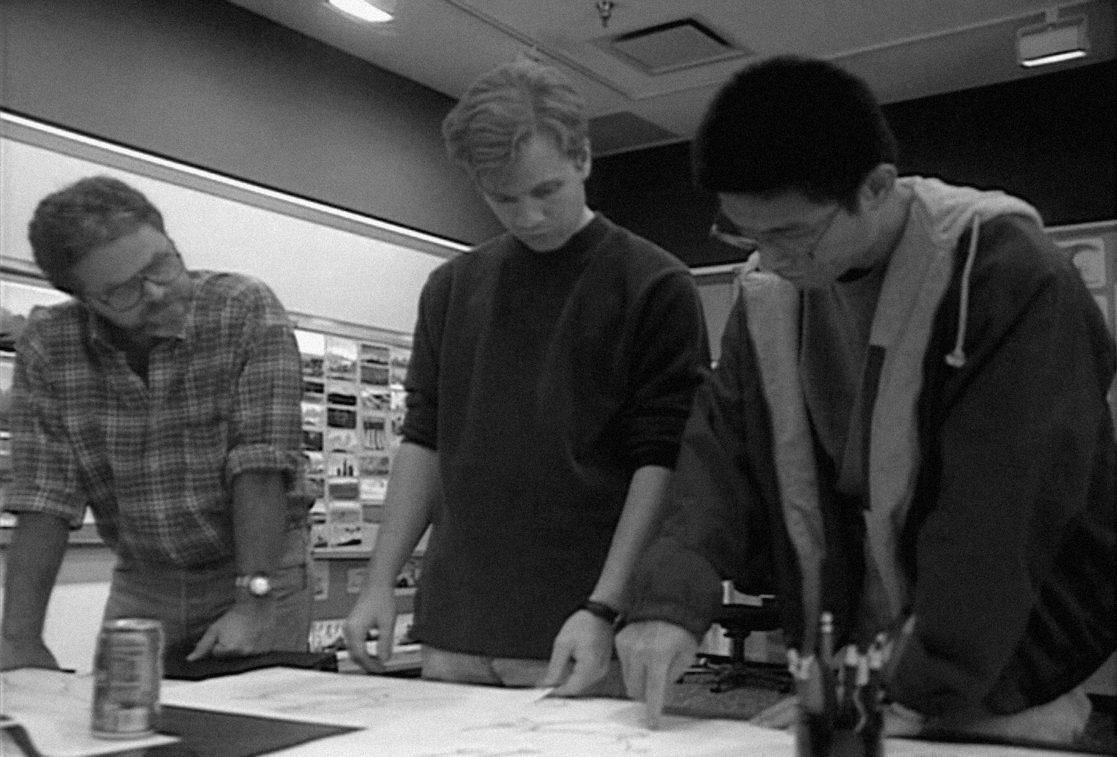
Chen-Yi Chang (right) with Hans Bacher (left) during Mulan
2. Newsbits
We lost Tatsuo Sato (61), director of Cat Soup, and the veteran Ukrainian filmmaker Yevhen Syvokin (88).
Guillermo del Toro says that his upcoming Buried Giant, animated by ShadowMachine in America, will be a “fascinatingly difficult stop-motion movie for adults.”
Submissions are open for the Factual Animation Film Festival, based in Britain and Germany. Its focus is animated non-fiction, including docs.
On that note, It Wasn’t Bourgogne is an interesting French film based on the memories of the director’s grandfather. It’s now on YouTube.
In America next month, the Muskegon Museum of Art opens an exhibition on women in animation, including the work of Mary Blair and Lotte Reiniger. Curating it is Mindy Johnson, author of the excellent Ink & Paint.
Also in America, a new post from Cartoon Research gets into some of UPA’s obscure latter-day work, with links to rarities we’ve never seen before.
In Greece, the government is putting €750 million into film and television, including animation. Cineuropa calls it “the most comprehensive state-backed framework for the country’s creative industries to date.”
The rise of original South Korean animation received long-form coverage from CNN.
In Czechia, the Karel Zeman feature Krabat – The Sorcerer’s Apprentice (1978) was restored, and just screened at the Anifilm festival.
Quotes from Bancroft’s book Directing for Animation and the “Character Design” featurette on the Mulan Blu-ray release. The latter was used a lot today.
See The Art of Mulan, Chang’s 2002 lecture at California State Polytechnic University and his 2013 master class for Virtual Animators. The first two were main sources, used extensively throughout.
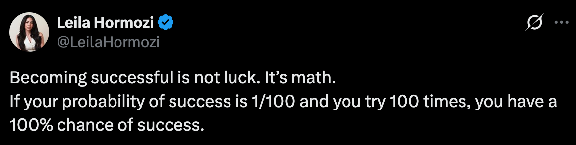
A recent post on X has been getting a lot of attention, including in some snarky screengrabbed archiving as it has made its way onto various other platforms (snarkiving?)
The reason for its popularity came down to a mathematical claim about success:
As hundreds of commentators pointed out, the maths here is wide of the mark. To give a simple example, your probability of getting heads with a fair coin toss is 1/2. If you try twice, you don’t have a 100% chance of getting at least one head. You have a 3/4 chance (i.e. you need to avoid failure twice).
Similarly, if we want to know chance of at least one success if each attempt has a 1/100 probability, we need to calculate the chance that you don’t fail at all 100 attempts, given there’s a 99/100 probability of failure each time:
And 63% is not 100%.
Even so, the above calculation assumes that each attempt is independent and equally likely to succeed, which will rarely hold in practice. In reality, your probability of success should change as you learn; the goal isn’t just to try more, but to improve your chances with each attempt.
As some people also pointed out, the directional sentiment was correct, even if 100% isn’t the same as 63%. Pushing through lots of failures is generally important if you want to eventually achieve some success. After all, I’ve lost count of how many book rejections, grant rejections, and investor rejections I’ve had over the years.
And ultimately, if you’re spending time telling people they’re wrong on the internet, you’re probably not out there doing hard things.
Now, you might respond that mathematical errors matter in life, and correcting them is worthwhile. Often that can be true. But in this instance, does the correction shed much more light on the probability of success?
Mathematician Stanislaw Ulam once said that ‘Knowing what is big and what is small is more important than being able to solve partial differential equations’.
This distinction is important, because, in reality, you’ll rarely know your exact chance of success on a given attempt. It might be 1%, it might be 20%, it might be 0.1%.
Even having some data doesn’t alway help. If you apply for a grant with a 5% success rate, for example, it doesn’t mean your personal chance of success is 5%. Having reviewed a lot of proposals over the years, there’s often consensus about the outstanding applications and extremely weak ones. Neither of these groups ever had a 5% chance.
This means it’s not only about attempt tallies. If your probability of success is 0.1% and you try 100 times, your overall chance of success is 9.5% according to the correct mathematical approach above. And if your probability is 1% and you try 10 times, your overall chance is also 9.5%.
In other words, for situations where the probability of success is small, and your number of attempts is small relative to that probability, Hormozi’s simple calculation can actually provide useful rough intuition. If probabilities are small and attempts are limited, either you need more attempts, or a better probability per attempt. Both have the same impact.
(For maths fans, this approximation works because:
when x is small relative to n.)
It is of course misleading to suggest that 100 attempts would guarantee success given a 1% probability on each effort. But a better critique would be that trying to put numbers on these things in the first place isn’t that informative when it comes to the deep uncertainty of success.
By ‘uncertain’ knowledge, let me explain, I do not mean merely to distinguish what is known for certain from what is only probable. The game of roulette is not subject, in this sense, to uncertainty; nor is the prospect of a Victory bond being drawn. Or, again, the expectation of life is only slightly uncertain. Even the weather is only moderately uncertain.
The sense in which I am using the term is that in which the prospect of a European war is uncertain, or the price of copper and the rate of interest twenty years hence, or the obsolescence of a new invention, or the position of private wealth-owners in the social system in 1970. About these matters there is no scientific basis on which to form any calculable probability whatever. We simply do not know.
This idea would later become known as ‘radical uncertainty’, where the concepts honed on dice games and roulette would break down. But this wasn’t the main concern about the post on X. Instead, here are some of the comments below the post’s flawed calculation:
“that’s girl math”
“With your understanding of math, your probability of success is near zero”
“Your math ain’t mathing sugar pie. Go back to primary school.”
What is the benefit of such comments? What, even is the benefit, of posting, or quoting, or snarkiving something that has been corrected hundreds of times already?
To inform? To persuade? Or to signal merely that you know some high school probability – but perhaps not enough to realise that it’s not really a problem that probability can solve.
Thanks for reading Understanding the unseen! Subscribe for free to receive new posts and support my work.