
There is a closing window to stop driverless cars from creating omnigridlock.
We all need a little validation now and then from friends or family, but sometimes too much validation can backfire—and the same is true of AI chatbots. There have been several recent cases of overly sycophantic AI tools leading to negative outcomes, including users harming themselves and/or others. But the harm might not be limited to these extreme cases, according to a new paper published in the journal Science. As more people rely on AI tools for everyday advice and guidance, their tendency to overly flatter and agree with users can have harmful effects on those users' judgment, particularly in the social sphere.
The study showed that such tools can reinforce maladaptive beliefs, discourage users from accepting responsibility for a situation, or discourage them from repairing damaged relationships. That said, the authors were quick to emphasize during a media briefing that their findings were not intended to feed into "doomsday sentiments" about such AI models. Rather, the objective is to further our understanding of how such AI models work and their impact on human users, in hopes of making them better while the models are still in the early-ish development stages.
Co-author Myra Cheng, a graduate student at Stanford University, said she and her co-authors were inspired to study this issue after they began noticing a pronounced increase in the number of people around them who had started relying on AI chatbots for relationship advice—and often ended up receiving bad advice because the AI would take their side no matter what. Their interest was bolstered by recent surveys showing nearly half of Americans under 30 have asked an AI tool for personal advice. "Given how common this is becoming, we wanted to understand how an overly affirming AI advice might impact people's real-world relationships," said Cheng.


I’m a big believer in evidence-informed teaching. I think research has a lot to offer teachers, and I try to write about ideas that are supported by education research.
In the real world where I receive professional development and have random education consultants tell me what to do, the things I hear as evidence-based are...interesting.
Over time I’ve developed a kind of bullshit detector for evidence. There’s no one thing that can tell you if an idea is or is not evidence-based. But looking across a number of dimensions, teachers can make better-informed decisions based on the evidence we’re shown. This post is a kind of crash course in how to think critically about evidence in education.
Effect Size
The first thing to understand about research in education is the meaning of an effect size. Below is a normal distribution. The vertical lines represent one standard deviation. At a basic level, an effect size measures the difference between two groups in standard deviations. An effect size of 1.0 means that the difference is approximately one standard deviation — the distance between vertical lines on the graph below. This means a 50% percentile student moves to the 84th percentile, an 84th percentile student moves to the 98th percentile, etc.

A helpful comparison here is to height. American men are, on average, about 5 feet 9 inches tall (175 centimeters) and the standard deviation is about 3 inches (7.6 centimeters). An effect size for height of 1.0 means the effect is, on average, 3 inches (7.6 centimeters). That’s a big difference! The vast majority of effect sizes in education are less than 1. A rough “average effect size” is in the neighborhood of 0.4, which is about 1.2 inches (3 centimeters). Imagine, two groups of adult men. One group is, on average, about 1 inch taller than the other group.
Height and education are different in many ways, but one thing they have in common is that they are the product of lots and lots and lots of little variables. The average adult height is about 4 inches (10 centimeters) taller today than it was a few hundred years ago. Height isn’t some number that’s programmed into us from birth. But there also isn’t one silver bullet that makes humans taller. Humans are taller today because of lots and lots of little changes in our lives. The effect size of any one intervention to make people taller is small, but collectively those effects add up to a large change. That’s a decent mental model for thinking about education.
Ok, let’s talk about research. We’ve got effect sizes. Lots of folks in education wield “research” as a way to reinforce their ideas. What are some things to watch out for? Preview: there are a lot of things to watch out for!
Nonsense
There’s a lot of nonsense out there. In a real PD session last year, a very highly-paid consultant told us that “current research shows student attention span is their age, plus or minus two years.” That’s nonsense. A quick Google search will reveal a wide range of answers depending on a wide range of factors. I don’t know what else to say here. Learning styles, the learning pyramid, and lots more fall into this category. If something “research says” sounds too neat and tidy, do a bit of research. Check the citations. Follow the evidence. It might be nonsense.
Correlation vs Causation
One piece of “research” that I’ve seen multiple times in my professional development is this John Hattie meta-analysis on “collective teacher efficacy.” This collection of studies says that, when teachers believe in their students, those students learn more. Hattie references an effect size of 1.57, which is massive! The catch is, none of these studies are experimental. This is a correlational result. We know that teachers beliefs in students and high levels of student learning are associated, but we don’t know which is causing the other, or if some other factors are causing both. My hypothesis: high levels of student achievement cause teachers to believe in students. If you work in a school where students do well, it’s easy to believe in those students. If you work in a school that’s struggling, it’s much harder to believe in your students. When a result is correlational, it’s hard to figure out what the result means and easy to draw simplistic conclusions.
Correlational research isn’t all useless. There are lots of places in education where we can’t run experiments for practical or ethical reasons, or we rely on quasi-experiments that aren’t fully randomized. Correlation can give us valuable insights or help triangulate other results. But correlation will always be a limited tool, and it’s easy to be misled. Correlation vs causation is probably the most common issue I see in interpreting education research, so I’m going to drop a bunch more examples in a footnote.1
Bias
Another consultant came to my school and told the English teachers that they needed to use the i-Ready digital platform for at least 45 minutes each week. Research showed, they said, that students who used i-Ready for 45 minutes each week made more progress than their peers.
Look, I am so cynical about stuff like this. If you Google the result, you’ll find something on the Curriculum Associates website (the company that produces i-Ready) saying that research supports 45 minutes blah blah blah. The overview starts with, “Curriculum Associates analyzed data…” Let’s just stop there. The company that produced the product analyzed the data for us. How kind of them! It seems like every curriculum commissions some sort of study like this. We should probably just ignore them all. Unless I am 100% convinced a study on a commercial product was done by a disinterested third party, I’m going to assume there’s some bias involved.
Researcher-Designed vs Standardized Measures
I taught in a summer school program as part of my student teaching. During that program, I was required to give the same test at both the start and the end of summer school. My students grew from an average of 31% to an average of 82%. The standard deviation was 15%, meaning my teaching had an effect size of 3.4. 3.4!!! Even higher than collective teacher efficacy! Am I the best teacher in the world? (No.)
The reason my results looked so good is that my teaching was very tightly aligned to the outcome assessment. In this case, I was teaching word problems. The school had me introduce a very structured approach to annotating word problems where students got points for underlining the question, circling key information, etc. When they took the assessment at the beginning of summer school, students didn’t know how to annotate the problems correctly so they got lots of points off even if they knew the math. My student teaching wasn’t a research study, but if it were we would call this a researcher-designed assessment. In general, it’s much easier to show growth on a researcher-designed assessment because the intervention can focus efforts on narrow measures of success. It’s much harder to demonstrate growth on a broader measure like state standardized tests or university entrance exams. Even less reliable measures like grade point average are much harder to influence at scale than a narrow researcher-designed measure.
One more example of this phenomenon: Dr. Jo Boaler ran an 18-day math summer camp focused on mindset and open-ended tasks. The study reported an effect size of 0.52. That’s pretty big! But it wasn’t measuring a standardized result. The assessment was four open-ended tasks from the MARS project. What does that mean for regular school learning? It’s hard to say. It’s not surprising that a program focused on open-ended tasks caused an increase in scores on open-ended tasks.
Cost-Benefit Analysis
Here’s an interesting study. Researchers ran a randomized trial of a growth mindset intervention, so some students received the intervention and others did not. The intervention was short: two 25-minute sessions. The result was an effect size of 0.11 on grade point average.
That’s a small effect size. In a lot of contexts, we might be pretty dismissive of an effect of 0.11. But here, the intervention is tiny and easy to implement. Two 25-minute sessions. That’s nothing. If education could find a dozen different interventions with an effect size of 0.11 that take 50 total minutes to administer, that could add up to a substantive change in outcomes. Let’s compare that to a recent study on Khan Academy. Following Khan Academy’s recommendations for 30 minutes per week of computerized learning resulted in an effect size of 0.08. And that’s for the students who spent 30 minutes on the platform, which was only 10% of the total! As any teacher will tell you, finding time for two 25-minute lessons on growth mindset isn’t too hard. Lots of schools have a homeroom or advisory block where they can squeeze in this intervention. Getting students to spend 30 minutes every week on Khan Academy: surprisingly hard, and has a smaller effect size.
This isn’t a full-on endorsement of growth mindset. There’s a lot of variability in growth mindset results, and the researchers always emphasize that growth mindset interventions are challenging to design. The point here is that, if the research is rigorous and randomized and the cost is small, even small effect sizes can matter.
Comparison Group
Rigorous research makes a comparison. If we want to know how well something works, we need to ask: what is it being compared to? Schools have finite time and resources. Teachers constantly navigate tradeoffs.
The World Bank published a paper last year on an AI education intervention. The end result was a respectable effect size of 0.21 on final exam scores. Here’s the catch: the experimental group received a six-week, twice-a-week, 30-minute after-school intervention using AI. The control group received…nothing. As Michel Pershan writes, they “only proved that their program is better than nothing.”
To give one more simple example of this phenomenon: the SAT is an American university entrance exam. Students often take the test multiple times, and on average do better the second time. I found a few different sets of numbers, but we can ballpark the effect size of taking the exam twice at around 0.15-0.20. That’s a significant effect from literally no intervention at all. Students learn things and get better at stuff all the time. If the study compares the same group of students before and after an intervention, we should expect to see some growth even if the intervention doesn’t do anything at all.
The most rigorous education research compares two serious interventions. If we want to know how well a curriculum works, we compare it to another high-quality curriculum. If we want to know how well tutoring works, we compare it to another plausible use of that same time and resources, maybe small-group instruction or extra teacher planning time. The question isn’t whether something works. Most interventions work! The question is, what is the best use of our time and resources?
Replication
One education research result that just will not die is what’s often called Bloom’s 2-sigma study. Benjamin Bloom wrote a paper summarizing two dissertation studies on one-to-one tutoring. The headline result: an effect size of 2. That’s massive, and has been repeated over and over again as evidence that one-to-one tutoring is the gold standard in education.
There are a bunch of issues with this result, but the one I want to talk about here is simple: when other researchers have tried to replicate it, the results have fallen dramatically. There are tons of studies we could look at. One study looked at a large tutoring program in Nashville. The result? An effect size in the range of 0.04 to 0.09 on literacy test scores. There was no effect on math test scores, or on course grades in either subject.
This doesn’t mean tutoring doesn’t work. Plenty of studies find significant effects. The reality is, there’s a ton of research out there. If you want to say something is research-based, you can probably find a study that you can reference. The most valuable research replicates — it has been repeated in different contexts over and over again, giving us some evidence the result is robust. If a result relies on a single study, we should be suspicious.
Heterogeneity
People love to average things in research. Average results, average effect sizes of a bunch of different studies. Those averages can hide heterogeneity. In a classic meta-analysis by Kluger & Denisi, the researchers found an average effect size of 0.41 for feedback. The catch: huge heterogeneity. One-third of the studies they looked at had a negative effect size: providing feedback decreased performance! The lesson here isn’t about whether feedback is good or bad. It depends!
A few more examples: the growth mindset intervention above showed larger results for lower-achieving students. The effect size of 0.08 for the Khan Academy intervention was limited to the 10% of students who spent the recommended amount of time on the platform. That heterogeneity is important!
Learning is complex. Results depend on all sorts of things. Averaging results together can hide important context.
Lab vs Real World
Many cognitive science phenomena are studied in a lab setting, where researchers can control lots of variables that are hard to control for classroom teachers. Results that are produced in a lab don’t always translate to real classrooms. One example: the interleaving effect is a popular cognitive science result. Interleaving question types (mixing different question types within a study session) typically leads to more durable learning than “blocked” practice where students focus on one question type at a time. That result shows up consistently in lab studies, but has been less consistent in studies conducted in real classrooms. Here is an example of a study in which researchers struggled to replicate the phenomenon in a classroom-based context. This doesn’t mean interleaving is useless. I’m a big fan of interleaving! There is a ton of research on interleaving. Plenty of studies find a positive result in classroom contexts, but those results are often smaller than in a laboratory. These results suggest that interleaving is tricky to get right.
In general, research results are smaller and less consistent in real classrooms. This is common across education research, and we can often learn a lot more from classroom contexts than lab studies.
Months of Learning
If you see someone claim that a teaching practice results in a growth of 4 or 6 or 8 months of learning, you should ignore that number entirely. It’s nonsense. Researchers are typically converting effect sizes into months of learning through some very dubious math. First, no one agrees on what a month of learning is equal to. Sometimes a school year is equal to an effect size of 1, or 0.4, or something else. Second, I hope I’ve convinced you through everything else in this post that effect sizes aren’t that simple. Let’s take the result of my summer school teaching from before: an effect size of 3.4. Did I cause more than three years of additional learning in my three-week summer school class as a student teacher? (No, I did not.) Does taking the SAT a second time result in 4 months of learning? (No.) This is not a serious way to measure learning. We should ignore these claims entirely.
Don’t Average Effect Sizes
Finally, averaging effect sizes. Every time I have been in some sort of PD session and someone brings up John Hattie, I just tune out. Hattie is famous for putting together what’s probably the largest synthesis of education research ever. His website is an interesting reference for meta-analyses of lots of different topics. However, Hattie also distilled his synthesis by publishing an average effect size for over 100 different topics in education research. You can think of this entire post as an argument that averaging effect sizes doesn’t make any sense. Those averages then get taken out of context by people who want to make a particular claim about a particular area of education research. Hattie’s work can be a helpful starting point: if you want to learn about a topic, his website collects a lot of research on lots of different topics. The average effect sizes we should mostly ignore.
In Summary
Teaching is hard. It would be great if there was some magic spell I could cast on my students to make them learn more. Unfortunately, there isn’t. You can maybe tell from my tone in this post that I have a lot of disdain for the ways research is typically used in education. I both believe in the value of evidence-informed teaching, and I mostly see research used in simplistic or opportunistic ways to justify the fad du jour. If we are serious about improving education, that means finding lots and lots of things that make a small difference, and adding up those small differences to make a substantive change in the quality of the education students receive. Finding lots and lots of things that make a small difference means being rigorous in how we interpret evidence.
No research is perfect. The best evidence has been replicated in multiple contexts and demonstrates converging evidence across different types of studies. There are a bunch of studies I’ve mentioned in this post that fail half the criteria or more. Let’s start by ignoring those, and focus on what’s left.
There are two big traps in education research. The first is oversimplification. It’s tempting to pick out some large, flashy effect and claim that this one thing is the answer to all of our problems. It isn’t. Teaching is hard. There’s no one idea coming to save us.
The second trap is dismissing small effects. In reality, all effects are small. Large effects are usually the result of shoddy research. This is tricky! Small effects can be spurious. We need to think rigorously about which small effects are real, which are worth the effort, and what we need to do to execute them effectively. That’s all hard, and that’s the core work of improving teaching and learning.
Very few studies will meet all of the criteria I laid out above. We don’t need to dismiss everything. Serious ideas to improve education come from multiple lines of evidence. That evidence is never going to be perfect. There’s no one silver bullet to improve education, and there’s no one secret thing that guarantees a study is robust and useful for teachers. There are no shortcuts. The goal should be to read broadly, evaluate evidence rigorously, and do the slow, careful work of figuring out what really works.
1
A few more examples on the correlation vs causation front. This grade inflation study got a lot of attention with a flashy headline, that students of a teacher who inflates grades lose $160,000 of collective lifetime earnings. (The 160k is a misleading way to frame things, but let’s put that aside for now.) This is a correlational study. There is a correlation between having a teacher who grades more leniently and making less money as an adult. Here is a simple, alternative explanation: there is a confounding variable, let’s call it “challenge avoidance.” Students with higher challenge avoidance are more likely to take classes from teachers who grade leniently. In many high schools, there are ways to change one’s schedule and teacher reputations are well established. Challenge-avoidant students switch out of classes with tougher teachers into classes with easier teachers. That same trait, challenge avoidance, leads those same students to make less money as adults because they put less effort into seeking out challenging roles and climbing the ladder in their chosen career. That’s a long explanation, and the reality is probably messier, but this is a helpful thought experiment to understand why correlational research can lead us astray. I’m sure there are lots and lots of variables at play here, and a correlational study can’t account for all of them.
Another hot topic right now is classroom technology. Folks like Dr. Jared Cooney Horvath point out that there is a correlation between the introduction of classroom technology and declining test scores. The issue is, lots of other things changed around the same time. Student social media use and phone use increased, Covid disrupted schooling, schools saw significant demographic change. Maybe classroom technology did play a large role in the decline, but correlational evidence alone should make us cautious.
Finally, something lots of districts, including mine, are talking about right now is attendance. My district made a big deal at the beginning of this year about the fact that low attendance correlated with low achievement. I believe it! But the assumption is that to improve achievement, we need to improve attendance. Maybe the causation goes the other way: maybe students come to school less when they are having a hard time and feel dumb in class. Maybe we need to improve achievement to improve attendance. More likely, it’s a complicated combination of both of those and lots of other factors.
Look, I’m sympathetic to all of these arguments. I think grade inflation is bad. I think schools should radically reduce student screen time. I think attendance is important. There are two lessons here: first, let’s think carefully about claims based on correlational evidence. The causal factors are usually much more complex than correlational results make it seem. Second, correlational evidence typically results in very large effects. Horvath recently wrote about how strong the correlations are between classroom technology use and declining achievement, and shared some compelling graphs. We should take that evidence seriously. At the same time, the claim that large declines in achievement were largely caused by education technology implies that if we remove that technology, we are likely to see a large increase in achievement. I doubt that’s going to happen. All of this is just too complex. Leaning hard on correlational evidence can overstate the potential impact of interventions, and do long-term harm when results don’t meet expectations.
Feedback is what makes Life work at all: it's the engine of evolution, producing magical results. We'll use some electronics exposure to better grasp what feedback can conjure. Continue reading
The famous article Choose Boring Technology lists two problems with using innovative technology:
- There are too many "unknown unknowns" in a new technology, whereas in boring technology the pitfalls are already well-known.
- Shiny tech has a maintenance burden that persist long after everybody has gotten bored with it.
Both of these tie back to the idea that the main cost of technology is maintenance. Even if something is easy to build with, it might not be as easy to keep running. We cannot "abandon" mission-critical technology. Say my team builds a new service on Julia, and 2 years later decides it was the wrong choice. We're stuck with either the (expensive) process of migrating all our data to Postgres or the (expensive) process of keeping it running anyway. Either way, the company needs to spend resources keeping engineers trained on the tech instead of other useful things, like how to mine crypto in their heads.
Tech is slow to change. Not as slow to change as, say, a bridge, but still pretty slow.
Now say at the same time as Julia, we also decided to start practicing test && commit || revert (TCR). After two years, we get sick of that, too. To deal with this, we can simply... not do TCR anymore. There is no "legacy practice" we need to support, no maintenance burden to dropping a process. It is much easier to adopt and abandon practices than it is to adopt and abandon technology.
This means while we should be conservative in the software we use, we can be more freely innovative in how we use it. If we get three innovation tokens for technology, we get like six or seven for practices. And we can trade in our practices to get those tokens back.
(The flip side of this is that social processes are less "stable" than technology and take more work to keep running. This is why "engineering controls" are considered more effective as reducing accidents than administrative controls.)
Choose Boring Material and Innovative Tools
Pushing this argument further, we can divide technology into two categories: "material" and "tools".1 Material is anything that needs to run to support the business: our code, our service architecture, our data and database engine, etc. The tools are what we use to make material, but that the material doesn't depend on. Editors, personal bash scripts, etc. The categories are fuzzy, but it boils down to "how bad is it for the project to lose this?"
In turn, because tools are easier to replace than material, we can afford to be more innovative with it. I suspect we see this in practice, too, that people replace ephemera faster than they replace their databases.
(This is a short one because I severely overestimated how much I could write about this.)
April Cools
It's in a week! You can submit your April Cools in the google form or, if you want to be all cool and techie, as a github PR.
-
This is different from how we call all software "tools". ↩
Welcome! If you’re new here, please consider signing up for this free newsletter to get more random weird cultural stuff in your Inbox!
I occasionally share little web projects I’ve made now that technology lets me go from an idea to actually releasing something without knowing how to code. After six months, I can’t believe how many people are still playing DOOMscroll. And after nearly two years, even more people are still playing Gisnep!
But sometimes I get far enough on a project to scratch a weird itch, and then abandon it for one reason or another. I thought I’d share a few of those today, starting with a couple games that actually have prototypes you can play.
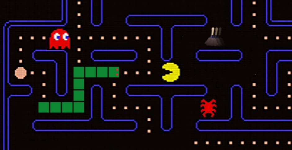
Your Friendly Neighborhood Pac-Man
If Spider-Man was just a normal guy who got the proportional strength, speed, and agility of a spider after being bitten by a radioactive spider, maybe Pac-Man started out as just a normal guy who got the proportional strength, speed, and agility of a pac after being bitten by a radioactive pac.
What's a pac? I have no idea. But I wondered if I could make a mash-up of Pac-Man and Spider-Man anyway.

Eventually I came up with a prototype that’s actually fun to play! Pac-Man swings through a city-like maze eating pellets and avoiding ghosts. A more traditional maze map in the corner shows an overview of where everything is.
But once I got it to this kinda-fun playable state, I realized that while this little one-level demo scratched my itch, I didn't think there was enough to it that made it worth developing further.
You're welcome to take a swing at it yourself. You can play the game here.
On mobile, you can switch between on-screen or tilt controls, and tap the map to switch on-screen controls between right or left handed.
Snake, But You’re The One Feeding It
You know the classic Snake game where you control a snake eating apples that make you get longer? I thought there might be a fun game that’s played in reverse, where you don’t control the snake directly, but you’re the one setting out the apples the snake eats.
This approach makes it less of an action game and more of a strategy game because you have to think about where the snake will go and plan ahead so it doesn’t run into itself as it gets bigger.
I called the game SINS which stands for SINS Is Not Snake, and doubles as a sideways reference to the snake in Genesis.
Here’s me testing the game inside the level editor to show you what it looks like. You can watch me set the apples in advance and then the snake goes after them in order, picking up keys that unlock gates so it can get to the exit:
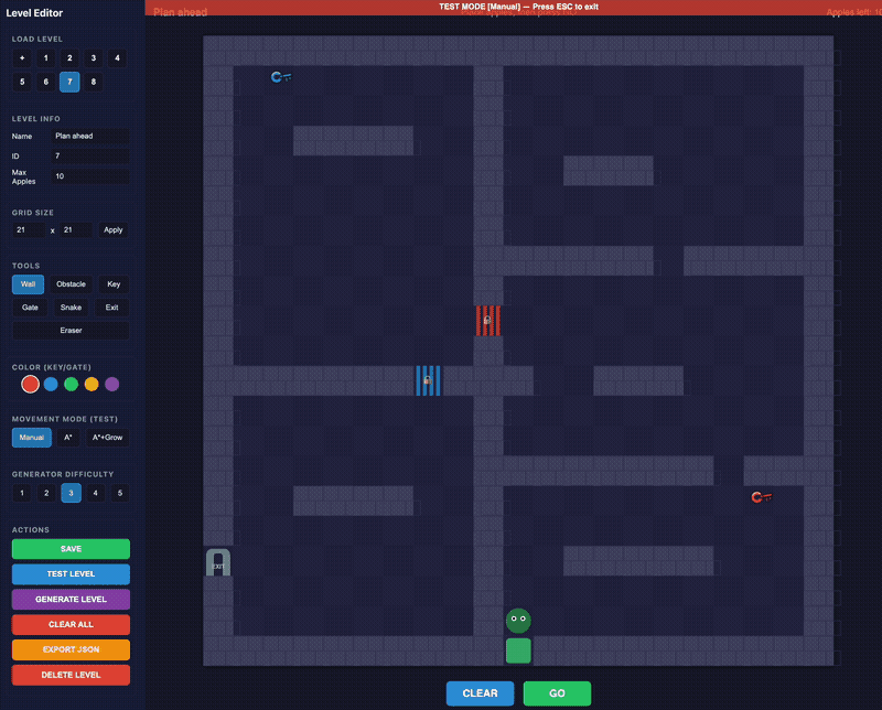
The level editor also lets me try out different gameplay rules. There is the variation seen above where you plan the snake’s entire path in advance turn by turn. Then there’s a version where the snake does more pathfinding on its own, going around obstacles as needed and you just set the next destination. There’s a version where you place the apples in real time while the snake is already moving; one where the higher the apple number, the more segments get added to the snake. And so on. I was trying to figure out what has the best challenge-to-fun ratio.
Ultimately I decided that while there was definitely something to the puzzle gameplay, it just wasn’t as fun as original Snake, and didn’t give me that “just one more time” feeling like a good game should. I kept asking myself, would I rather just play Snake? And too often, the answer was yes.
But you can play the eight-level prototype of SINS here.
The Exclamation Point Limiter
Way back in 2013, I had an idea for a snarky app that would force people to use fewer exclamation points.
When I wrote about it, I referenced F. Scott Fitzgerald’s quote, “An exclamation point is like laughing at your own jokes” and imagined the app working like this:
At first, it’s generous. The person using the software gets 15 exclamation points they can use each week. Eventually over time, it winds down to three a week. Each Monday, the counter resets and they get three exclamation points to use however they want. They can all be wasted at the end of one sentence!!! Or they can be used sparingly, and only when truly needed.
So after all this time, I made it! It lives in the toolbar and every time you use an exclamation point, it alerts you as it decreases your allotment until you’re all out, and then you’re cut off until it resets. But you can whitelist apps that actually need exclamation points, like if you program in a language that uses != to mean “not equal to.”
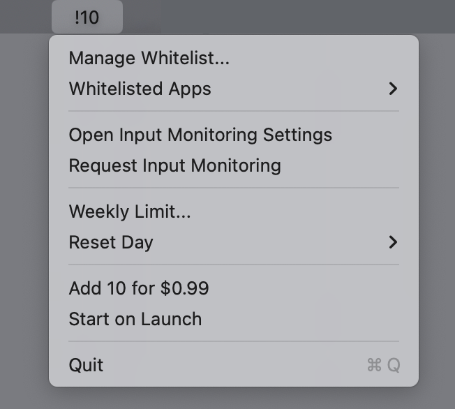
And because I thought it was funny, I added an option to purchase 10 more exclamation points for $1. I call it “getting more bang for a buck” but I’m not sure if people know that exclamation points are also called bangs. There’s no reason a person should ever use that feature. They can just quit the app if they need more exclamation points.
But in the 13 years since I first thought this up, my feelings around exclamation points have changed. Research has shown that women use exclamation points more than men, and the discussion around that is a bit complicated. Women are told to use fewer exclamation points in business communication. But the exclamation point is also seen as communicating a warmth and friendliness, as opposed to a bossy tone.
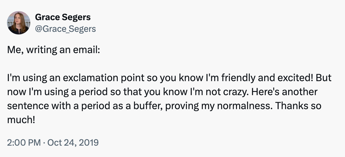
I don’t like that there’s a double standard around a punctuation mark. So I decided that this idea should be abandoned rather than add any bad feelings around how people communicate.
As The Onion reported:
In a diabolical omission of the utmost cruelty, stone-hearted ice witch Leslie Schiller sent her friend a callous thank-you email devoid of even a single exclamation point, sources confirmed Monday. “Hey, I had a great time last night,” wrote the cold-blooded crone, invoking the chill of a thousand winters with her sparely punctuated missive—a message as empty of human warmth as the withered hag’s own frozen soul. “Nice to get together. We should do it again sometime.”
One That’s Actually Incredibly Useful
I use Hazel for organizing and filing documents. It’s a program that watches my Downloads folder and scans for files that match rules I set up. For example, when Hazel sees a document that contains my electric bill account number, it renames the file and moves it into a certain folder.
I like putting dates in my filenames, like what month a bill is for, but Hazel is terrible at figuring out what date a document was sent. It can find a date, but doesn’t know if it’s a date of service or the send date or when a payment is due, etc.
And even though I have a bazillion rules, there are tons of things that fall through the cracks: service letters that don’t include my account number, or scans of drawings my kids made, or report cards I don’t have rules for, or greeting cards, etc. After six months, those leftovers add up.
Document analysis is something AI is very good at, so I hoped that Hazel’s next major version would somehow use AI to solve these problems. But then they released a new major version and it didn’t have that feature.
So I made my own version of AI Hazel. It’s set up very similarly to Hazel, but the rules are written in plain English. Each category gets a written description and examples to guide the AI.
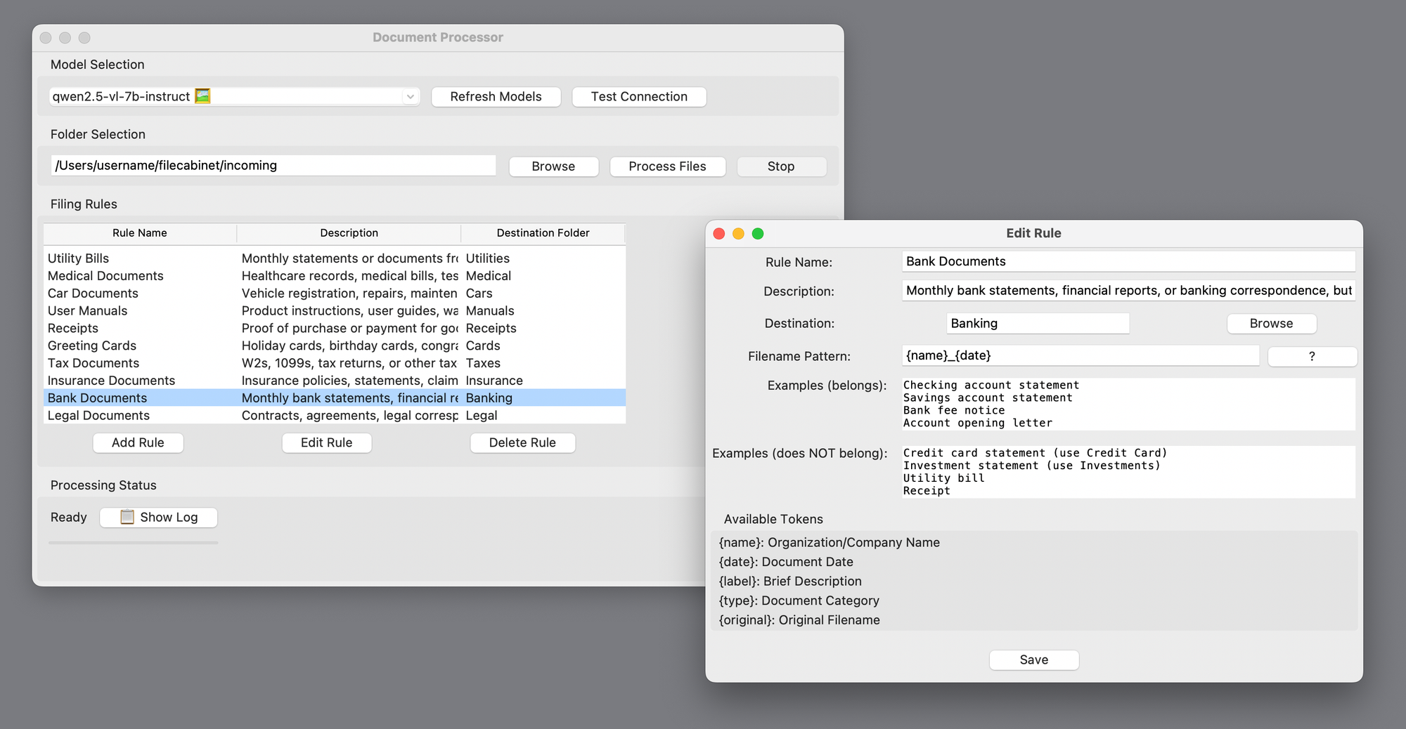
And here’s the most important part: Since these documents can include personal or sensitive information I wouldn’t want slurped up by the big AI companies, it runs entirely with a local LLM, which is good enough for this sort of task. It uses a combination of OCR and AI vision recognition for things like hand-written notes and photos. Nothing leaves my computer.
It’s slow, but it works pretty well. And it logs its reasoning behind each filing decision in case I need to adjust the rules.
This tool isn’t in the same “abandoned” category as the other apps above. It’s something made just-for-me that I won’t be distributing. I imagine this kind of vibe-coding use case where you just make your own version of the app you want, tailored to your particular needs, both excites and terrifies businesses.
Why I’m Done Writing About Vibe Coding
Literally two days after ChatGPT launched, I used it to fix some broken javascript on my website that I didn’t know how to fix myself, and I was amazed. Nobody called it vibe-coding yet, but that’s what it was. And I’ve been vibe-coding all kinds of projects ever since.
But the process has evolved a lot since then. I used to have ChatGPT write a bunch of code which I’d copy and paste in a text editor, then test, then report back what errors I get. Most of the time was spent arguing with it when it told me for the hundredth time that it fixed a bug that was clearly still there.
When I launched Gisnep, I wrote the whole story of how I developed it working with ChatGPT. I wrote a similar story when I launched DOOMscroll. The development process was as much a part of the story as the product idea itself.
But over the past few months, with the release of Claude Code and Codex, the process has become both much smoother and more opaque. (I was using tools like Cursor and Windsurf before that, but these feel like more of a turning point).
Working with those new tools, I’m rarely reporting back errors and more often getting exactly what I asked for, for better or worse. Now the conversation involves adding or refining features, or explaining misunderstandings. I don’t even see the code anymore. There are definite drawbacks, of course. I saw every line of code in Gisnep and that helped me understand how the site worked, even if I couldn’t have written the code myself. And for projects of high importance, I’m not sure how much I would trust vibe coding for things like security.
But for the kinds of silly projects I like to make, like the ones shown above, the process itself now feels beside the point. Vibe coding may not be a completely solved problem, but it doesn’t feel like magic anymore. So the how is no longer as interesting to me as the what and the why.
When word processors were new, it was cool to see how easily you could change fonts or make something bold or check your spelling with a click of a button. But now, I’m much more interested in what people are writing than the app they used to write it. Vibe coding tools are starting to reach the word processor stage for me.
I’m sure I’ll still be vibe-coding apps both stupid and useful, but unless there’s another seismic shift to nerd out about, I don’t think I’ll be gushing about the process anymore and focusing instead on what I’m making.

And that’s it for another newsletter! I’ve had a huge influx of new subscribers since the last one, so to all of you I say, welcome!
The last issue was about art. This one is a bit more tech focused. Mix in a bit of popular and unpopular culture, and I think you get a sense of the range of topics of this newsletter. I hope you stick around and enjoy it! I try to make most of my topics evergreen, so poke around and get lost in the archives. Let me know what kinds of things you want to see more of.
Oh man, just this little conclusion alone has three exclamation points.
Thanks for reading. See you next time!
(That’s four)
David
P.S. I made the header image at the top of this newsletter after I wrote it, but now I really am wondering what an actual Snake/Pac-Man mashup would be like, where Pac-Man is replaced by a snake, and maybe the snake would get longer each time it eats a power pellet or a ghost, making it harder to avoid them. Somebody stop me before I go make this.
UPDATE: You didn’t stop me!
Next Page of Stories