

Inspired by 90s edutainment, Final Fantasy, renaissance paintings and editorial illustrators, Louie Zong believes that sitting in the intersection between the past and present is the key to making thought-provoking stories.
Inspired by 90s edutainment, Final Fantasy, renaissance paintings and editorial illustrators, Louie Zong believes that sitting in the intersection between the past and present is the key to making thought-provoking stories.


Over the weekend, another group of college graduates booed another pro-AI speaker, as ex-Google CEO Eric Schmidt failed to read the room at a commencement speech Sunday at the University of Arizona. This thoroughly predictable but nevertheless heart-warming event follows on the heels of University of Central Florida students booing commencement speaker Gloria Caulfield earlier in the month.
Schmidt, like Caulfield, came to tell a bunch of young people staring down a brutal job market that they have to get on board with the smoke-and-mirrors AI future. While Schmidt acknowledged that students might fear that, according to a transcription by Kotaku, “the future has already been written, that the machines are coming, that the jobs are evaporating, that the climate is breaking, that politics is fractured, and that you are inheriting a mess that you did not create,” he then decided the solution to all this is to swallow the AI bullshit that’s contributing to these evaporating jobs, broken climate, and fractured politics.
“The question is not whether AI will shape the world, it will, the question is whether you will help shape artificial intelligence,” Schmidt said. “We do not know the precise contours of what this transformation will look like, but what we do know is it will require each of us to adapt in ways that we cannot yet anticipate. My hope is that you will choose to engage anyway. That you’ll choose to be in the room where these decisions take place and to have a voice in how they’re made. ”
In a video of the booing, Schmidt said, “If you don’t care about science that’s OK, because AI is going to touch everything else as well. Whatever path you choose, AI will become part of how work is done.” He continued, “When someone offers you a seat on the rocket ship, you do not ask which seat, you just get on. The rocket ship is here; let me give you some advice. First, find a way to say yes.”
Like Caulfield, Schmidt does not seem to have expected the response, but where Caulfield made a bit of flummoxed light out of it, Schmidt smiled smugly as the students booed. Schmidt closed his remarks by saying “The future is not yet finished,” according to NBC, despite having previously touted the inevitability of AI and exhorting students to get on board.
Prior to his speech, some University of Arizona students planned to protest Schmidt over allegations of sexual assault in a lawsuit filed by his former girlfriend and business partner Michelle Ritter in 2025. That lawsuit went to arbitration in early March 2026, and Schmidt has denied Ritter's claims.
Something that made Caulfield’s speech so weird was that she is a vice president at a company working on “health and medical partnerships” and a planned community in Florida, fields that have surely talked about AI but which you wouldn’t expect to have a real stake in ramming it down students’ throats. Schmidt, who stepped down from Google leadership in 2011 and left parent company Alphabet’s board in 2017, at least has some connection to the technology that gives his speech some context. Schmidt is “among the most prominent voices on technology, AI, business, and philanthropy” according to his own LinkedIn, so he clearly has some sort of stake here, but still: Telling students they have the power to shape the future, but that power will be consigned to helping the machines that are letting a handful of rich men get richer while making the rest of our lives worse is a shockingly tone-deaf thing to say to a bunch of nascent grads, even for a businessman.
The only good thing about this recent “This Is Water but make it AI” trend is getting to revel in the students’ response. For all the ways AI is ruining education, it’s inspiring to watch young people roundly reject it, refuting the inevitability narrative that seems to be the only thing AI companies have left as their products get both worse and more expensive. We might be stuck with this shit until it implodes itself, but we can at least refuse to be conscripted into helping it along. Drag ‘em, kids.
Some recent conversations have reminded me that I have opinions about data and its use inside organisations. Especially for marketing-type stuff.
Here are three of those opinions

A few years ago in a sales meeting some ad-tech person said 'I bet you wish you had more data on your customers' and the my perpetually contrary inner voice said 'oh no I don't, I wish I had far less'. I may have actually said it. I may have said 'No I don't, I wish I had less, and if you came to me promising an effective service with far less data I might have been interested.'
That's what I'd have said now.
Because:
a. Data is a risk. Every bit of data has to be managed/looked after/cared for. That costs time and money. And most of it is useless.
b. Data is distracting. Most of it is just noise. You're gathering it because you can, just in case, because it seems valuable. Then you spend ages trying to work out what to do with it. When you should be paying attention to just a couple of bits of it and actually doing something about it.
c. It becomes a job. Get enough data and you need data scientists. Then you're stuck in a self-perpetuating structure that requires more data to feed the data scientists.
The best expression for all this I've ever seen is from James Timpson, a column in The Sunday Times towards the end of the pandemic. Here's a (long) excerpt:
"I vividly remember being shown the charts room in fund manager Fidelity’s huge London office. There were graphs of everything under the sun. Was the theatre of the chart room the big sell to clients, or was it a useful tool for the analysts? No doubt Debenhams’ bosses had lots of facts at their fingertips, but data didn’t help them save the business.
Now our shops are open again and everyone is back at the office, the data is pouring forth. We have a culture where we want to produce as little information as possible, but it can feel like watching a dripping roast, with statistics flowing from every department at an alarming rate. With 2,100 shops, there’s always lots of information to consume and my eyes can quickly glaze over.I prefer to focus on a few things, as well as the basics of retailing. Are the shops open? Is everyone happy? If so, we can start taking money.
There must be a point where the costs of interpreting and using data exceed the benefits of collecting it. Can you afford a chief data officer paid £120,000 a year plus bonus? We can’t, so instead we have three simple ways of understanding what’s going on.Every night at 7pm, I get an email listing that day’s sales. This data isn’t collected by an “Epos” (electronic point of sale) till system, but by colleagues filling out a form online. They also write the sales numbers on a piece of paper and keep it on a bulldog clip. This takes five minutes a day. It sounds old-fashioned, but when people physically write things down they seem to take more notice. If you ask our colleagues what their sales are so far today, I bet they’ll know to within the nearest £50.
Over the past 25 years, we have acquired a number of (loss-making) retail chains. The first thing we do is switch off their Epos tills. All we need is a drawer to keep the cash in and a calculator to add up the sales. We have thrown away more than £8 million of kit — and it’s made life easier for us.The businesses we bought were often collecting vast amounts of data from their fancy tills, yet the managers were actually reading very little of it, and it rarely helped colleagues give better customer service. As sales plummeted, they analysed more data, and brought in more finance experts and consultants to work out where the problems were. Redundancies weren’t made from the data team — it was the people on the front line, serving customers, who lost their jobs first. These companies failed because they lost focus on what’s important: great customer service.
So our second barometer is customer service scores, which I look at every day. We ask customers to use an online form to rate their experience out of ten (our average score last week was 9.4). Every colleague sees their feedback in real time, and if we get a bad score our area managers are expected to call the unhappy customer straight away to apologise and fix the problem.
One piece of data beats everything else. A quarter of a century ago, my dad taught me the best way to measure the health of our business was to look at the cash figure every day. Each morning at 10am, I get an email from Caroline in the finance team showing the cash we have in the bank compared with the same day last year. This fact offers no hiding place."

Data is most useful when it's in the hands of the teams who create it or need it. The more it gets abstracted away to other teams and other softwares the more dangerous and misleading it gets.
So start off with writing it on pieces of paper or sticking it on the wall. Graduate to spreadsheets only when you have to. Move on from spreadsheets very, very reluctantly. Dashboards are dangerous. Everyone knows the stories about pilots flying into the ground while staring at their instruments. Dashboards abstract away the reality.
The trick is to keep the data in your hands. Get it from the source yourselves, regularly, daily, weekly and copy it into your spreadsheets then get together and talk about what you're seeing. Yes, you might have transcription errors but you should catch them because you know the data directly.
You know, because you've been sticking it in a spreadsheet every week, how many subscribers you have. Or whatever. That's different to seeing it go green on a dashboard or seeing the lines on a pie chart move.
This has the additional advantage of matching the fidelity of the presentation to the quality of the data. When you don't have much data - and therefore don't know much - then keep it scratchy and on paper. It might look less whizzy but it reminds you of the uncertainty. There's a massive risk in taking the tiny amounts of data that startups have and pasting it into fancy dashboards and vibe coded analytics. You start forgetting you've got a tiny sample size.

I used to have regular rows with engineers who told me that various things they'd built worked for 99% of our customers and were therefore ready to go. But, I'd say, we've got two million customers, so twenty thousand people are about to be massively inconvenienced and most of them will phone us.
You have to think through the data to the people-sized reality.
I find two things help with that:
Numbers of people are hard to visualise. It helps if you think of things you've actually seen. Like 'that's the same number of people who can fit in Wembley stadium'. You might realise that a number is bigger, or smaller than you thought.
Check the data by imagining the story behind it. Say, out loud, in your data meeting, what you think might be happening. So, if you've changed something on your emails and the click-through rate is going down then talk it though 'I think this means that people aren't sure what they'll get when they click so they're reluctant to do it. Does that make sense?' It doesn't have to be right, it just has to be plausible. Because if you can't think of a plausible explanation for what's happened you need to revisit the data or check some assumptions.

Back in the late Cretaceous when I was learning to drive, most cars and trucks did not have power steering. Larger/heavier vehicles had larger steering wheels because you actually had to muscle the front rolling wheels around to turn the vehicle, and the additional leverage from a larger steering wheel was important. (Incidentally, you could tell if one of your tires was low because it literally got harder to steer. Local truckers and other frequent drivers tended to build up their arm muscles from navigating corners.) My dad's little MG sports car had a 13" steering wheel; my VW van had a 16" steering wheel; pickup trucks' were more typically 17"; and buses were more typically 18-20".Nowadays, practically every vehicle has power steering assist, but (CyberTruck aside) they're basically all designed so that if the power steering fails, you can still steer the car -- it's just harder to do so. So the big bus steering wheels are still around, as a safety measure.
A bus driver has to maneuver through lanes the same size as small cars but with a lot less clearance. With a smaller steering wheel, any adjustments could be too abrupt for safety. With a larger steering wheel, you can make a correction without changing the turning radius of the bus too dramatically. Smaller adjustments won’t cause any instability.
This feature has changed over the years and varies in vehicles, but initially, the large steering wheels on buses sat almost horizontally. The driver sits directly above the tires, so for the steering column to correct the tires, the steering wheel needs to be positioned at a different angle. More recent bus models have options for the driver to adjust the position of the wheel.

Thanks to Sam Graf for introducing me to this and suggesting some toys.
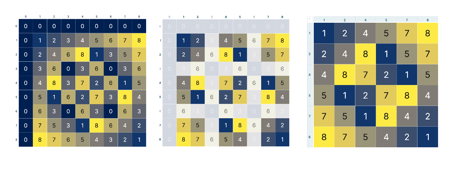
Multiplication tables can be fun. Line up your numbers, multiply, and find patterns. Like with 5x5, we can fill it out and highlight symmetry, divisibility, squares, and so much more. In this inquiry, we're going to play with a different version of these tables.

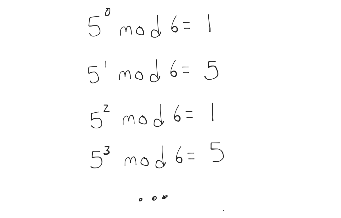
Take that 5x5 multiplication table and divide each number by 6, and write down the remainder. Another way to say this is mod 6.

What do you notice?
What patterns emerge in the table?
What numbers produce zeros?
What numbers don't produce zeros?
Make a table for the numbers that don't produce zeros, and apply mod 6 as before. This is called a Cayley table

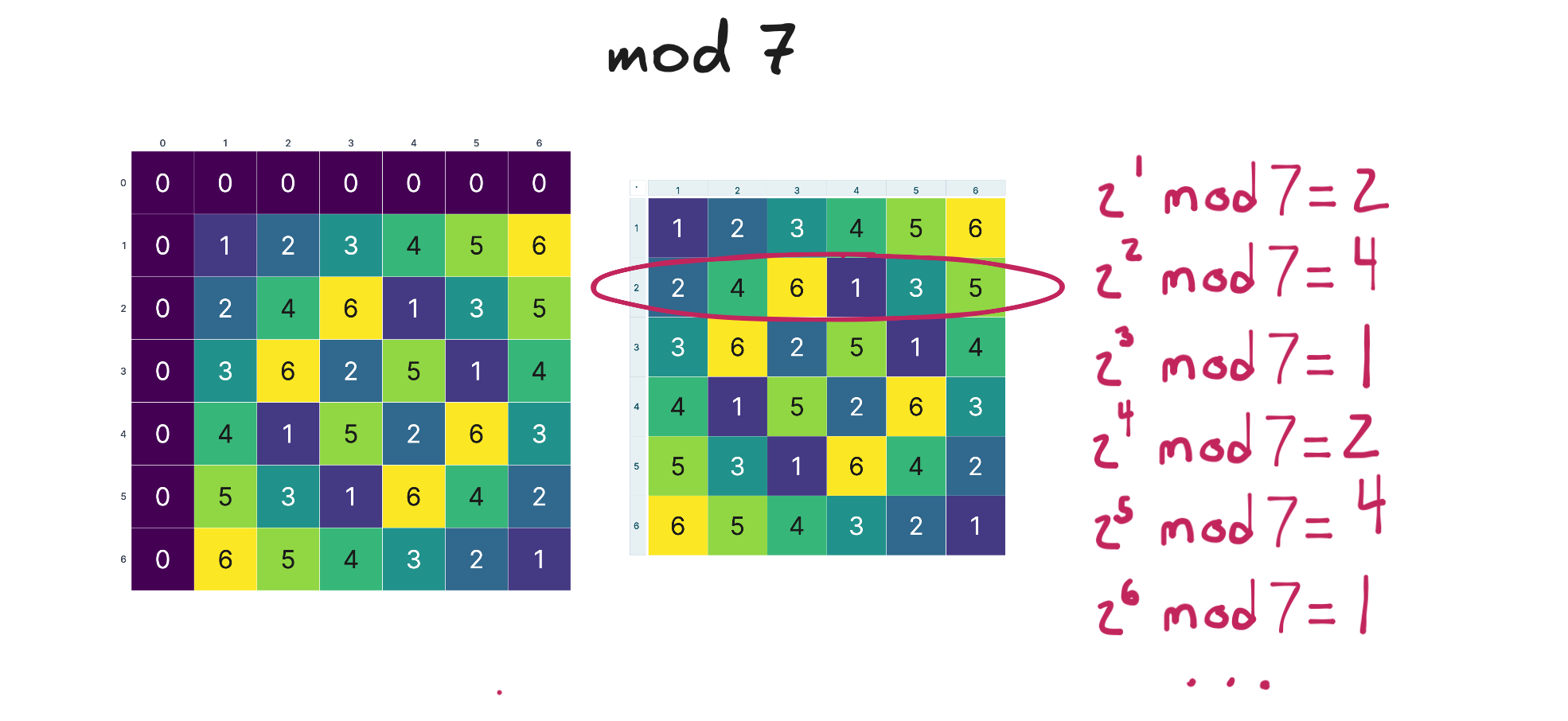
For each number in the table, look at its powers mod 6 and note any observations:
Here is 5:
Now, let's take what we did with six and repeat it with other numbers. Let's call each number we pick m.
For each m:
Here is a tool (full page on desktop is best). It is too big to embed here, so save it and read on.
Here is six using that tool:

Here is nine. The size or number of rows in the Cayley table is Euler's totient. For nine it is six, written as φ(9)=6.
For different values of m
Form conjectures about the tables.
Spoiler alert - go play before proceeding (this means you too).
This is a 60–90 minute activity exploring the multiplicative structure of integers mod m.
Building the first tables
Have learners build the mod 6 multiplication table by hand. The hand-work matters — patterns surface faster when learners feel the symmetry and notice the zeros or lack thereof.
Comparing several values of m
Some useful values to start with:
Here is the tool — full page on desktop is best.
Groups or learners can take values and then trade.
Give time to write down observations before discussing. Offer examples if learners stall.
Example Conjectures:
Example: "When m is prime, no rows or columns get hidden after the zero row and column."
Example: "The numbers left after hiding zeros are exactly the numbers that share no factors with m."
Example: "Every row of the Cayley table has the same set of numbers, just rearranged."
Example: "Sometimes one number's powers generate all the numbers in the table."
Example: "Every Cayley table has 1 and m-1."
Example: "Every Cayley table is a Latin Square."
Supporting Questions:
The content below is what you might find in a textbook, and possibly too heavy for light inquiry.
Do the powers always cycle?
How long is the cycle?
When does one number's powers produce all the others?
Powers of a Cayley table number (unit) cycle back to 1
Is this true for all numbers in the Cayley table?
Note: Try 2 mod 6, where 2 isn't in the Cayley table. The powers go 2, 4, 2, 4, … The cycle never reaches 1, because 2 has no inverse mod 6. There's nothing to cancel with.

I like the Fits on a Floppy manifesto by Matt Sephton:
Software should be as small as it can be. Not as a gimmick, but as a discipline. The floppy disk is the measuring stick: 1.44 MB. If the software that ran entire businesses could fit in that space, then a modern, focused, single-purpose tool certainly can.
In my own work, I have mostly focused on the web side of this equation, as this is where the situation feels the most dire: tens of megabytes dedicated to heavy frameworks, unnecessary tracking scripts, and video ads have a real negative effect on experiencing websites. Progressive loading challenges also make it harder to offer a great experience.
But space considerations are starting to feel more pertinent to local software too, in an era where SSD and hard drive prices are going up, and where local LLM models start taking up more room.
Also, this passage feels very Unsung, and is exactly why the tag #history exists on this blog:
I don’t miss floppy disks. I miss the mindset they demanded—that every byte matters, that constraints breed creativity, and that software should be light on its footprint.
If you reduce tech history to just nostalgia, it won’t be that useful. But if you look at it as inspiration, you might find some truly wonderful and meaningful stuff in there.
On that note: Bonus for a nice classic domain, and a nod toward Mac’s most famous screensaver.